 kage
openship.io
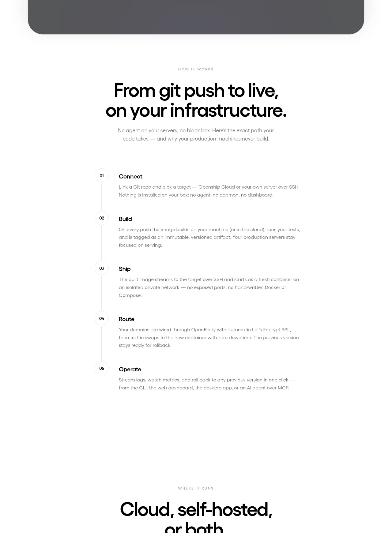
Design analysis
A numbered five-step process turns the product promise into a clear operational sequence, with a vertical guide line and concise descriptions.
Prompt preview
## Reference images

Study these alongside the description below: hierarchy, rhythm, spacing, colour. Build for the product you are asked about, using this design language.

- Component: https://kage-design-assets.t3.tigrisfiles.io/components/openship-cloud/9519eed9-0239-434c-a94e-7bf81cfc26ba-1792562627-4.webp
- Full page it was cut from: https://kage-design-assets.t3.tigrisfiles.io/screenshots/openship-cloud/9519eed9-0239-434c-a94e-7bf81cfc26ba-1792562575709-full.webp
- Component on Kage: https://kage.design/component/openship-cloud-feature-grid

## Before you start
Ask what the user's product and brand are, then apply the principles below to that product rather than copying the reference.

Build a process section with a small uppercase eyebrow, a bold two-line heading, and a constrained introductory paragraph. Below it, create a vertical numbered timeline of five stages. Each row should have a compact step number, a bold title, and a short explanation aligned on a shared content column; connect the numbers with a very faint vertical rule. Keep the layout narrow and readable rather than filling the full viewport. Use black text, soft gray supporting copy, generous 28–44px row spacing, and a minimal #eeeeee guide line. On mobile preserve the number column but allow descriptions to occupy the remaining width.

Never: use logos, product names, copy, illustrations, or imagery from the reference.
More components
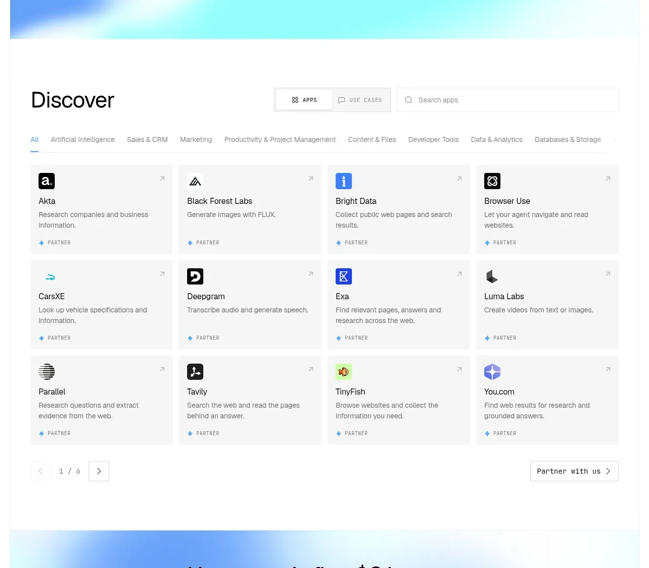
 Discover app directory
Composio Instant · Feature grid
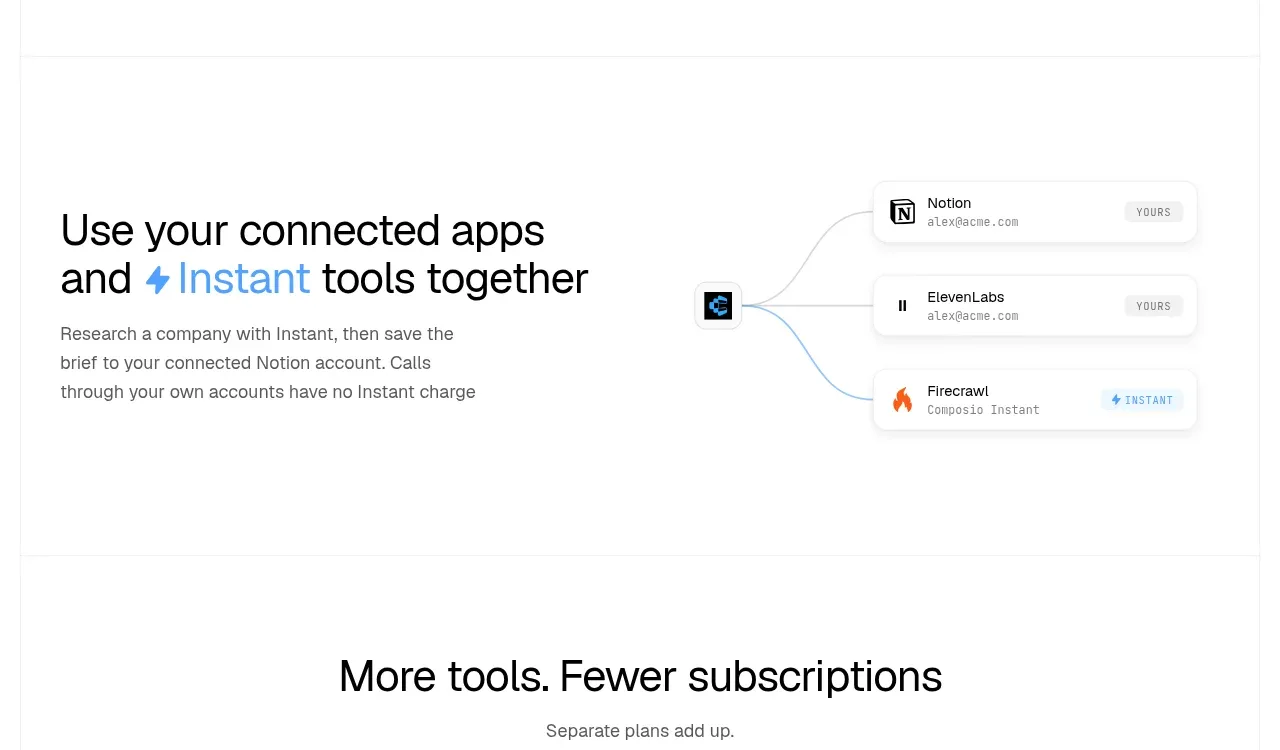 Connected apps workflow
Composio Instant · Feature grid
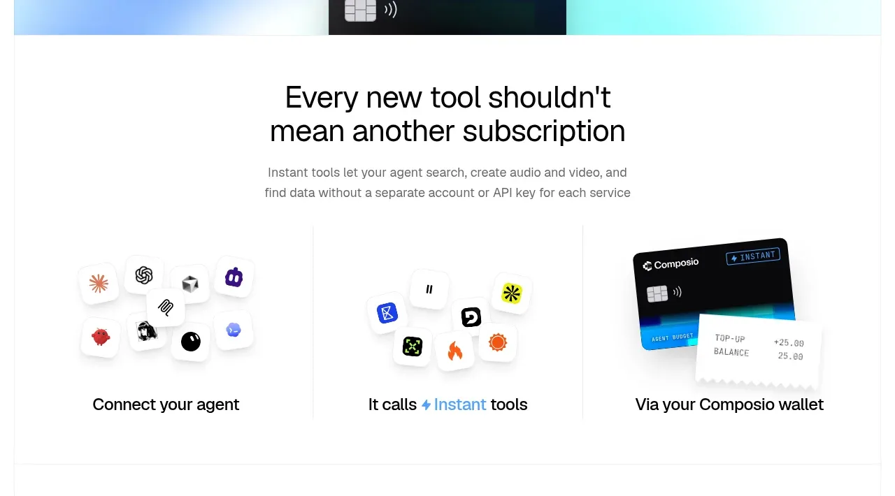 Three-part product workflow
Composio Instant · Feature grid
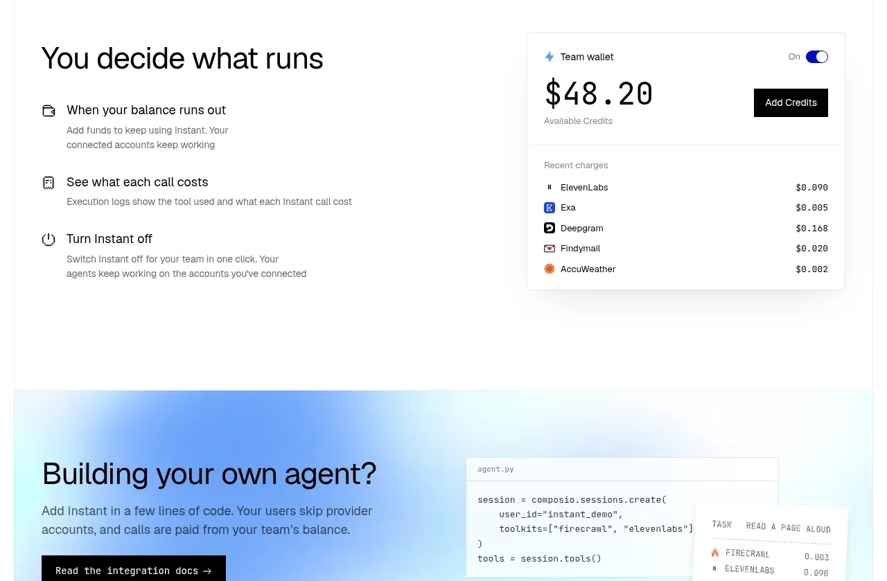 Spending controls
Composio Instant · Feature grid
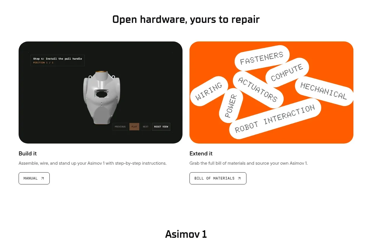
 Open hardware pathways
Asimov 1 · Feature grid
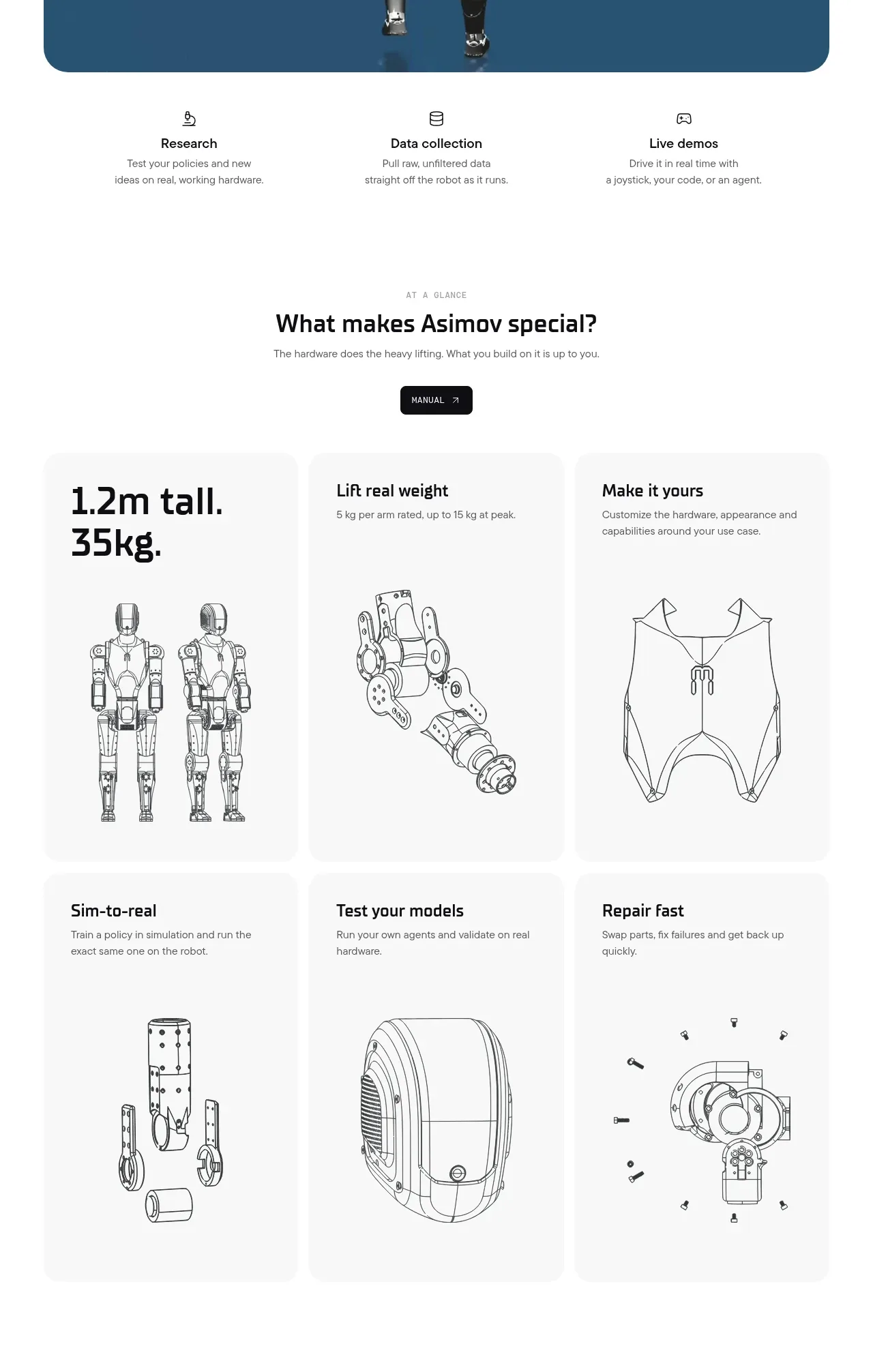 Capability overview and specification cards
Asimov 1 · Feature grid