 kage
kage
openswarm.info
Design analysis
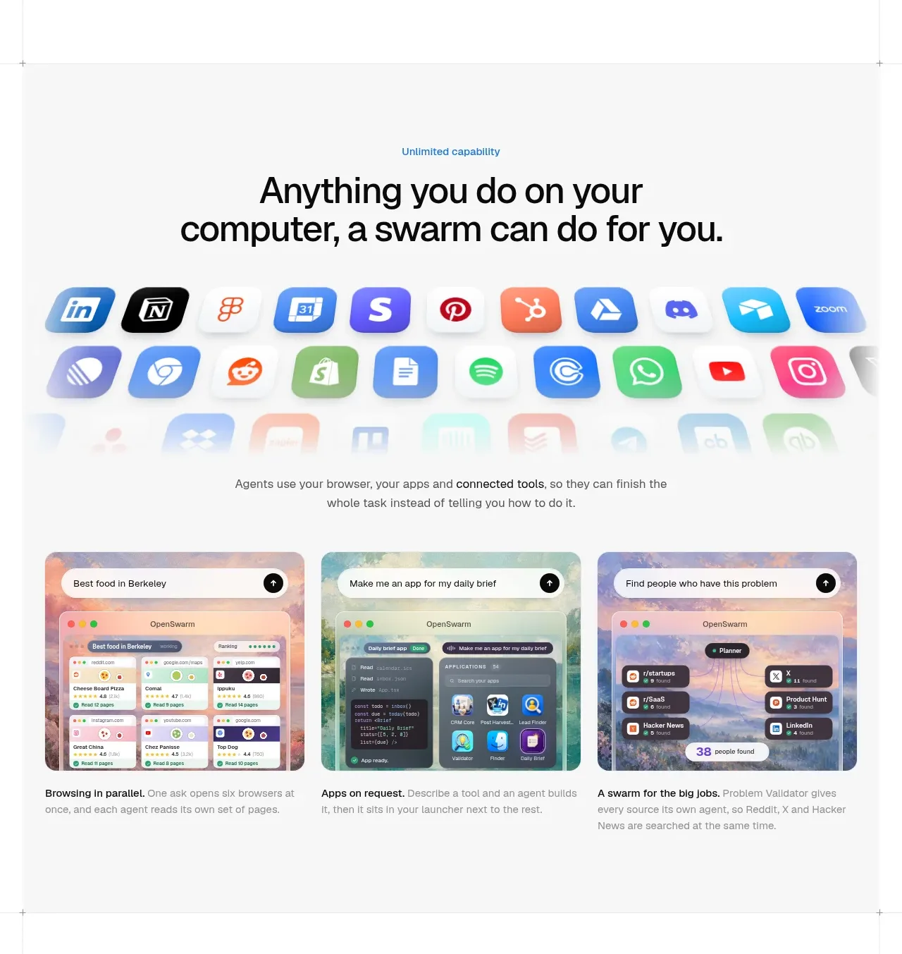
A centered capability statement is followed by an app ecosystem visual and three evenly weighted use-case cards, translating an abstract promise into concrete outcomes.
Prompt preview
## Reference images

Study these alongside the description below: hierarchy, rhythm, spacing, colour. Build for the product you are asked about, using this design language.

- Component: https://kage-design-assets.t3.tigrisfiles.io/components/openswarm/378a218c-dbaf-492a-bc34-8c3bcee33f67-1791525665-2.webp
- Full page it was cut from: https://kage-design-assets.t3.tigrisfiles.io/screenshots/openswarm/378a218c-dbaf-492a-bc34-8c3bcee33f67-1791525640433-full.webp
- Component on Kage: https://kage.design/component/openswarm-feature-grid

## Before you start
Ask what broad capability the user's product unlocks and which three use cases best prove it. Ask for the user's brand colors and preferred visual assets, then adapt this structure.

Build a spacious feature section on a very light gray background `#f7f7f5`. Start with a small blue eyebrow at `#317ea5`, followed by a centered two-line headline in near-black, around 34–48px and bold. Under it, show a wide, softly reflected ecosystem strip of rounded app tiles or abstract capability tokens; use original icons, neutral placeholders, or the user's integrations, never copied marks. Add a short centered explanation at 14px gray. Finish with a three-column card grid: each card has a rounded image/demo panel above a concise bold title and a two-sentence description. Use 16–20px gaps, 12–16px radius, subtle borders `#e5e7e9`, and a white card surface. Keep all cards equal height and align titles and descriptions. On smaller screens, turn the grid into a vertical stack or horizontal snap carousel. Let imagery communicate outcomes while copy stays scannable.

Never use logos, product names, copy, illustrations, or imagery from the reference.
More components

 Privacy and optional intelligence
Mailwell · Feature grid
Privacy and optional intelligence
Mailwell · Feature grid
 Reliable, recoverable actions
Mailwell · Feature grid
Reliable, recoverable actions
Mailwell · Feature grid
 Unified account setup
Mailwell · Feature grid
Unified account setup
Mailwell · Feature grid
 Fast local workflow and calm reading
Mailwell · Feature grid
Fast local workflow and calm reading
Mailwell · Feature grid

 Cloud layer workflows
ProcBoss · Feature grid
Cloud layer workflows
ProcBoss · Feature grid
 Operational blind spots
ProcBoss · Feature grid
Operational blind spots
ProcBoss · Feature grid