kage
kage
openswarm.info
Design analysis
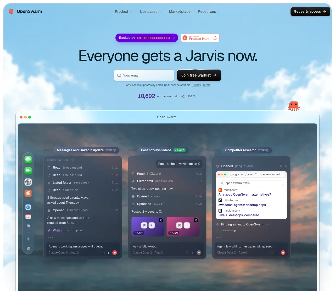
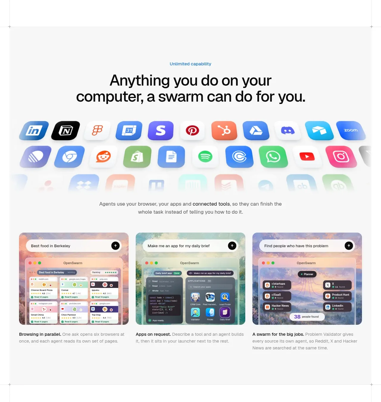
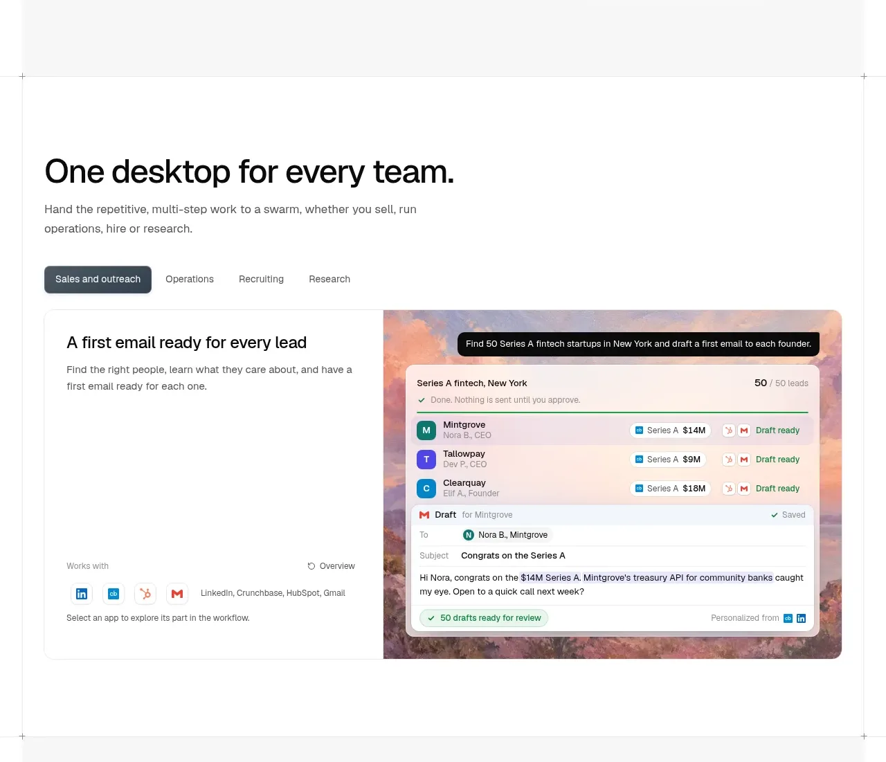
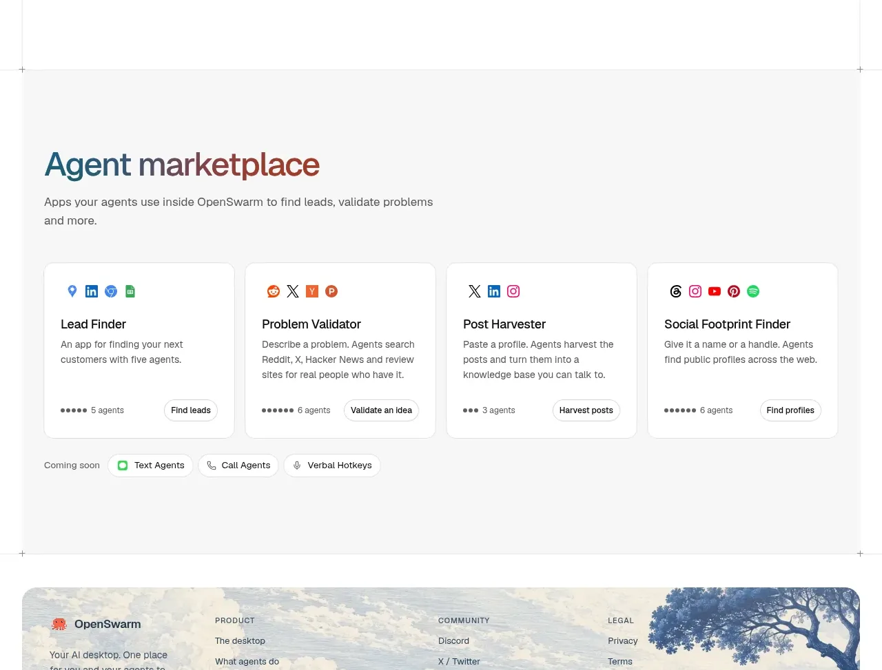
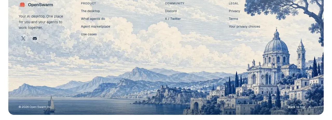
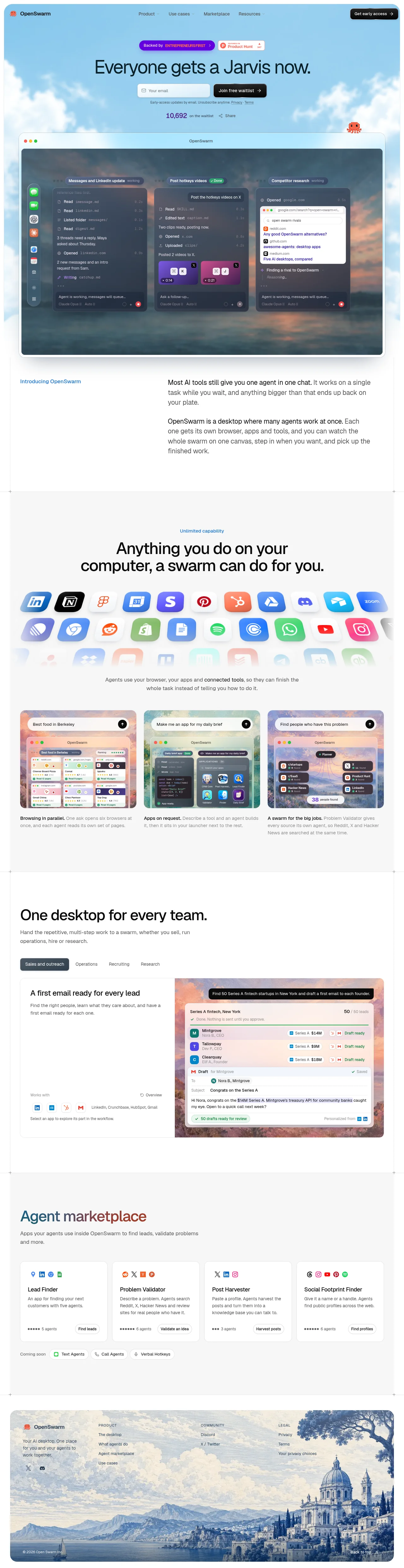
A sky-blue photographic hero with a serif display line, inline waitlist form and live counter sets a warm tone that contrasts with the dense macOS window mockup below, where three agent panels float over a sunset wallpaper. Below, the page alternates airy white and grey bands with shifting rhythm: a quiet two-column editorial intro, a dense icon-collage capability section, a three-card demo row with bold lead-in captions, a left-aligned tabbed persona showcase, and a four-card marketplace grid headed by a rust-coloured display line. Full-round black pills, oversized radii, soft shadows and a coral octopus mascot unify the page, which closes with a vintage-landscape illustrated footer.
Prompt preview
## Reference images

Study these alongside the description below: hierarchy, rhythm, spacing, colour. Build for the product you are asked about, using this design language.

- Full page: https://kage-design-assets.t3.tigrisfiles.io/screenshots/openswarm/378a218c-dbaf-492a-bc34-8c3bcee33f67-1791525640433-full.webp
- Above the fold: https://kage-design-assets.t3.tigrisfiles.io/screenshots/openswarm/378a218c-dbaf-492a-bc34-8c3bcee33f67-1791525636249.webp
- Design on Kage: https://kage.design/designs/openswarm-landing-page

## Before you start
Ask the user what product they are building, who it is for, and what brand assets they already have (name, colours, type, imagery). Wait for the answers before writing any code — everything below is applied to *their* product, never to the reference site.

## Page structure
1. **Top nav** — a slim bar sitting directly on the hero sky: logo + wordmark left, four plain text links centred (Product / Use cases / Marketplace / Resources), one black pill CTA with a trailing arrow on the right. No border or shadow; the nav floats on the background.
2. **Hero** — a centred stack on a photographic sky: two small backer/press badges side by side, one short serif display headline, an inline email field plus black pill button, one line of 11px legal microcopy, then a live counter ("N on the waitlist") with a share link. A small mascot character peeks in from the right edge.
3. **Hero product shot** — a full-width macOS-style window (traffic lights, centred title, large radius, soft shadow) laid over a wallpaper image. Inside it, two or three floating agent panels, each with a status chip, a log of actions, keyboard-shortcut chips and a follow-up input.
4. **Intro split** — a quiet two-column editorial break: tiny blue eyebrow label on the left, two short body paragraphs on the right, generous whitespace above and below.
5. **Capability band** — a full-bleed light-grey section: small blue eyebrow, big centred two-line headline, a collage of ~20 app icons in soft rounded tiles that fades out at its bottom edge, then a two-line caption with one bold phrase.
6. **Parallel-demo cards** — three equal cards in one row. Each card is a mini product mockup with a prompt/search pill floating at its top, and beneath it a caption that opens with a bold lead-in phrase followed by one sentence.
7. **Persona showcase** — left-aligned big headline plus short subcopy, a row of tab pills (active tab = dark filled), then one large card: a text column on the left (title, paragraph, "Works with" logo row) and a screenshot on the right sitting over a warm photographic backdrop with a prompt bar across its top.
8. **Marketplace grid** — a grey band with the section headline set in a rust/terracotta accent colour; subcopy; four white cards in a row, each with a row of small source icons, a title, a two-line description, a dot-scale count and a small pill button; close with a "Coming soon" row of outlined pills.
9. **Footer** — a rounded-corner card inset from the viewport edges, filled with a muted vintage landscape illustration; over it: logo, one-line blurb and social icons on the left, three link columns (Product / Community / Legal), copyright bottom-left, "Back to top ↑" bottom-right.

## Design language
- **Backdrop rhythm**: open on a photographic sky gradient (approx #a8d4f0 → #e8f4fb), then alternate flat bands — white #ffffff and warm grey #f5f5f3 — so each section reads as a distinct scene. Never run the same background twice in a row.
- **One accent per section**: blue eyebrow labels (~#2e6bf0), a rust/terracotta display colour for one headline (~#b0502c), and at most one purple or coral badge. Base UI is black-on-white; colour is used sparingly and never on body copy.
- **Type pairing**: a warm serif display for the hero only (one line, ~64–72px, tight leading); a neutral grotesque sans for everything else. Scale steps: ~64px hero → ~44–48px section headlines → 18px body → 13–14px captions → 11px microcopy. Headlines below the hero may switch to the sans at heavy weight.
- **Buttons and pills**: every CTA is a fully rounded black pill (#111) with white 13–14px text and a trailing "→"; secondary actions are white pills with 1px #e4e4e0 borders; status chips are tiny rounded rectangles with dot or check glyphs.
- **Windows and cards**: mockups use macOS traffic lights (10px red/amber/green dots), a centred window title, 20–24px outer radius and a large soft shadow (0 30px 60px rgba(0,0,0,.15)). Cards inside get 14–16px radius, 1px light borders and near-flat shadows.
- **Density arc**: the page breathes at the top (hero and intro, ~120px section padding), tightens in the middle (icon collage and card rows on denser grids), then relaxes again into the illustrated footer. Captions stay two lines maximum.
- **Mockups over prose**: every claim is shown as a floating panel, log line or list item (e.g. "Read … 0.2s", "Draft ready ✓") rather than as text; UI copy inside mockups is 10–12px and muted.
- **Motion**: restrained — hover lift on cards and pills, slow fade on the icon collage; no parallax or heavy animation.

## Never
- Do not use the OpenSwarm name, its octopus logo or mascot, its headline copy, its badge texts or its footer illustration.
- Do not reproduce real third-party app icons or logos; use generic placeholder tiles.
- Never present the result as OpenSwarm or reuse any of its photography.