 kage
kage
openswarm.info
Design analysis
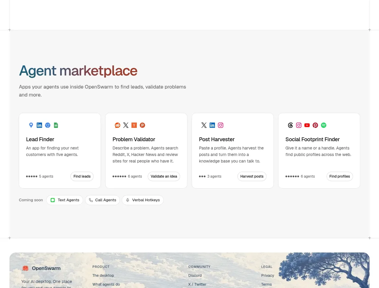
A soft gray marketplace band introduces a directory of compact agent cards, each with a purpose, short explanation, activity signal, and action.
Prompt preview
## Reference images

Study these alongside the description below: hierarchy, rhythm, spacing, colour. Build for the product you are asked about, using this design language.

- Component: https://kage-design-assets.t3.tigrisfiles.io/components/openswarm/378a218c-dbaf-492a-bc34-8c3bcee33f67-1791525666-4.webp
- Full page it was cut from: https://kage-design-assets.t3.tigrisfiles.io/screenshots/openswarm/378a218c-dbaf-492a-bc34-8c3bcee33f67-1791525640433-full.webp
- Component on Kage: https://kage.design/component/openswarm-feature-grid-2

## Before you start
Ask what kinds of extensions, agents, templates, or integrations the user's product offers and what action each card should drive. Apply the same information hierarchy to the user's brand.

Build a marketplace section on a pale gray surface `#f5f5f3`. Use a left-aligned heading with one emphasized word in the brand accent, approximately 36–46px, followed by a short explanatory paragraph constrained to 430px. Below, place four equal-width white cards in a responsive grid. Each card should include a small abstract category icon, 18–20px semibold title, two or three lines of muted description, a compact activity/count indicator near the bottom, and a small outlined action button. Cards should use 12–16px radius, 1px border `#e1e3e4`, soft shadow, and 22–28px internal padding. Add a subtle 'coming soon' or filter chip row below only if useful to the product. Preserve strong alignment and consistent card heights; on mobile use two columns only when readable, otherwise stack.

Never use logos, product names, copy, illustrations, or imagery from the reference.
More components

 Privacy and optional intelligence
Mailwell · Feature grid
Privacy and optional intelligence
Mailwell · Feature grid
 Reliable, recoverable actions
Mailwell · Feature grid
Reliable, recoverable actions
Mailwell · Feature grid
 Unified account setup
Mailwell · Feature grid
Unified account setup
Mailwell · Feature grid
 Fast local workflow and calm reading
Mailwell · Feature grid
Fast local workflow and calm reading
Mailwell · Feature grid

 Cloud layer workflows
ProcBoss · Feature grid
Cloud layer workflows
ProcBoss · Feature grid
 Operational blind spots
ProcBoss · Feature grid
Operational blind spots
ProcBoss · Feature grid