 kage
kage
opentable.com

Design analysis
A tabbed FAQ navigation separates topic areas, followed by two wide accordion questions that keep the dense information scannable.
Prompt preview
## Reference images

Study these alongside the description below: hierarchy, rhythm, spacing, colour. Build for the product you are asked about, using this design language.

- Component: https://kage-design-assets.t3.tigrisfiles.io/components/opentable-com/dad68d84-d5d0-4fa5-a1c8-84465fc5fc04-1789146316-8.webp
- Full page it was cut from: https://kage-design-assets.t3.tigrisfiles.io/screenshots/opentable-com/dad68d84-d5d0-4fa5-a1c8-84465fc5fc04-1789146276379-full.webp
- Component on Kage: https://kage.design/component/opentable-tabs

## Before you start
Ask what the user's product, audience, and brand are, then apply the principles below to that context rather than reproducing a restaurant-booking site.

Create a compact tab-and-accordion information module. Follow these rules:
- Place a horizontal tab bar with four topic labels and a thin bottom rule. The active tab uses the accent color #bd3c51 and a 2px underline.
- Below it, use a two-column grid of accordion questions on desktop, stacking on mobile. Each row has a concise question, generous 18–22px vertical padding, and a chevron aligned to the far edge.
- Use 13–14px labels, #30343b text, #737981 inactive text, and #e3e5e7 dividers. Keep the visual density calm and whitespace-led.
- Implement true tab semantics, keyboard arrow navigation, focus-visible rings, and accordion buttons with aria-expanded and animated content.
- Ensure the module can support longer answers without shifting the surrounding layout unpredictably.

Never: use logos, product names, copy, illustrations, imagery, or exact visual assets from the reference.
More components

 Directory filters and sorting
The Brains · Tabs & steps
Directory filters and sorting
The Brains · Tabs & steps
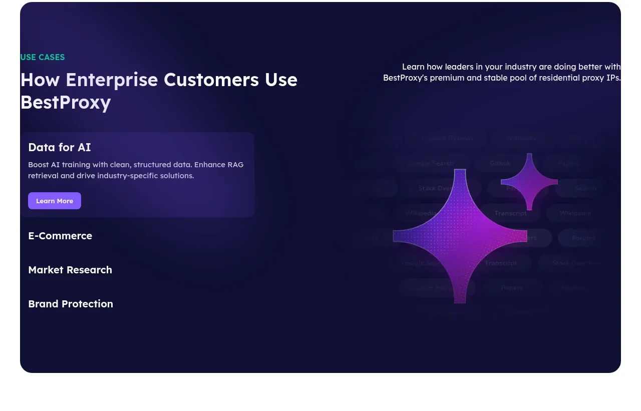
 Enterprise use cases
bestproxy.com · Tabs & steps
Enterprise use cases
bestproxy.com · Tabs & steps
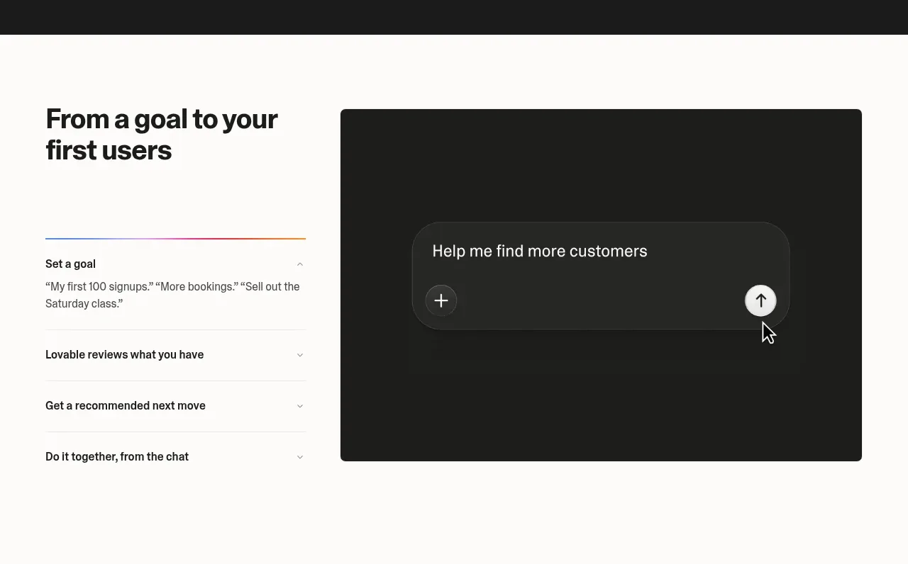
 Goal-to-first-users assistant
Lovable Growth Tools · Tabs & steps
Goal-to-first-users assistant
Lovable Growth Tools · Tabs & steps
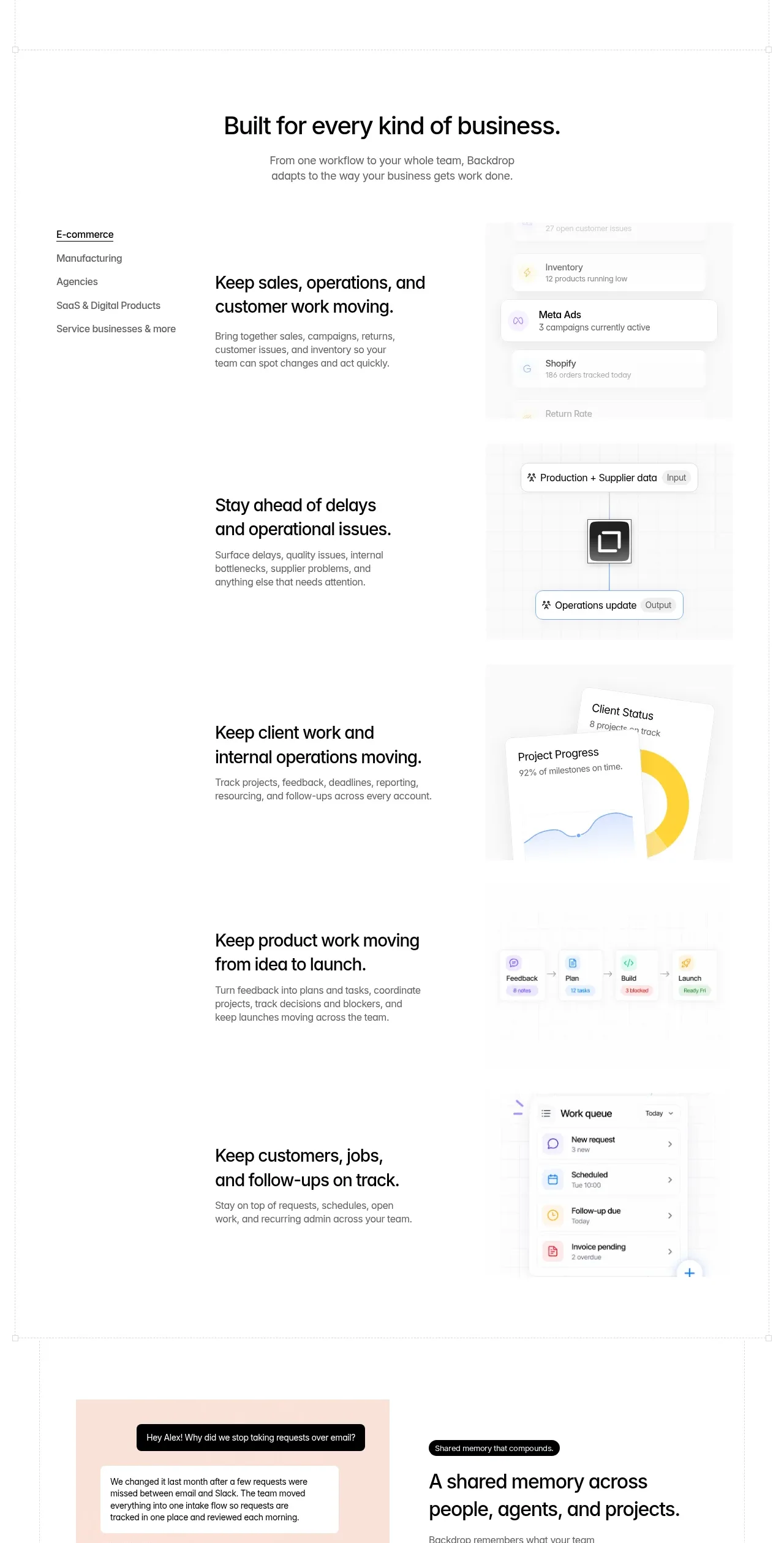
 Business use cases tabs
Backdrop · Tabs & steps
Business use cases tabs
Backdrop · Tabs & steps
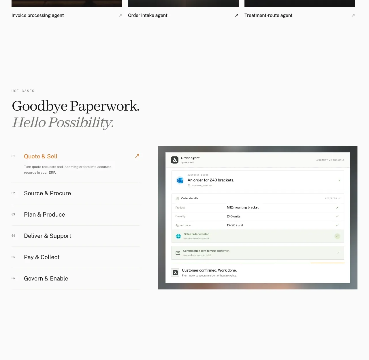
 Workflow stages with product preview
Lleverage · Tabs & steps
Workflow stages with product preview
Lleverage · Tabs & steps
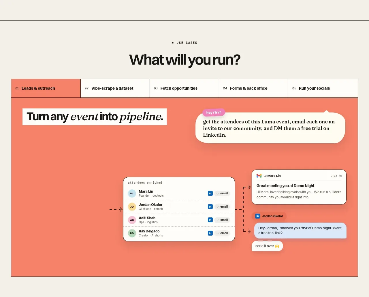
 Use-case selector and interactive showcase
Retriever AI · Tabs & steps
Use-case selector and interactive showcase
Retriever AI · Tabs & steps