 kage
kage
openwhispr.com
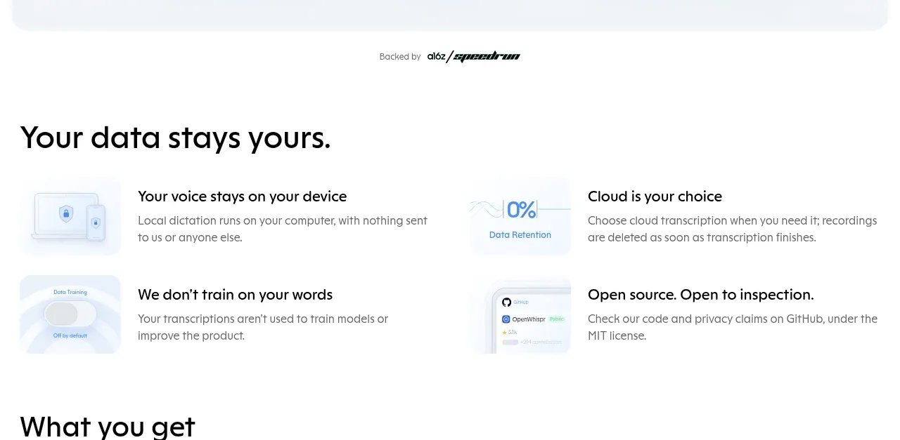
Design analysis
A clear section heading introduces four concise benefits arranged in a two-column grid, each combining a faint product-style thumbnail with a bold title and supporting explanation.
Prompt preview
## Reference images

Study these alongside the description below: hierarchy, rhythm, spacing, colour. Build for the product you are asked about, using this design language.

- Component: https://kage-design-assets.t3.tigrisfiles.io/components/openwhispr-for-ios/fdca984f-87fc-4407-a067-b1821a770c20-1791957716-2.webp
- Full page it was cut from: https://kage-design-assets.t3.tigrisfiles.io/screenshots/openwhispr-for-ios/fdca984f-87fc-4407-a067-b1821a770c20-1791957682462-full.webp
- Component on Kage: https://kage.design/component/openwhispr-for-ios-feature-grid

## Before you start
Ask what the user's product, audience, and brand are, then apply the principles below to that product rather than reproducing this reference.

Build a benefits section with a strong left-aligned heading and a two-column, two-row grid. Each item should pair a small pale interface thumbnail or icon panel with a bold benefit title and one or two lines of explanation. Favor concise claims about control, privacy, user choice, or trust. Use a 32–36px heading, 18px item titles, and 14–15px muted descriptions. Align all item content to a consistent grid, use 28–40px gaps, and leave generous whitespace around the section. Keep the palette white with very pale blue-gray thumbnail surfaces (#f4f8fc), black text (#111318), gray body text (#68707c), and minimal borders or shadows. Use 12–16px thumbnail radii and avoid making the cards feel like heavy promotional tiles.

Never: use logos, product names, copy, illustrations, or imagery from the reference.
More components
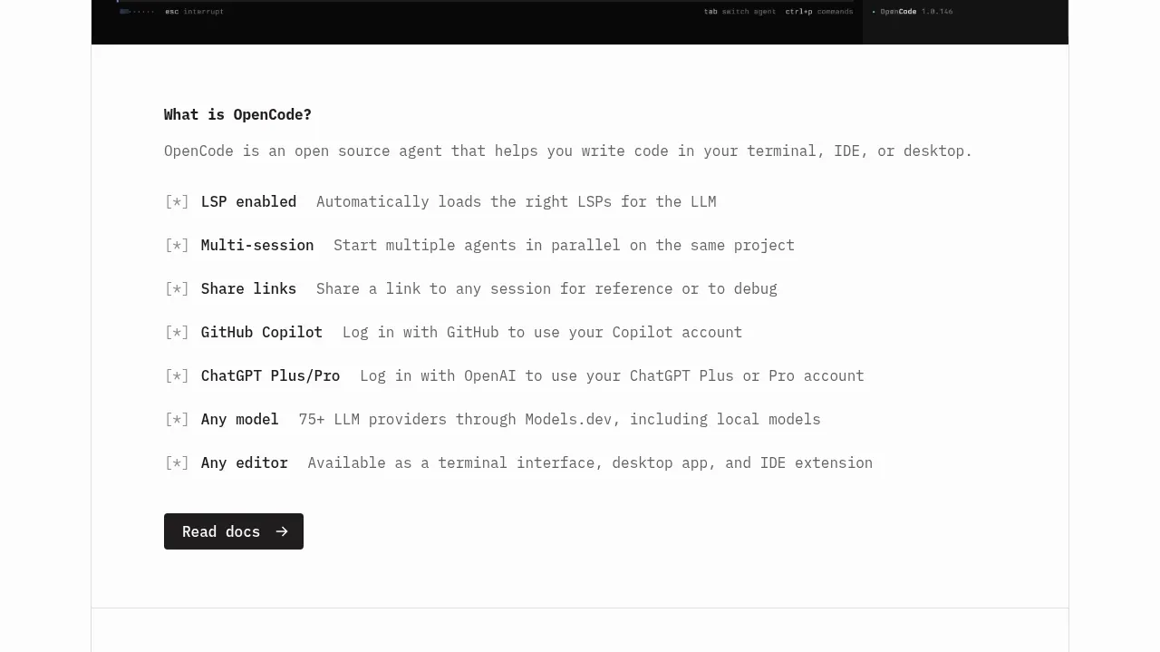
 Core capabilities overview
OpenCode 2.0 · Feature grid
Core capabilities overview
OpenCode 2.0 · Feature grid
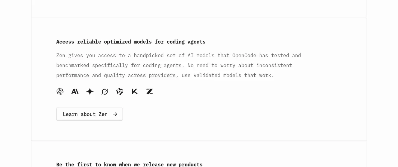 Model access feature block
OpenCode 2.0 · Feature grid
Model access feature block
OpenCode 2.0 · Feature grid
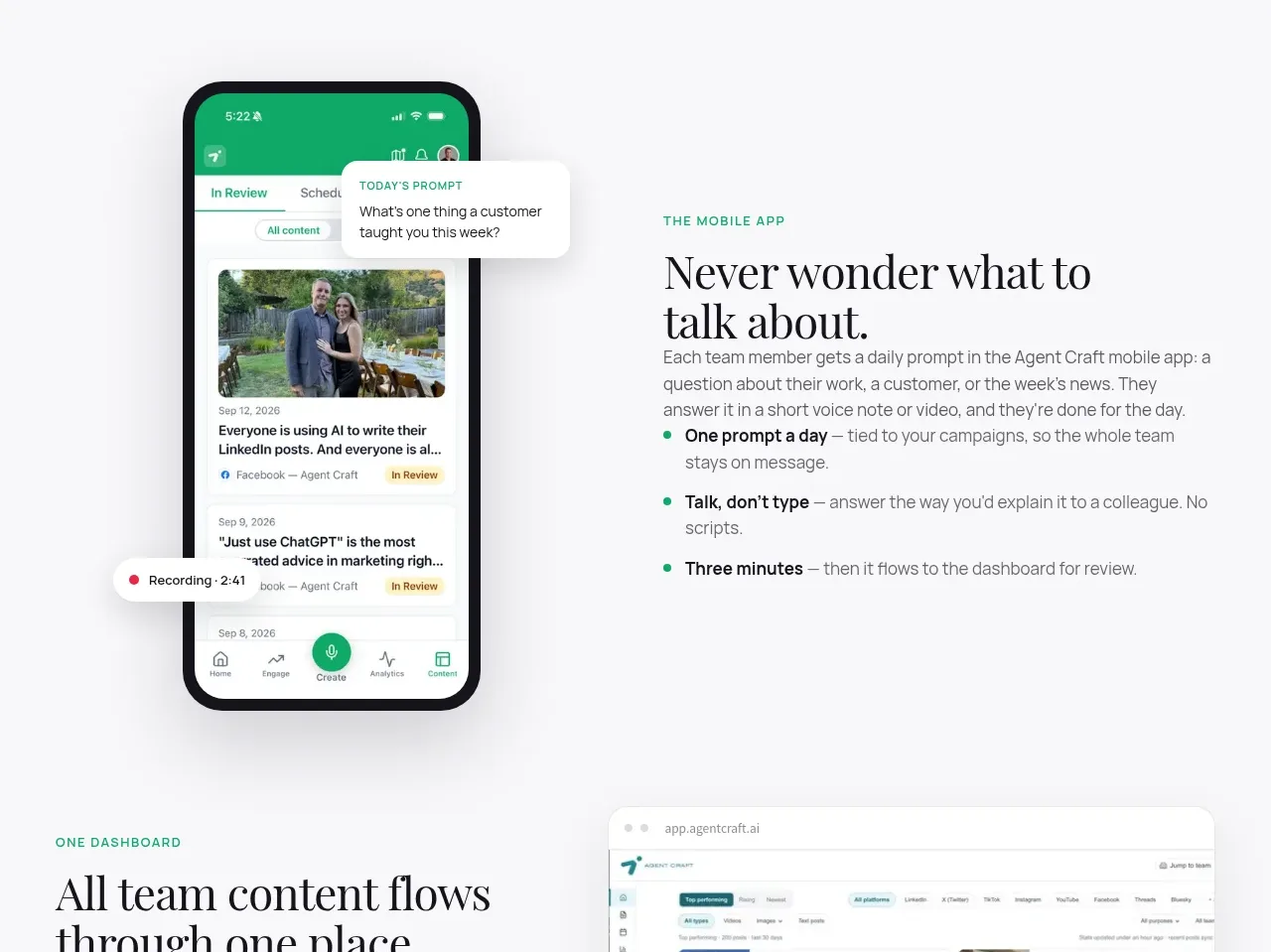
 Mobile capture workflow
Agent Craft · Feature grid
Mobile capture workflow
Agent Craft · Feature grid
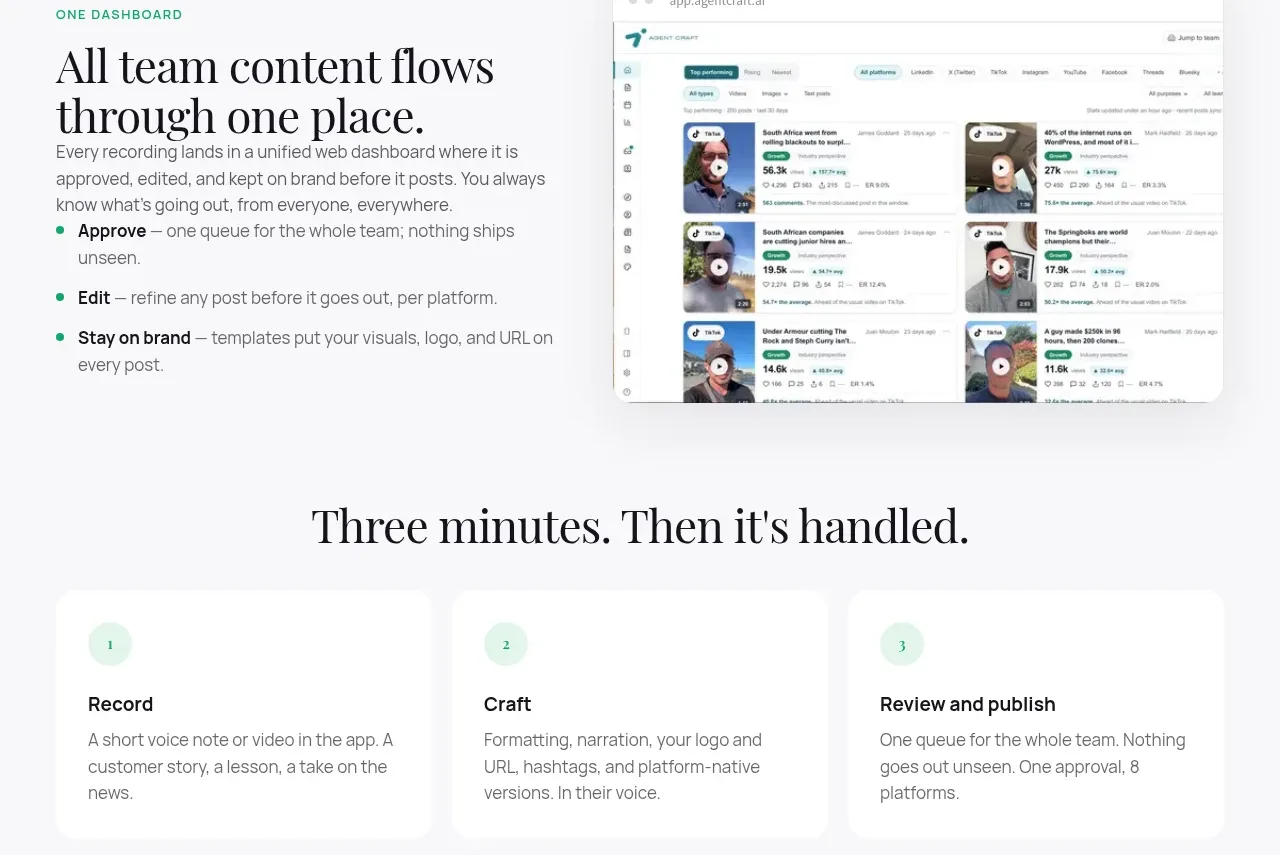 Unified dashboard workflow
Agent Craft · Feature grid
Unified dashboard workflow
Agent Craft · Feature grid
 Three-step operating model
Agent Craft · Feature grid
Three-step operating model
Agent Craft · Feature grid
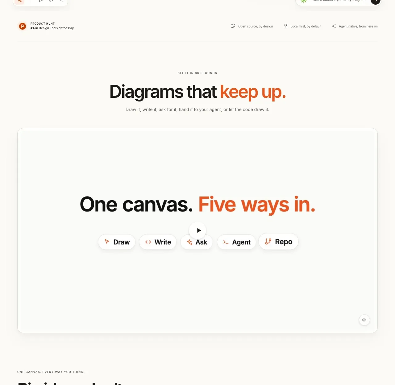
 Canvas modes showcase
OpenFlowKit 2 · Feature grid
Canvas modes showcase
OpenFlowKit 2 · Feature grid