 kage
kage
openwhispr.com
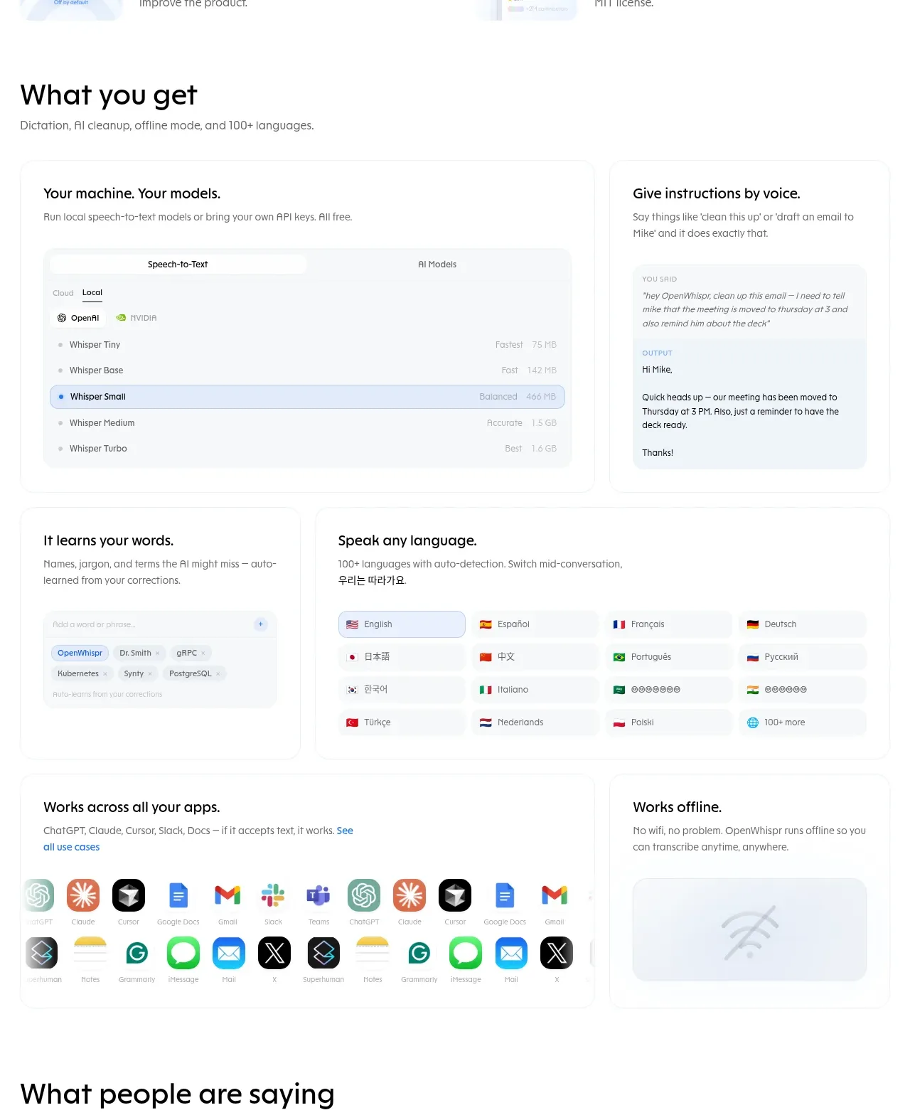
Design analysis
This dense capability area uses varied large and small cards to show local models, voice instructions, learning, languages, app integrations, and offline operation through interface mockups.
Prompt preview
## Reference images

Study these alongside the description below: hierarchy, rhythm, spacing, colour. Build for the product you are asked about, using this design language.

- Component: https://kage-design-assets.t3.tigrisfiles.io/components/openwhispr-for-ios/fdca984f-87fc-4407-a067-b1821a770c20-1791957716-3.webp
- Full page it was cut from: https://kage-design-assets.t3.tigrisfiles.io/screenshots/openwhispr-for-ios/fdca984f-87fc-4407-a067-b1821a770c20-1791957682462-full.webp
- Component on Kage: https://kage.design/component/openwhispr-for-ios-feature-grid-2

## Before you start
Ask what the user's product, audience, and brand are, then apply the principles below to that product rather than reproducing this reference.

Create a capabilities section with a heading, a short subtitle, and a responsive bento-style grid. Use two wide feature cards on the first row, followed by smaller cards for personalization/learning and multilingual support, then a wide integrations card beside a smaller offline card. Each card should have a clear 17–20px title, short muted description, and a restrained UI mockup or data panel occupying the lower portion. Use white cards on white or near-white background, 1px #edf0f3 borders, 14–18px radii, and subtle shadows. Keep card padding around 22–28px; use a 2-column desktop layout with varied spans, then stack naturally on mobile. Interface mockups should use pale gray-blue surfaces (#f5f8fb), small labels, blue selected states (#dceaff/#3978df), and compact icon or language chips. Keep hierarchy calm: one section heading around 32px, card titles around 18px, descriptions around 14px.

Never: use logos, product names, copy, illustrations, or imagery from the reference.
More components
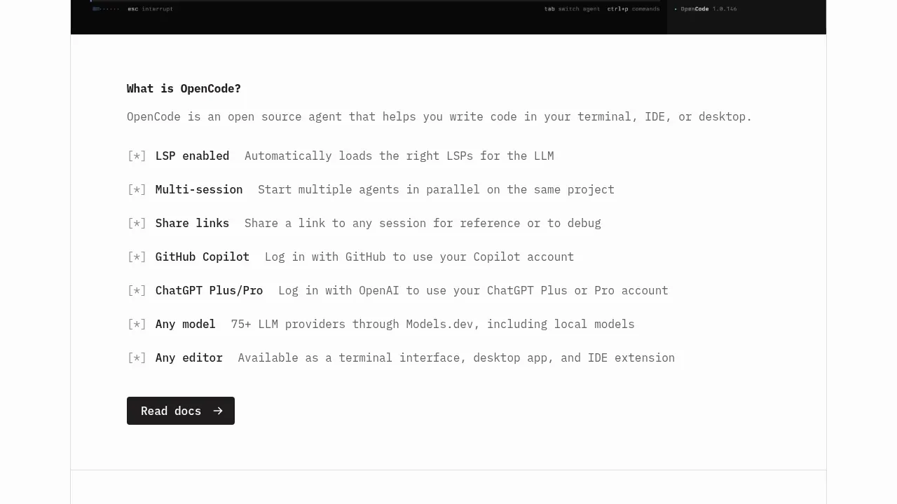
 Core capabilities overview
OpenCode 2.0 · Feature grid
Core capabilities overview
OpenCode 2.0 · Feature grid
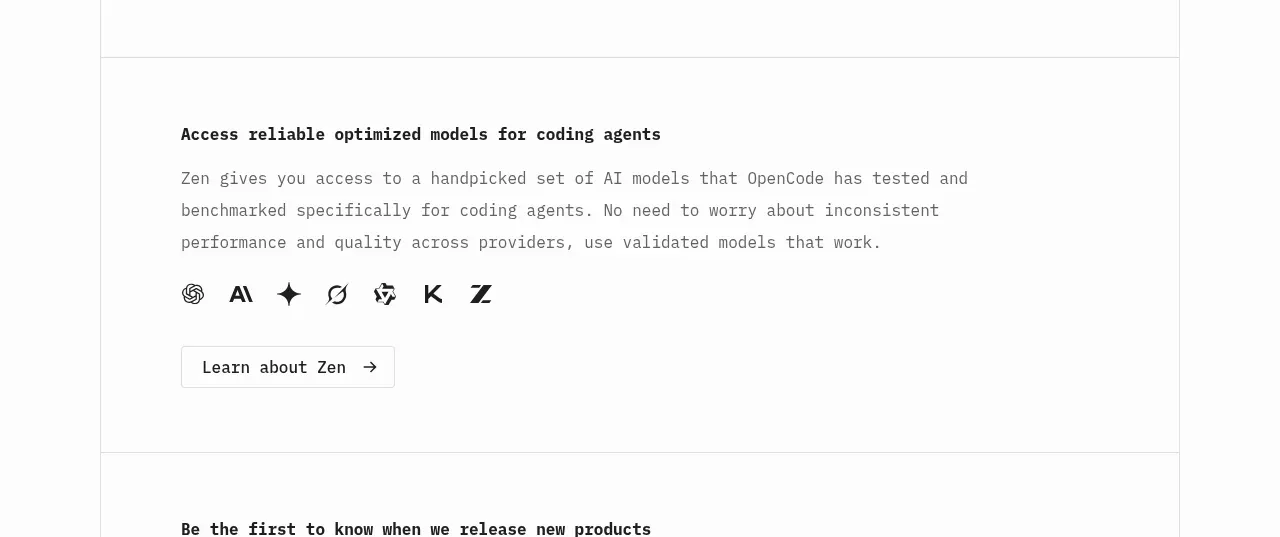 Model access feature block
OpenCode 2.0 · Feature grid
Model access feature block
OpenCode 2.0 · Feature grid

 Mobile capture workflow
Agent Craft · Feature grid
Mobile capture workflow
Agent Craft · Feature grid
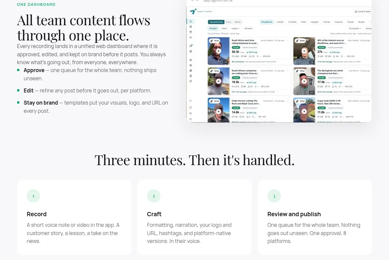 Unified dashboard workflow
Agent Craft · Feature grid
Unified dashboard workflow
Agent Craft · Feature grid
 Three-step operating model
Agent Craft · Feature grid
Three-step operating model
Agent Craft · Feature grid
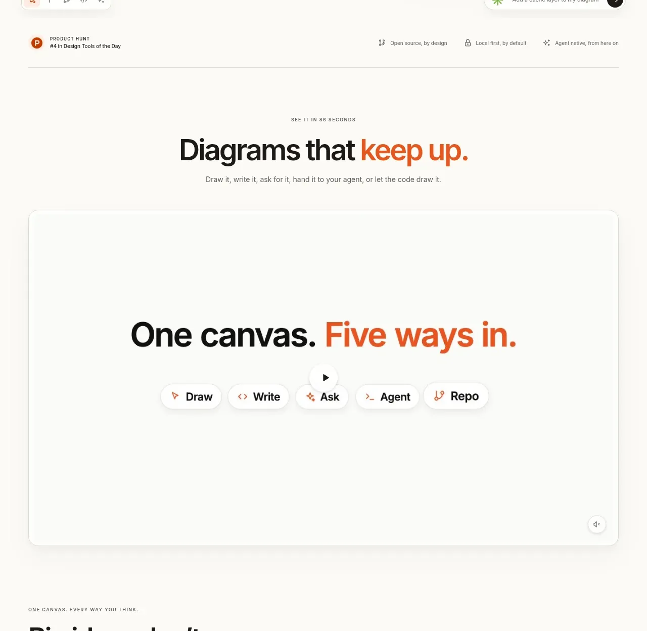
 Canvas modes showcase
OpenFlowKit 2 · Feature grid
Canvas modes showcase
OpenFlowKit 2 · Feature grid