kage
kage
ovoplayer.com
Design analysis
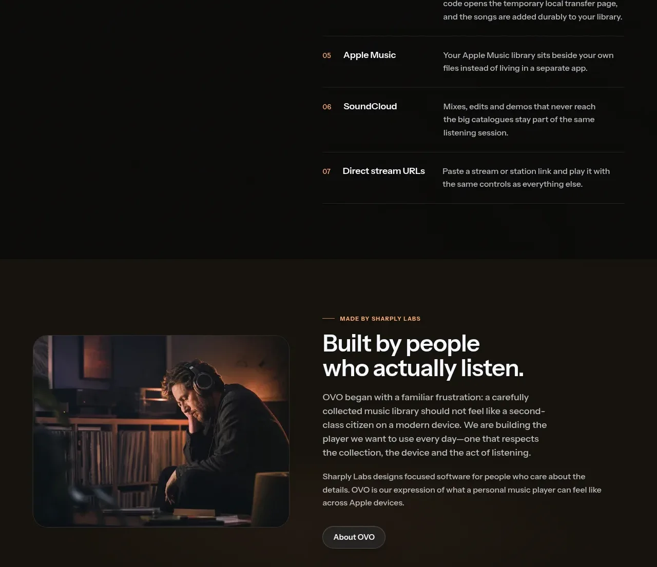
A warm tinted story section pairs a documentary image with a personal origin narrative and a single low-emphasis About action.
Prompt preview
## Reference images

Study these alongside the description below: hierarchy, rhythm, spacing, colour. Build for the product you are asked about, using this design language.

- Component: https://kage-design-assets.t3.tigrisfiles.io/components/ovo/3c9ed73d-a170-49d0-8a12-5cf9a4f3d08f-1789452269-7.webp
- Full page it was cut from: https://kage-design-assets.t3.tigrisfiles.io/screenshots/ovo/3c9ed73d-a170-49d0-8a12-5cf9a4f3d08f-1789452172899-full.webp
- Component on Kage: https://kage.design/component/ovo-card

## Before you start
Ask who is behind the user's product, what authentic story should be told, and what action the reader should take next. Apply the pattern to that story.

Create a wide warm-dark story band (#1c1712) with a rounded documentary image on the left and an editorial text block on the right. Use a small uppercase eyebrow, a large two-line heading, two short paragraphs, and one subtle pill or text button. Align image and copy vertically, keep the image around 40% of the row width, and use soft 12px corners. Typography should be confident but human: 32–40px heading, 14–16px body, generous line height, and muted cream/gray tones. Add a slight border or tonal separation rather than a heavy card shadow.

Never use the reference's logos, product names, copy, illustrations, or imagery.