 kage
kage
ovoplayer.com

Design analysis
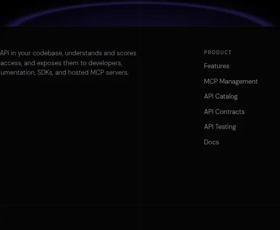
A shallow, high-contrast closing banner repeats the core promise over a cinematic background and places one obvious download action near the left.
Prompt preview
## Reference images

Study these alongside the description below: hierarchy, rhythm, spacing, colour. Build for the product you are asked about, using this design language.

- Component: https://kage-design-assets.t3.tigrisfiles.io/components/ovo/3c9ed73d-a170-49d0-8a12-5cf9a4f3d08f-1789452271-10.webp
- Full page it was cut from: https://kage-design-assets.t3.tigrisfiles.io/screenshots/ovo/3c9ed73d-a170-49d0-8a12-5cf9a4f3d08f-1789452172899-full.webp
- Component on Kage: https://kage.design/component/ovo-cta

## Before you start
Ask what final conversion action matters most and what concise promise should close the user's journey. Adapt the CTA to the user's product and brand.

Create a shallow full-width closing CTA with a cinematic, darkened background image and a left-aligned content block. Use a large two-line heading, one short supporting sentence, and a warm peach pill button with dark text. Apply a strong black-to-transparent overlay so the text remains readable, keep content inside the same max-width grid as the rest of the site, and use around 64–96px vertical padding. The button should have a subtle hover lift or brightness change; the banner should feel like a confident conclusion rather than a dense panel.

Never use the reference's logos, product names, copy, illustrations, or imagery.
More components
 Final conversion CTA
Elva · Call to action
Final conversion CTA
Elva · Call to action

 Final download call to action
Aside · Call to action
Final download call to action
Aside · Call to action

 Download call to action
Oats · Call to action
Download call to action
Oats · Call to action

 Website migration CTA
Neopress · Call to action
Website migration CTA
Neopress · Call to action
 Build or migrate services CTA
Neopress · Call to action
Build or migrate services CTA
Neopress · Call to action

 Final trial call to action
Epilude Notetaker · Call to action
Final trial call to action
Epilude Notetaker · Call to action