 kage
kage
ovoplayer.com

Design analysis
This section frames one library across multiple screens, combining a concise promise, a large tablet-style visual, and three short device-specific explanations.
Prompt preview
## Reference images

Study these alongside the description below: hierarchy, rhythm, spacing, colour. Build for the product you are asked about, using this design language.

- Component: https://kage-design-assets.t3.tigrisfiles.io/components/ovo/3c9ed73d-a170-49d0-8a12-5cf9a4f3d08f-1789452268-4.webp
- Full page it was cut from: https://kage-design-assets.t3.tigrisfiles.io/screenshots/ovo/3c9ed73d-a170-49d0-8a12-5cf9a4f3d08f-1789452172899-full.webp
- Component on Kage: https://kage.design/component/ovo-feature-grid-3

## Before you start
Ask which devices, platforms, or surfaces the user's product spans and what continuity promise matters. Build the section around those answers.

Design a two-column dark feature section. Put a small uppercase label, large two-line heading, and supporting paragraph on the left; place a large rounded tablet, desktop, or responsive product visual on the right. Under the main panel add three equal-width explanation cells separated by subtle vertical rules, each with a short bold label and one sentence. Use near-black brown (#14120f), a slightly lighter image frame (#211c1a), cream headings, gray copy, 1px dividers (#332d27), and 12px image corners. Keep alignment anchored to a shared max-width grid and make the three cells collapse cleanly on mobile.

Never use the reference's logos, product names, copy, illustrations, or imagery.
More components

 Playback and personalization showcase
OVO · Feature grid
Playback and personalization showcase
OVO · Feature grid
 Unified library and source collection
OVO · Feature grid
Unified library and source collection
OVO · Feature grid
 Local-first product feature
OVO · Feature grid
Local-first product feature
OVO · Feature grid

 Preset recipes
Image to ASCII · Feature grid
Preset recipes
Image to ASCII · Feature grid
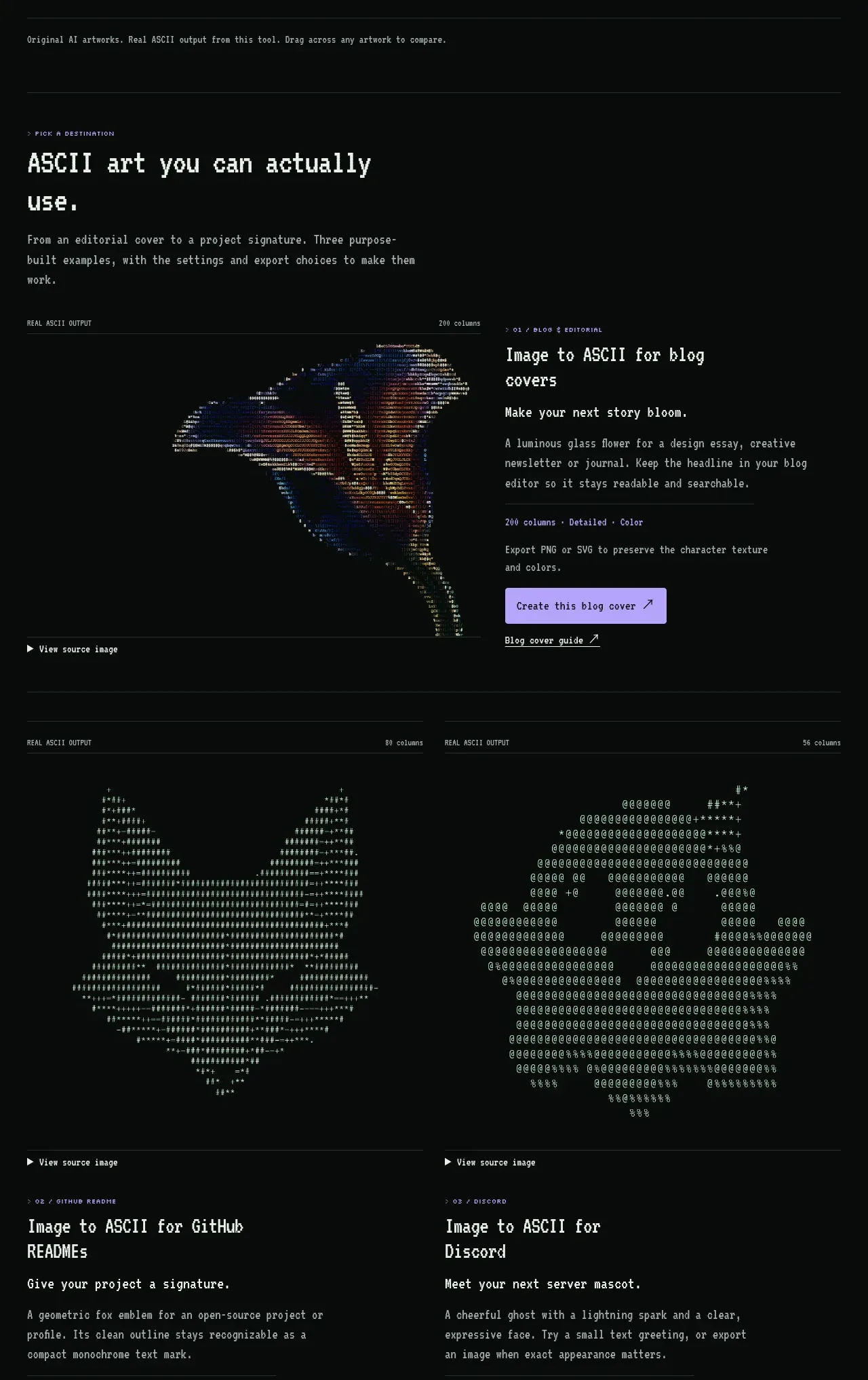 Destination examples
Image to ASCII · Feature grid
Destination examples
Image to ASCII · Feature grid
 Product features
Image to ASCII · Feature grid
Product features
Image to ASCII · Feature grid