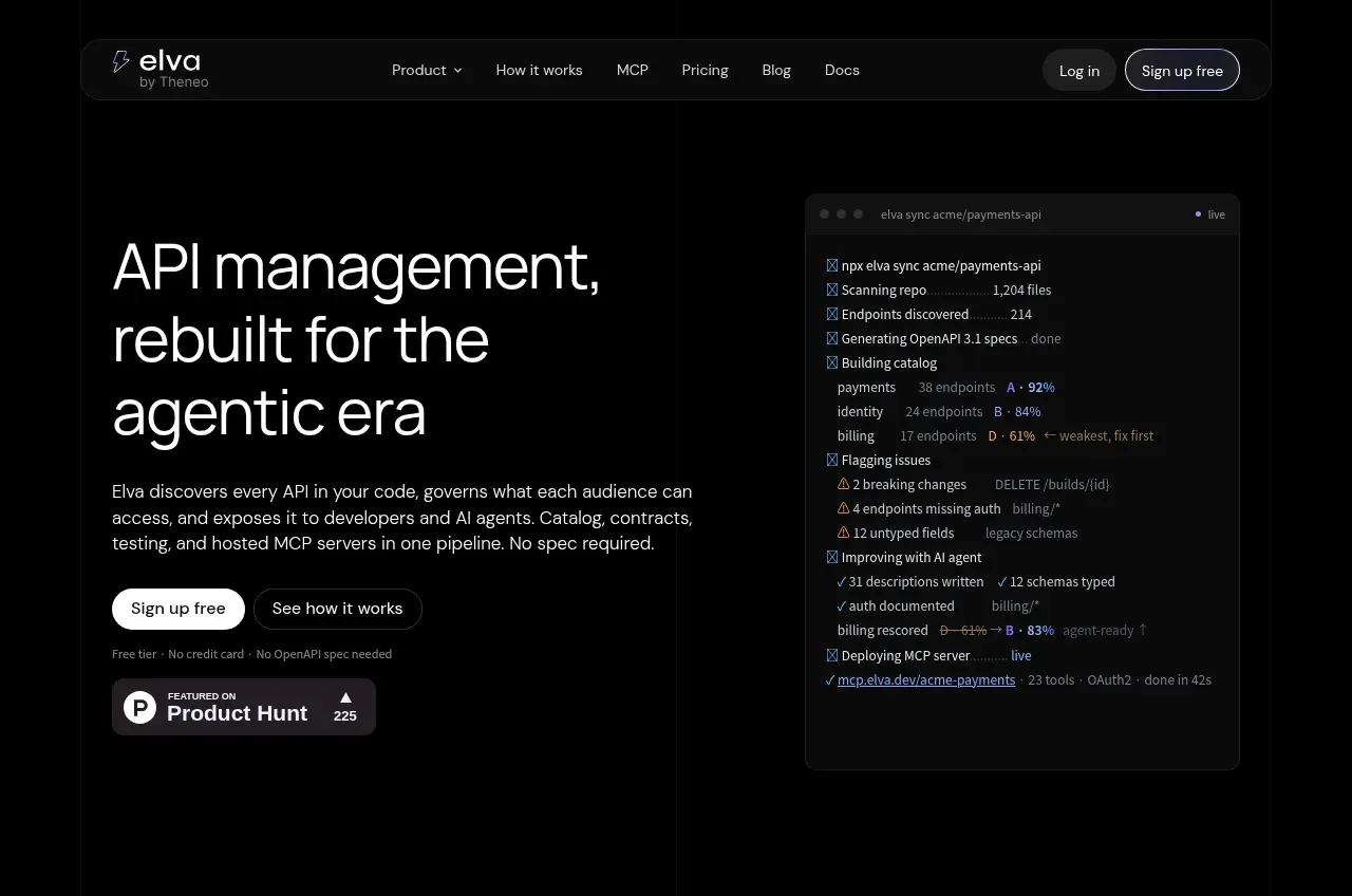
kage
kage
ovoplayer.com
Design analysis
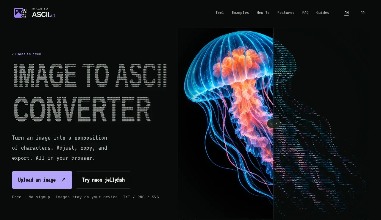
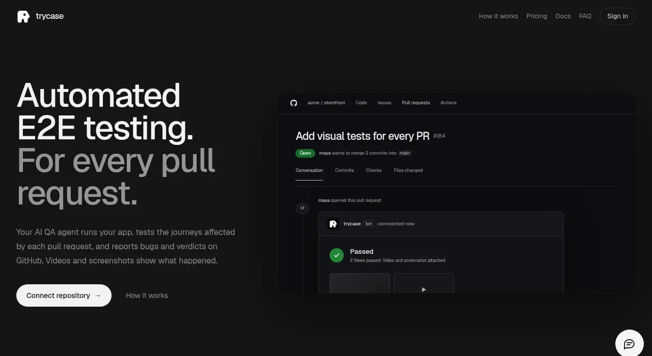
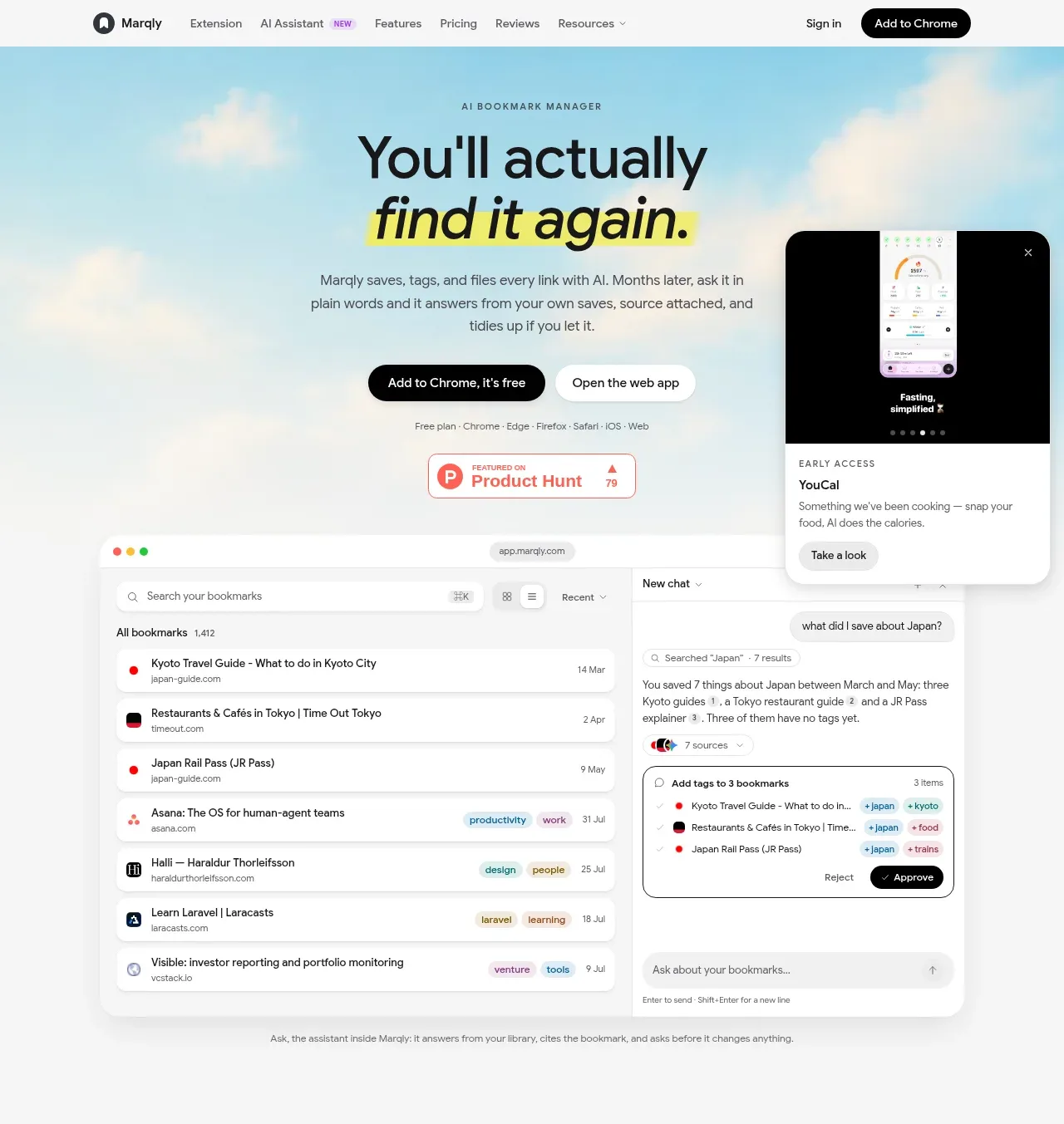
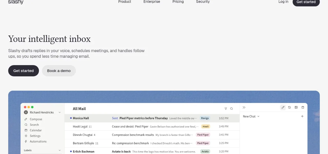
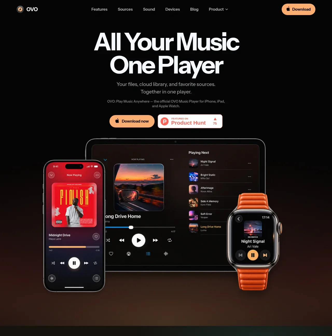
The hero creates a strong promise with oversized two-line typography, a short supporting statement, dual calls to action, and a large multi-device product visual grounded near the bottom.
Prompt preview
## Reference images

Study these alongside the description below: hierarchy, rhythm, spacing, colour. Build for the product you are asked about, using this design language.

- Component: https://kage-design-assets.t3.tigrisfiles.io/components/ovo/3c9ed73d-a170-49d0-8a12-5cf9a4f3d08f-1789452267-1.webp
- Full page it was cut from: https://kage-design-assets.t3.tigrisfiles.io/screenshots/ovo/3c9ed73d-a170-49d0-8a12-5cf9a4f3d08f-1789452172899-full.webp
- Component on Kage: https://kage.design/component/ovo-hero

## Before you start
Ask what the user's product does, what its strongest promise is, and what visual assets or brand colors are available. Apply the following structure to that product.

Create a tall, centered hero directly below the navigation on a near-black background (#070706). Use a large bold sans-serif headline with a tight two-line rhythm, a muted supporting paragraph, and two horizontally aligned actions: a warm filled download button and a restrained social-proof or store badge. Place the main product visual below the copy, with layered device screens or a single relevant product render extending toward the lower edge. Keep the content column centered, use generous vertical spacing, and fade the visual into a warm dark gradient (#241914) so the transition feels intentional. Make the primary action pill-shaped and the secondary badge bordered with a small radius.

Never use the reference's logos, product names, copy, illustrations, or imagery.