 kage
kage
trypalomino.com
Design analysis
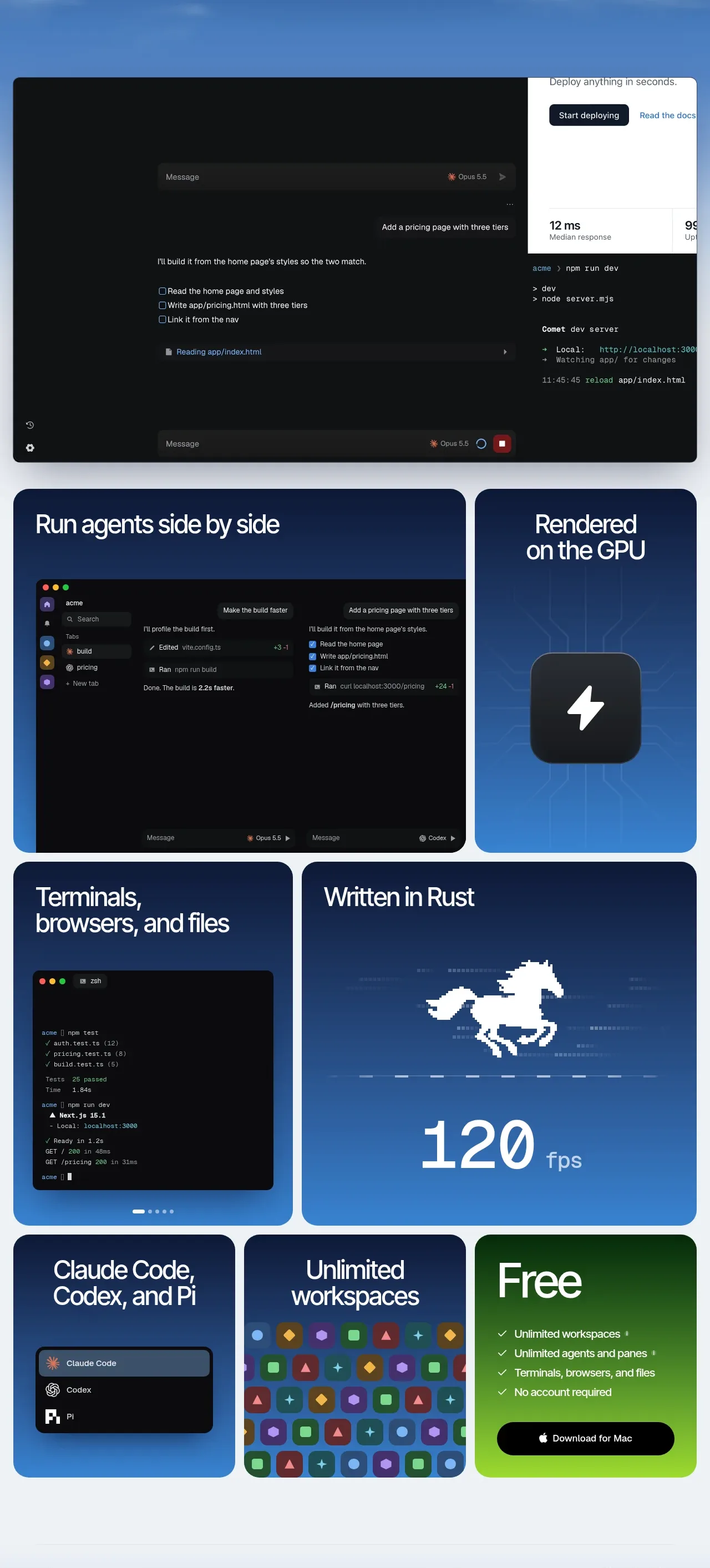
A dense rounded-card mosaic presents capabilities in varied tile sizes, combining dark interface previews, bold headings, technical motifs, and a contrasting green download tile.
Prompt preview
## Reference images

Study these alongside the description below: hierarchy, rhythm, spacing, colour. Build for the product you are asked about, using this design language.

- Component: https://kage-design-assets.t3.tigrisfiles.io/components/palomino/b08bb039-2732-4831-94dd-d664e600a54a-1792216873-2.webp
- Full page it was cut from: https://kage-design-assets.t3.tigrisfiles.io/screenshots/palomino/b08bb039-2732-4831-94dd-d664e600a54a-1792216834141-full.webp
- Component on Kage: https://kage.design/component/palomino-feature-grid

## Before you start
Ask what the user's product is, which capabilities matter most, and what brand system should govern the cards. Then create an original feature mosaic based on these principles.

### Design rules
- Build a responsive CSS grid of rounded feature cards with varied spans: use a few large showcase tiles, medium supporting tiles, and one clear conversion tile.
- Keep gutters consistent at roughly 12–16px and use card radii around 18–24px; cards should align cleanly despite different heights.
- Each card needs a short, oversized heading near the top and one visual proof point below it: UI mockup, metric, code-like panel, abstract pattern, or product screenshot created for the user's product.
- Use a unified dark-to-blue system, approximately `#0e1c3b`, `#18376c`, `#367fc4`, with near-white text `#f5f8fb`.
- Reserve a contrasting accent card for the main conversion, such as a fresh green gradient near `#1d5f21` to `#8bd632`; keep its text and button high contrast.
- Use heading sizes around 30–46px for large tiles and 24–34px for smaller tiles, with tight line-height and generous 28–32px internal padding.
- Interface mockups should use subtle borders, dark surfaces near `#0c0f13`, muted labels, and small accent controls; keep decorative technical imagery abstract and product-specific.
- Include small interaction affordances where visible: hover elevation, image zoom or carousel dots, and buttons with clear pressed/focus states.
- On narrow screens, collapse to one column while preserving the priority order: flagship feature, supporting proof, then conversion.

### Never
- Never reuse logos, product names, copy, illustrations, or imagery from the reference.
- Never fill every tile with equal visual weight; preserve a clear hierarchy.
- Never use fake interface details that imply functionality without a meaningful explanation.
More components

 Data-to-action engine
Salience · Feature grid
Data-to-action engine
Salience · Feature grid
 Actionable alert workflow
Salience · Feature grid
Actionable alert workflow
Salience · Feature grid
 Trust proof and core outcomes
Salience · Feature grid
Trust proof and core outcomes
Salience · Feature grid
 Three-step implementation flow
Salience · Feature grid
Three-step implementation flow
Salience · Feature grid
 What analytics misses
Salience · Feature grid
What analytics misses
Salience · Feature grid

 Workflow features and capabilities
CrewTower Mod for Claude Code · Feature grid
Workflow features and capabilities
CrewTower Mod for Claude Code · Feature grid