 kage
kage
conifer.build
Design analysis
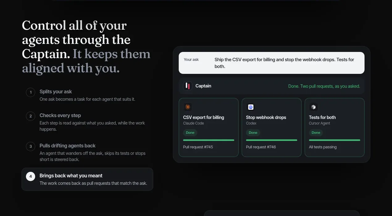
A strong left-hand narrative is paired with a detailed product card, and the numbered steps make the coordination mechanism easy to scan.
Prompt preview
## Reference images

Study these alongside the description below: hierarchy, rhythm, spacing, colour. Build for the product you are asked about, using this design language.

- Component: https://kage-design-assets.t3.tigrisfiles.io/components/parallax/9ca98bac-0bc3-4cc4-b310-031492d1188c-1792216893-2.webp
- Full page it was cut from: https://kage-design-assets.t3.tigrisfiles.io/screenshots/parallax/9ca98bac-0bc3-4cc4-b310-031492d1188c-1792216865980-full.webp
- Component on Kage: https://kage.design/component/parallax-feature-grid

## Before you start
Ask what the user's product coordinates, automates, or simplifies, and what its users need to understand first. Apply the same information hierarchy to that product.

Build a two-column feature section on a dark background. On the left, use a large warm serif heading, a short explanation, and four vertically stacked numbered steps. Each step should have a small outlined number, a concise title, and muted supporting text; visually emphasize the final/current step with a rounded dark card and a bright number badge. On the right, show a polished product-status panel with a prompt field at the top and three or more compact task cards below, each with a title, owner/type metadata, progress indicator, and completion state. Use generous column spacing, a max-width container, subtle 1px borders, 14–18px panel radii, and a pink/red highlight only for active or completed states. Palette: `#0b0b0b`, `#15171b`, `#22262b`, `#eeeae5`, `#929095`, accent `#e63d63`, success `#48c994`. Preserve clear mobile stacking and sufficient whitespace between narrative and UI.

Never:
- use logos, product names, or copy from the reference
- reproduce the exact task cards or wording
- use illustrations or imagery from the reference
More components

 Data-to-action engine
Salience · Feature grid
Data-to-action engine
Salience · Feature grid
 Actionable alert workflow
Salience · Feature grid
Actionable alert workflow
Salience · Feature grid
 Trust proof and core outcomes
Salience · Feature grid
Trust proof and core outcomes
Salience · Feature grid
 Three-step implementation flow
Salience · Feature grid
Three-step implementation flow
Salience · Feature grid
 What analytics misses
Salience · Feature grid
What analytics misses
Salience · Feature grid

 Workflow features and capabilities
CrewTower Mod for Claude Code · Feature grid
Workflow features and capabilities
CrewTower Mod for Claude Code · Feature grid