 kage
kage
payflip.xyz
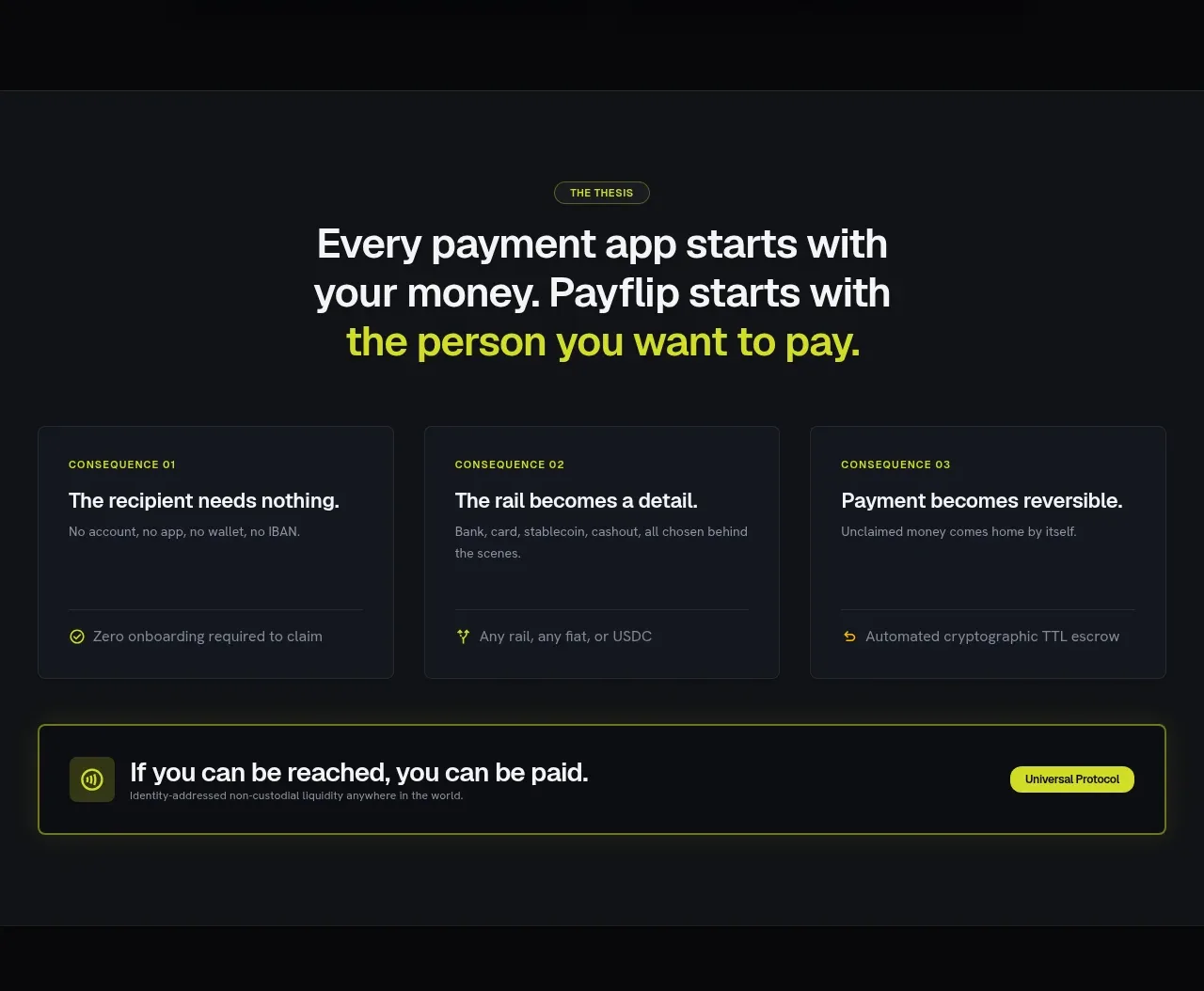
Design analysis
A thesis statement leads into three evenly weighted consequence cards and finishes with a bordered protocol callout, making the positioning easy to scan.
Prompt preview
## Reference images

Study these alongside the description below: hierarchy, rhythm, spacing, colour. Build for the product you are asked about, using this design language.

- Component: https://kage-design-assets.t3.tigrisfiles.io/components/payflip/0e07de96-2e0c-4347-b2be-d38a87386064-1789538771-2.webp
- Full page it was cut from: https://kage-design-assets.t3.tigrisfiles.io/screenshots/payflip/0e07de96-2e0c-4347-b2be-d38a87386064-1789538648080-full.webp
- Component on Kage: https://kage.design/component/payflip-feature-grid

## Before you start
Ask what the user's product thesis and three strongest customer outcomes are, then adapt this structure to that product.

Build a dark positioning section with a centered eyebrow and large multi-line thesis heading. Highlight the most important phrase in lime. Below it, place three equal-width cards in a responsive grid. Each card should contain a tiny uppercase index label, a concise bold title, supporting copy, and a bottom divider or metadata row with a small icon. Finish with a full-width bordered callout: icon at left, short bold statement and supporting microcopy in the middle, and a compact pill action or category label at right. Use #101216 and #0b0c0f backgrounds, #171b23 cards, #f2f3f3 text, #a0a4ae secondary text, lime #d8f21d, and a restrained 8px radius.

Keep card heights aligned, use consistent 24px internal padding, and preserve generous whitespace around the headline. Stack the grid and callout on narrow screens.

### Never
- Never copy logos, product names, copy, illustrations, or imagery from the reference.
- Never use generic filler benefits; make every card outcome-specific.
- Never let the callout compete with the primary heading.
More components

 Authentication product capabilities
tiun. · Feature grid
Authentication product capabilities
tiun. · Feature grid
 Customer data and user management
tiun. · Feature grid
Customer data and user management
tiun. · Feature grid
 Problem and unified solution narrative
tiun. · Feature grid
Problem and unified solution narrative
tiun. · Feature grid
 Integration and agent workflow
tiun. · Feature grid
Integration and agent workflow
tiun. · Feature grid
 Billing and checkout capabilities
tiun. · Feature grid
Billing and checkout capabilities
tiun. · Feature grid
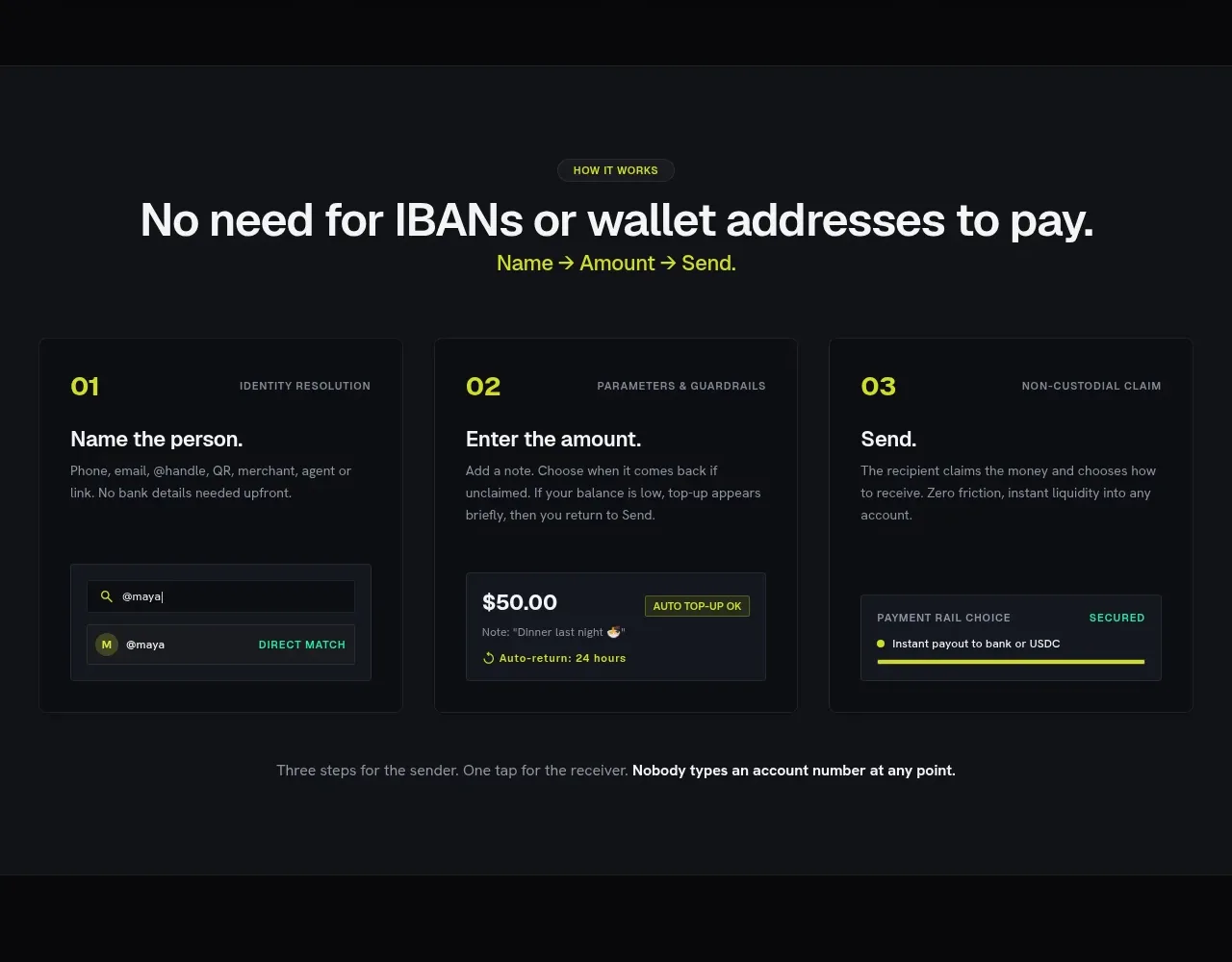
 Three-step payment flow
Payflip · Feature grid
Three-step payment flow
Payflip · Feature grid