 kage
kage
payflip.xyz

Design analysis
The section explains a single receiving-money action and presents four channel-specific interface cards in one horizontal row.
Prompt preview
## Reference images

Study these alongside the description below: hierarchy, rhythm, spacing, colour. Build for the product you are asked about, using this design language.

- Component: https://kage-design-assets.t3.tigrisfiles.io/components/payflip/0e07de96-2e0c-4347-b2be-d38a87386064-1789538772-3.webp
- Full page it was cut from: https://kage-design-assets.t3.tigrisfiles.io/screenshots/payflip/0e07de96-2e0c-4347-b2be-d38a87386064-1789538648080-full.webp
- Component on Kage: https://kage.design/component/payflip-feature-grid-2

## Before you start
Ask what action users are receiving or initiating and which channels your product supports, then use those answers to populate this component.

Create a dark feature section with a small lime eyebrow, a centered headline, and one short lime instruction line. Below, show four equal-width product-preview cards representing distinct channels. Each card needs a tiny channel label and metadata at the top, a realistic but abstracted message or notification surface in the middle, and a strong lime or dark action button at the bottom. Use subtle panel layering, 1px borders, 8px corners, compact type, and consistent card heights. Palette: #090a0c background, #151922 cards, #0d1015 inner surfaces, #f4f4f2 text, #9297a0 muted copy, #dafa1b accent.

Make the row horizontally balanced and stack to two columns or one column responsively. Use hover elevation sparingly.

### Never
- Never copy logos, product names, copy, illustrations, or imagery from the reference.
- Never use actual third-party platform branding without permission.
- Never make channel differences depend only on colour.
More components

 Authentication product capabilities
tiun. · Feature grid
Authentication product capabilities
tiun. · Feature grid
 Customer data and user management
tiun. · Feature grid
Customer data and user management
tiun. · Feature grid
 Problem and unified solution narrative
tiun. · Feature grid
Problem and unified solution narrative
tiun. · Feature grid
 Integration and agent workflow
tiun. · Feature grid
Integration and agent workflow
tiun. · Feature grid
 Billing and checkout capabilities
tiun. · Feature grid
Billing and checkout capabilities
tiun. · Feature grid
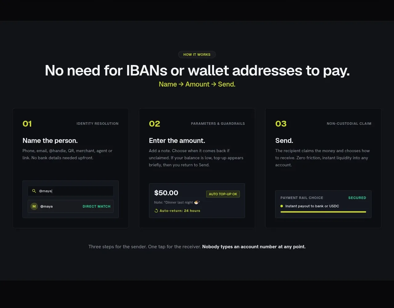
 Three-step payment flow
Payflip · Feature grid
Three-step payment flow
Payflip · Feature grid