 kage
kage
payflip.xyz
Design analysis
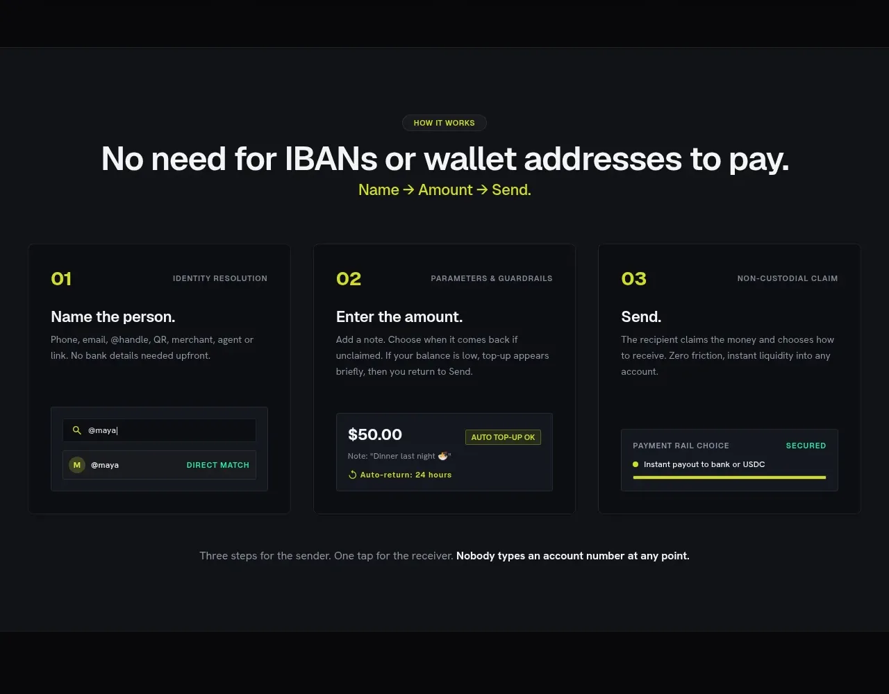
A process section turns the product promise into three numbered steps, each supported by a compact UI illustration and a closing reassurance.
Prompt preview
## Reference images

Study these alongside the description below: hierarchy, rhythm, spacing, colour. Build for the product you are asked about, using this design language.

- Component: https://kage-design-assets.t3.tigrisfiles.io/components/payflip/0e07de96-2e0c-4347-b2be-d38a87386064-1789538772-4.webp
- Full page it was cut from: https://kage-design-assets.t3.tigrisfiles.io/screenshots/payflip/0e07de96-2e0c-4347-b2be-d38a87386064-1789538648080-full.webp
- Component on Kage: https://kage.design/component/payflip-feature-grid-3

## Before you start
Ask what the user's core workflow is and identify its three simplest user actions before building this section.

Build a centered dark workflow section. Start with a small eyebrow, a strong headline, and an accent-coloured one-line sequence beneath it. Place three equal-width step cards in a row. Each card has a large lime number, a small uppercase category, a bold step title, concise explanatory copy, and a miniature framed UI preview at the bottom. Add a centered closing sentence below the cards, with the key reassurance in bold. Use #111318 background, #151820 cards, #0b0d10 inner previews, #f4f4f2 primary text, #90959f secondary text, and #d9f21c accent. Keep the visual hierarchy clear and card bottoms aligned.

On mobile, stack cards while retaining prominent step numbering. Use light borders and 8px radii rather than shadows.

### Never
- Never copy logos, product names, copy, illustrations, or imagery from the reference.
- Never add unnecessary steps to fill space.
- Never make the mini-previews more prominent than the instructions.
More components

 Authentication product capabilities
tiun. · Feature grid
Authentication product capabilities
tiun. · Feature grid
 Customer data and user management
tiun. · Feature grid
Customer data and user management
tiun. · Feature grid
 Problem and unified solution narrative
tiun. · Feature grid
Problem and unified solution narrative
tiun. · Feature grid
 Integration and agent workflow
tiun. · Feature grid
Integration and agent workflow
tiun. · Feature grid
 Billing and checkout capabilities
tiun. · Feature grid
Billing and checkout capabilities
tiun. · Feature grid

 Receiving money channels
Payflip · Feature grid
Receiving money channels
Payflip · Feature grid