 kage
kage
payflip.xyz
Design analysis
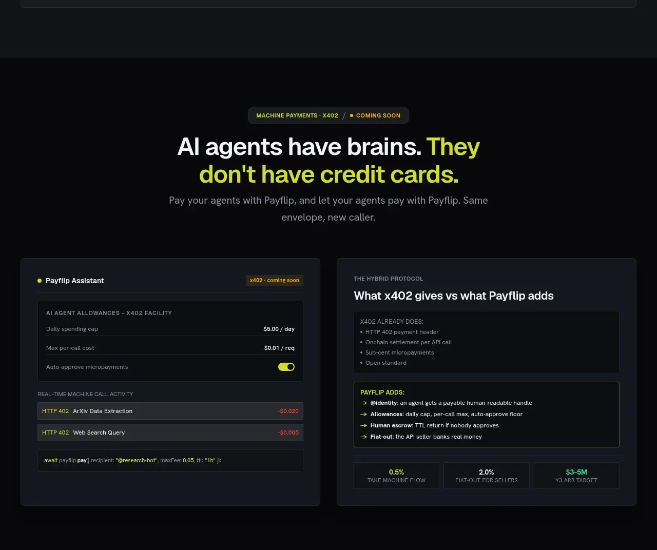
This forward-looking section introduces an emerging audience, then compares an agent payment console with the product's differentiated protocol benefits.
Prompt preview
## Reference images

Study these alongside the description below: hierarchy, rhythm, spacing, colour. Build for the product you are asked about, using this design language.

- Component: https://kage-design-assets.t3.tigrisfiles.io/components/payflip/0e07de96-2e0c-4347-b2be-d38a87386064-1789538773-7.webp
- Full page it was cut from: https://kage-design-assets.t3.tigrisfiles.io/screenshots/payflip/0e07de96-2e0c-4347-b2be-d38a87386064-1789538648080-full.webp
- Component on Kage: https://kage.design/component/payflip-feature-grid-6

## Before you start
Ask whether the user's product serves automation, agents, or advanced integrations, and what the real differentiators are before creating this section.

Create a dark innovation section with a small status pill, a centered two-line headline, and muted supporting copy. Below, place two large equal-width panels. The left panel should resemble an agent control console with allowance rows, limits, an approval toggle, activity entries, and a small code-like command line. The right panel should be a comparison card: a subdued “existing approach” list followed by a lime-bordered “our additions” list, ending with three compact metric cells. Use #08090b background, #151922 panels, #0b0d11 inner surfaces, #f3f4f4 text, #8e949e secondary text, #d9f21d accent, and subtle borders/radii.

Keep the comparison honest and scannable. Use monospace only for code or technical values, and make controls look interactive even if the demo is static.

### Never
- Never copy logos, product names, copy, illustrations, or imagery from the reference.
- Never present speculative capabilities as shipped facts.
- Never use a fake terminal as decoration without explaining its purpose.
More components

 Authentication product capabilities
tiun. · Feature grid
Authentication product capabilities
tiun. · Feature grid
 Customer data and user management
tiun. · Feature grid
Customer data and user management
tiun. · Feature grid
 Problem and unified solution narrative
tiun. · Feature grid
Problem and unified solution narrative
tiun. · Feature grid
 Integration and agent workflow
tiun. · Feature grid
Integration and agent workflow
tiun. · Feature grid
 Billing and checkout capabilities
tiun. · Feature grid
Billing and checkout capabilities
tiun. · Feature grid

 Receiving money channels
Payflip · Feature grid
Receiving money channels
Payflip · Feature grid