kage
kage
payflip.xyz
Design analysis
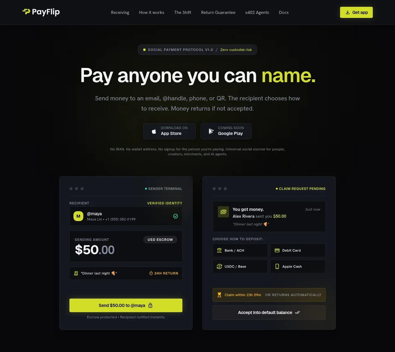
The hero pairs an identity-centered headline with concise explanatory copy, app-store actions, and a large dual-interface payment visual.
Prompt preview
## Reference images

Study these alongside the description below: hierarchy, rhythm, spacing, colour. Build for the product you are asked about, using this design language.

- Component: https://kage-design-assets.t3.tigrisfiles.io/components/payflip/0e07de96-2e0c-4347-b2be-d38a87386064-1789538771-1.webp
- Full page it was cut from: https://kage-design-assets.t3.tigrisfiles.io/screenshots/payflip/0e07de96-2e0c-4347-b2be-d38a87386064-1789538648080-full.webp
- Component on Kage: https://kage.design/component/payflip-hero

## Before you start
Ask what the user's product, brand, audience, and primary conversion action are, then apply these principles to that product.

Create a dark, high-impact hero directly beneath the navigation. Center a small pill-shaped eyebrow, a large two-line headline with one lime emphasis phrase, and a short muted paragraph. Add two compact download or primary-action buttons, followed by a small reassurance line. Below the copy, show a wide visual demonstration composed of two dark product panels, with crisp borders, layered surfaces, small status labels, and a single lime action accent. Use near-black backgrounds (#08090b), charcoal panels (#151820), off-white text (#f3f4f4), lime accent (#d9f21f), muted gray (#858995), 1px borders (#282d36), and 8–10px radii. Use generous vertical spacing and a centered max-width container.

Interaction: buttons have clear hover states; the visual may use subtle entrance motion but must remain understandable without animation.

### Never
- Never copy logos, product names, copy, illustrations, or imagery from the reference.
- Never turn the demo into an unreadable decorative screenshot.
- Never use more than one dominant accent colour.