 kage
peras.vertias.eu

Design analysis
Three cards distill the product's philosophy into monitoring, a protected boundary, and an explicit limitation or edge case.
Prompt preview
## Reference images

Study these alongside the description below: hierarchy, rhythm, spacing, colour. Build for the product you are asked about, using this design language.

- Component: https://kage-design-assets.t3.tigrisfiles.io/components/peras/2c988a48-c598-4fdf-86c9-23be8072f64d-1792821848-9.webp
- Full page it was cut from: https://kage-design-assets.t3.tigrisfiles.io/screenshots/peras/2c988a48-c598-4fdf-86c9-23be8072f64d-1792821751917-full.webp
- Component on Kage: https://kage.design/component/peras-feature-grid-6

## Before you start
Ask what three principles should guide trust in the user's product, including one important limitation or boundary. Build original cards around those principles.

Create a short section with a centered heading and three equal cards. Give each card a compact title and a paragraph that explains the principle in plain language. Visually emphasize the central or most important principle with an accent border and slightly tinted background, while keeping the outer cards neutral. Use #080b0a, #101512, #283128, #b7ff3c, #eef1eb, and #9da59d. Use 15–16px text, 20px padding, 10px radii, and clear contrast. Avoid excessive decoration; the value should come from crisp comparison.

Never: copy logos, product names, copy, illustrations, or imagery from the reference.
More components
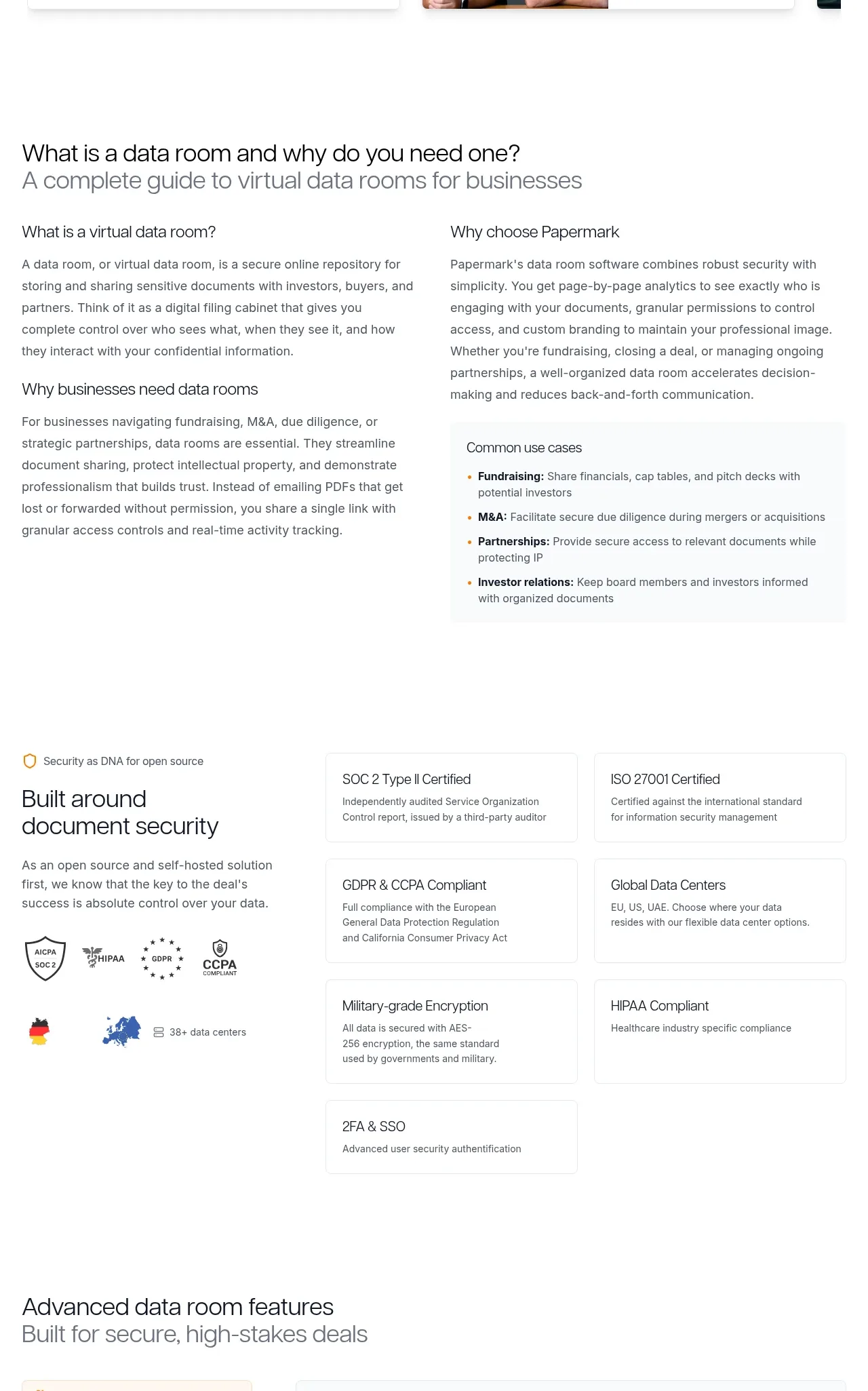
 Data-room education and security overview
Papermark Data Rooms · Feature grid
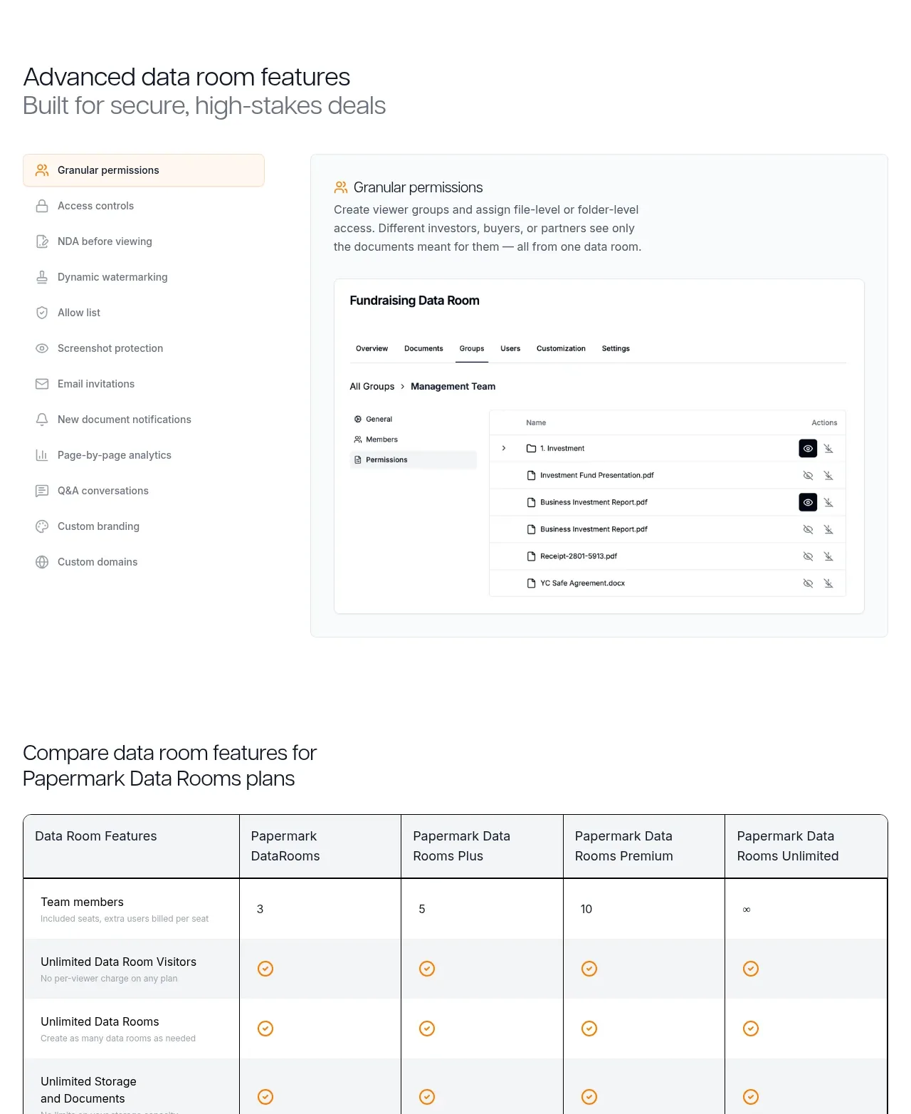 Advanced data-room features
Papermark Data Rooms · Feature grid
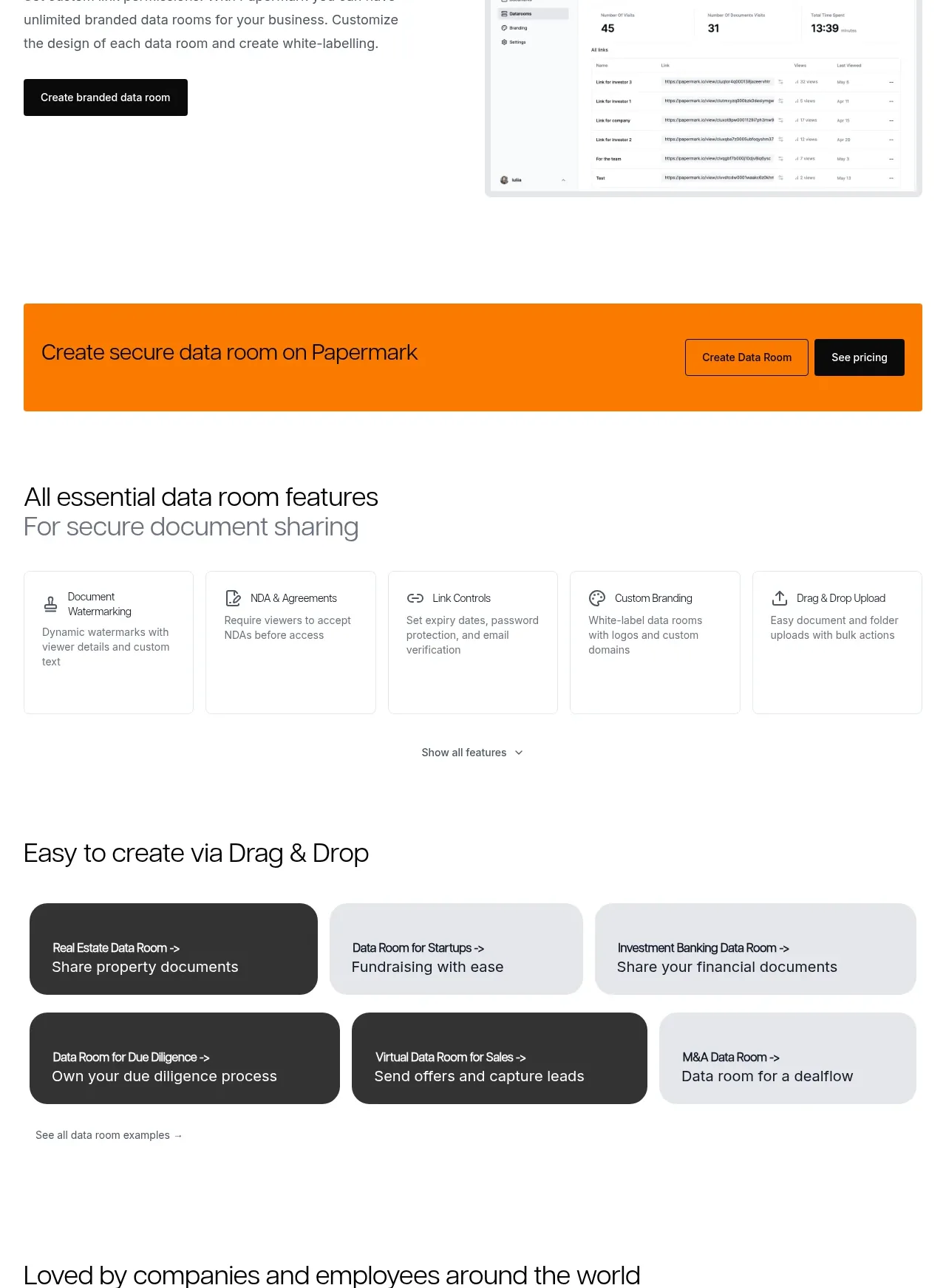 Workflow demonstrations
Papermark Data Rooms · Feature grid
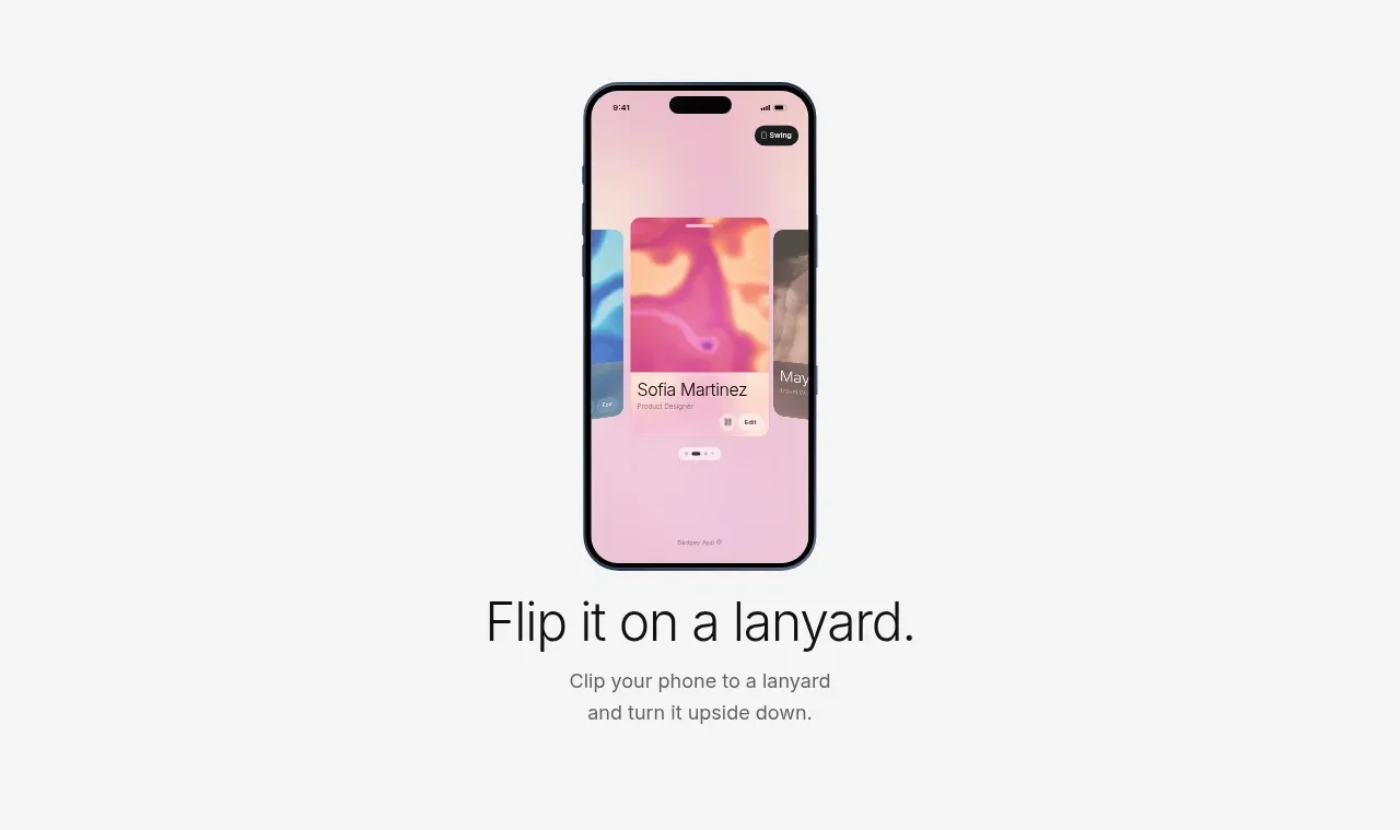
 Lanyard use-case feature
Badgey · Feature grid

 Problem statement
Clips by Plastic · Feature grid
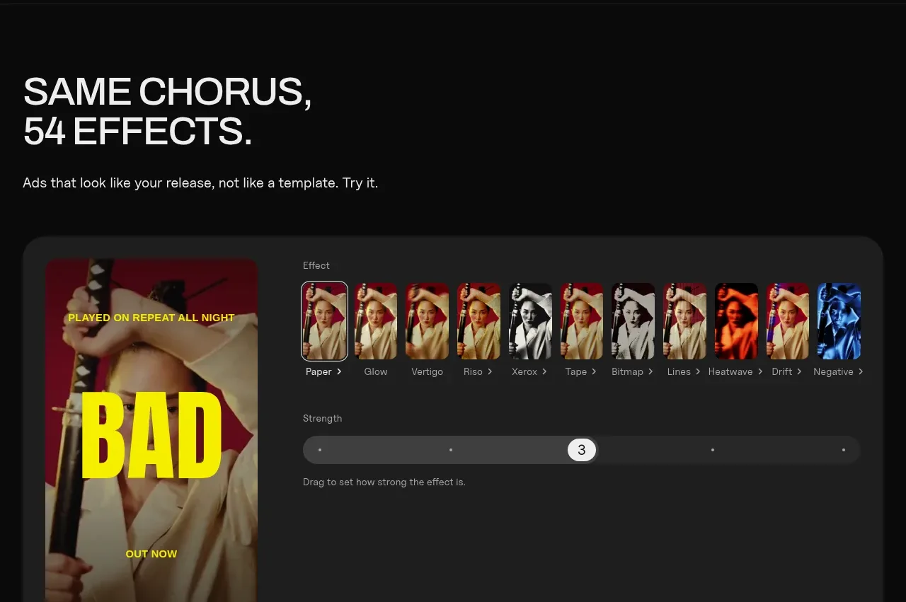 Effects and customization panel
Clips by Plastic · Feature grid