 kage
kage
pitch.com

Design analysis
A spacious, high-contrast category switcher pairs a concise introduction with oversized typographic labels and a compact preview strip for the selected category. The restrained active state and generous vertical rhythm make the interaction feel more like browsing a curated collection than operating a conventional tab bar.
Prompt preview
## Reference images

Study these alongside the description below: hierarchy, rhythm, spacing, colour. Build for the product you are asked about, using this design language.

- Component: https://kage-design-assets.t3.tigrisfiles.io/components/pitch-com/6703b162-6073-44e6-a626-e3df0dc35c4b-1789060649-8.webp
- Full page it was cut from: https://kage-design-assets.t3.tigrisfiles.io/screenshots/pitch-com/6703b162-6073-44e6-a626-e3df0dc35c4b-1789060611-full.webp
- Component on Kage: https://kage.design/component/pitch-tabs

# Build an editorial category-tabs section

## Before you start
Ask the user what their product is, who it is for, and what their brand personality, fonts, colours, and content categories are. Then apply the principles below to their product rather than reproducing the reference literally. Use the user's real content only after confirming it; otherwise create neutral placeholder content.

## Goal
Create a visually immersive tabs section for browsing a curated collection of items such as templates, resources, case studies, or products. The section should feel editorial and premium, with the category navigation treated as a prominent visual element rather than a small utility control.

## Design language

### Layout and alignment
- Use a full-width, dark, saturated background section with a centered max-width container of approximately 1180–1280px.
- Create a two-column desktop layout: the left column contains the section title, a short explanatory paragraph, and one call-to-action; the right column contains the category tabs and selected-item previews.
- Align the left content to the top of the tab list, while allowing the tab list to occupy substantial vertical space.
- Make the tabs a vertical list of large, lightweight category labels. Keep consistent left alignment and generous spacing between rows.
- Place a horizontal preview rail directly beneath the active category label. Use 3–4 compact cards with different aspect ratios or thumbnail treatments to imply a larger collection.
- Let the selected category sit around the visual midpoint of the section, leaving ample negative space above and below it.
- On smaller screens, stack the columns. Keep the intro first, then turn the category list into a horizontally scrollable tab rail or a compact vertical list, followed by the previews.
- Use responsive spacing rather than fixed heights; the desktop section may be tall and atmospheric, but it must not create unnecessary empty space on mobile.

### Typography hierarchy
- Use a distinctive display sans or geometric sans for the main heading, with a large responsive size around 64–92px on desktop and 44–60px on mobile.
- Add a small superscript-style count or metadata marker beside the heading when useful; keep it visually secondary.
- Set the supporting paragraph at approximately 18–21px with a relaxed line-height of 1.45–1.6 and a readable measure around 420–500px.
- Render category labels in uppercase or title case at approximately 56–76px, with a thin or regular weight and tight line-height.
- Make inactive labels low-contrast and the active label bright, using colour and opacity rather than heavy decoration to indicate state.
- Use concise CTA text at 15–17px with a semibold weight.

### Colour
- Use a deep brand-appropriate background, approximately `#281064` to `#321276`, rather than default white.
- Use a soft lavender or lilac for the main heading, approximately `#B9A0FF` or `#C1A8FF`.
- Use an off-white for the active category and primary body text, approximately `#FAF8F2`.
- Use a muted translucent lavender for inactive labels, approximately `rgba(220, 203, 255, 0.28)`.
- Use a bright, contrasting accent for the CTA or hover states, approximately `#C7F27A`, while ensuring text contrast remains accessible.
- If the product has a different brand palette, preserve the same relationship: saturated background, luminous heading, bright active state, and visibly subdued inactive states.

### Borders, cards, and radius
- Keep the main section free of card containers so the background feels continuous.
- Use preview thumbnails with a small-to-medium radius, approximately 6–12px, and subtle cropping or overflow.
- Avoid heavy borders around every tab. If a divider is needed, use a thin translucent line such as `rgba(255,255,255,0.22)`.
- Style the CTA as a pill or softly rounded button with approximately 999px radius, generous horizontal padding, and a simple arrow icon.
- Give preview cards a subtle shadow or tonal separation, but do not make them compete with the active category.

### Interaction
- Tabs must be real accessible controls, preferably a `tablist` with `tab` buttons and associated `tabpanel` content, or an equally accessible disclosure pattern if the layout requires it.
- Clicking or keyboard-activating a category should update the active label and replace or animate the preview rail.
- Add a restrained transition: inactive labels can shift opacity and active labels can brighten over 180–280ms; previews may fade and translate slightly by 6–12px.
- Support arrow-key navigation, visible keyboard focus, and `aria-selected`/`aria-controls` relationships where appropriate.
- On hover, brighten inactive labels slightly and reveal that they are interactive without changing their size or causing layout shift.
- Respect `prefers-reduced-motion` by removing transform and fade animations.
- Ensure the preview thumbnails have meaningful accessible names and that the selected state is not communicated by colour alone.

## Content structure
- Section eyebrow or heading.
- Optional collection count beside the heading.
- One short paragraph explaining the value of browsing the collection.
- One primary CTA.
- Five to eight category labels.
- A preview rail containing a few representative items for the active category.

## Never
- Never use the reference product's logo, product name, category names, exact copy, testimonials, or branded content.
- Never copy the reference's images, thumbnails, illustrations, imagery, or visual assets; use neutral placeholders or the user's own assets.
- Never reproduce the exact layout proportions, typography, spacing values, or colour palette as a pixel-perfect clone.
- Never make the tabs decorative only; preserve keyboard access, focus visibility, responsive behaviour, and clear active-state semantics.
- Never rely on a hover-only interaction or colour alone to communicate which category is selected.
More components

 Directory filters and sorting
The Brains · Tabs & steps
Directory filters and sorting
The Brains · Tabs & steps

 Enterprise use cases
bestproxy.com · Tabs & steps
Enterprise use cases
bestproxy.com · Tabs & steps
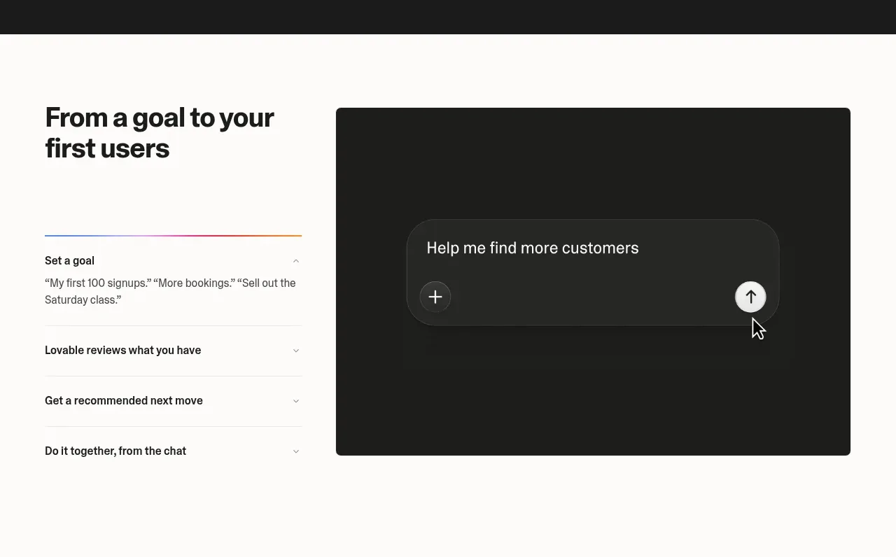
 Goal-to-first-users assistant
Lovable Growth Tools · Tabs & steps
Goal-to-first-users assistant
Lovable Growth Tools · Tabs & steps
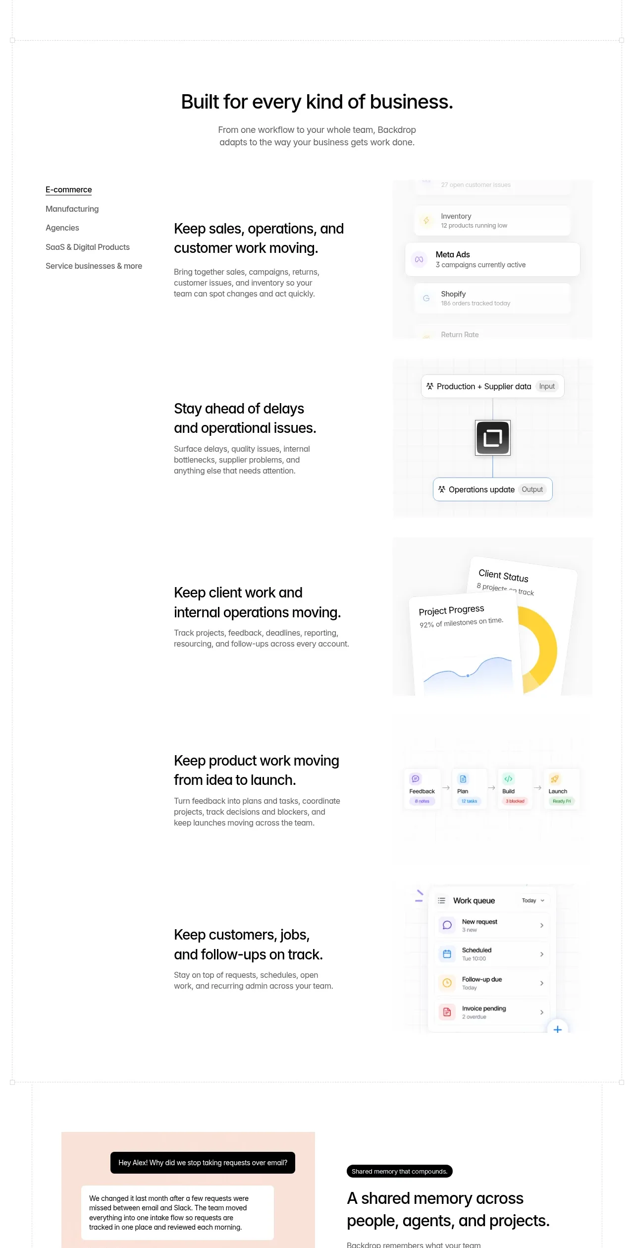
 Business use cases tabs
Backdrop · Tabs & steps
Business use cases tabs
Backdrop · Tabs & steps
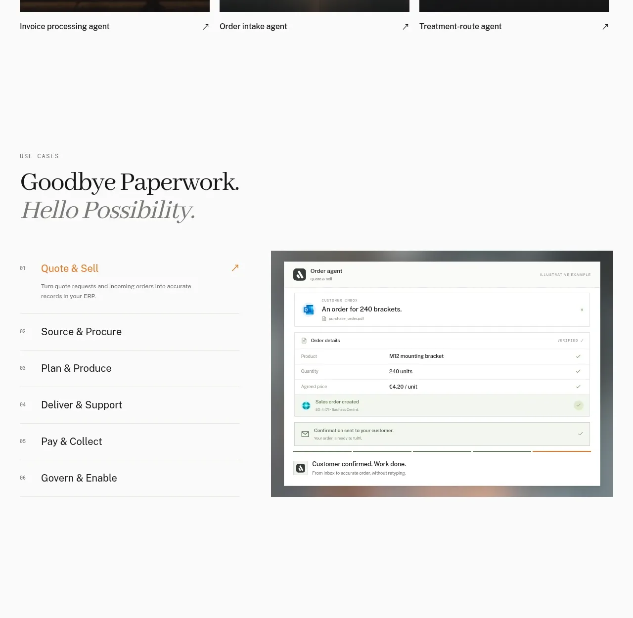
 Workflow stages with product preview
Lleverage · Tabs & steps
Workflow stages with product preview
Lleverage · Tabs & steps
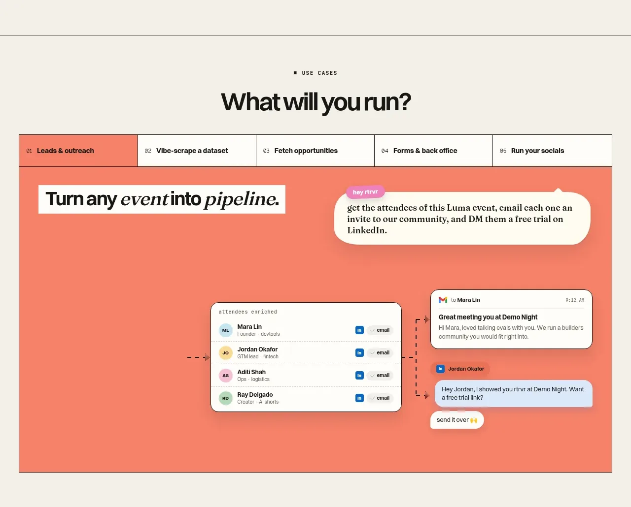
 Use-case selector and interactive showcase
Retriever AI · Tabs & steps
Use-case selector and interactive showcase
Retriever AI · Tabs & steps