 kage
kage
world.pixverse.video
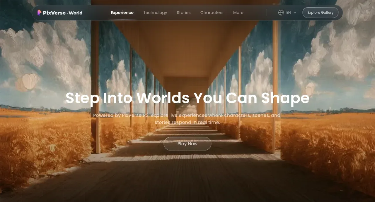
Design analysis
The opening hero uses a full-bleed painted/video-like environment, centered headline, concise supporting statement, and a restrained pill CTA. A dark gradient improves legibility without hiding the visual.
Prompt preview
## Reference images

Study these alongside the description below: hierarchy, rhythm, spacing, colour. Build for the product you are asked about, using this design language.

- Component: https://kage-design-assets.t3.tigrisfiles.io/components/pixverse-r2/7176eddd-e6f3-4887-9746-7bf2cc36c14b-1790402470-1.webp
- Full page it was cut from: https://kage-design-assets.t3.tigrisfiles.io/screenshots/pixverse-r2/7176eddd-e6f3-4887-9746-7bf2cc36c14b-1790402442610-full.webp
- Component on Kage: https://kage.design/component/pixverse-r2-hero

## Before you start
Ask what the user's product, audience, and brand are, then apply these principles to that product and its own visual assets.

Create a full-bleed cinematic hero directly beneath the floating navigation. Use a responsive video or image stage with a strong focal point, dark edge/bottom gradients, and enough contrast for centered text. Place a concise, confident headline in a large 42–64px bold geometric sans-serif, a supporting paragraph below in 15–18px muted white, and one centered pill CTA with a subtle translucent fill. Keep the content vertically centered or slightly below center, with a max text width of about 720px and generous breathing room. Use near-white typography (#f7f5f7), muted copy (#d0cbd0), deep navy/black gradient overlays (#050615 to transparent), and a restrained neutral CTA surface with a 1px rgba(255,255,255,.25) border and 999px radius. The hero should be tall enough to feel immersive, around 55–70vh, but remain usable on mobile. Add a gentle hover lift and brightness change to the CTA; respect reduced-motion preferences for any background movement.

Never use logos, product names, copy, illustrations, or imagery from the reference.
More components

 AI workflow hero
Incredible · Hero
AI workflow hero
Incredible · Hero

 Decentralized energy statement
godaylight.com · Hero
Decentralized energy statement
godaylight.com · Hero
 Grid problem statement
godaylight.com · Hero
Grid problem statement
godaylight.com · Hero
 Warm mission statement panel
godaylight.com · Hero
Warm mission statement panel
godaylight.com · Hero
 Photographic power-home hero
godaylight.com · Hero
Photographic power-home hero
godaylight.com · Hero

 Product hero with download action and video
HyperFrames Studio (Desktop) · Hero
Product hero with download action and video
HyperFrames Studio (Desktop) · Hero