kage
kage
plaid.com

Design analysis
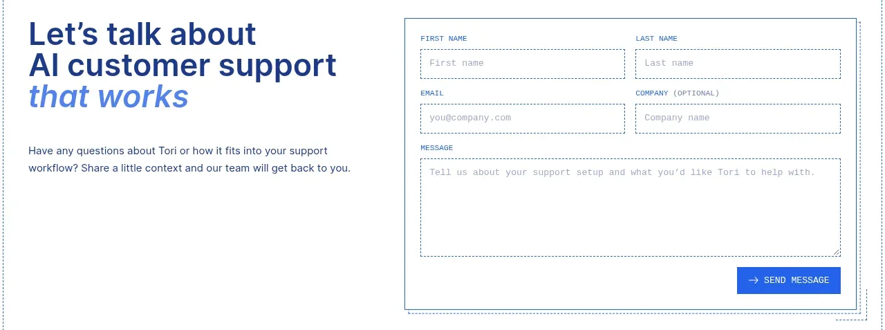
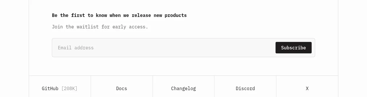
A compact two-column lead-capture form sits inside a bright, softly glowing gradient section. Strong field grouping, generous white-card padding, and a confident pill-shaped submit action make the form feel approachable while remaining conversion-focused.
Prompt preview
## Reference images

Study these alongside the description below: hierarchy, rhythm, spacing, colour. Build for the product you are asked about, using this design language.

- Component: https://kage-design-assets.t3.tigrisfiles.io/components/plaid-com/7f22fbce-e808-4b19-99a1-7dcb31fbfb56-1789060801-7.webp
- Full page it was cut from: https://kage-design-assets.t3.tigrisfiles.io/screenshots/plaid-com/7f22fbce-e808-4b19-99a1-7dcb31fbfb56-1789060772-full.webp
- Component on Kage: https://kage.design/component/plaid-form

## Before you start
Ask the user what their product does, who the form is for, and what their brand personality and visual identity are. Then apply the principles below to create an original contact form section for that product—not a copy of the reference.

## Build this component
Create a responsive contact or sales-inquiry section with a vivid atmospheric background and a prominent elevated form card. The form should feel polished, trustworthy, and easy to complete, with a short set of practical business-contact fields and a clear primary action.

## Design language

### Layout and alignment
- Use a full-width section with a saturated, softly blended background; compose the background as a horizontal or diagonal gradient rather than a flat colour.
- Add subtle abstract contour lines, glow, or tonal texture only if it supports the user's brand. Keep it decorative and low contrast so the form remains dominant.
- Place the form in a large white or near-white card aligned toward the right on desktop, leaving room on the left for a concise value proposition or supporting message.
- Constrain the content to a centred max-width around 1100–1240px with consistent outer gutters of 24–40px.
- Use a two-column field grid on desktop. Each field should occupy one grid cell, with full-width fields where a longer response is needed. Collapse to one column below roughly 700px.
- Keep the card comfortably padded: about 32–48px on desktop and 24px on mobile. The card may extend beyond the visible section edge if the surrounding composition calls for it, but maintain a stable reading flow.

### Typography hierarchy
- Use a contemporary sans-serif with high legibility and a friendly, modern tone.
- If there is supporting headline copy, make it large and expressive—approximately 48–72px on desktop with compact line-height—and scale it to 36–48px on mobile.
- Use 15–16px field text and placeholder text, with labels either visibly above inputs or represented by highly legible placeholders plus accessible labels.
- Set consent text around 13–14px with a muted colour and comfortable 1.4–1.5 line-height.
- Make the submit label semibold and slightly larger than body text, approximately 16–18px.

### Colour
- Use a vivid gradient with a cool deep blue or blue-violet anchor, approximately #075B91 or #173B9A, transitioning through cyan #18B9DC toward aqua or mint #40E2C0. Adapt the hues to the user's brand palette.
- Use a clean card colour such as #FFFFFF or a very slight cool tint like #F9FCFC.
- Use dark navy text around #10283A for headings and input text; use a softer grey around #6E7880 for supporting text and placeholders.
- Make the primary button a saturated cyan-to-blue or brand-colour gradient, with dark text when contrast allows. Include a clearly visible hover state through a subtle brightness shift, shadow, or translate effect.
- Ensure all text, borders, focus rings, and button states meet accessible contrast requirements.

### Fields and controls
- Use input heights around 48–52px, consistent across text inputs and select controls.
- Give fields a thin dark desaturated border, approximately #17313D at 1px, with a white background and a restrained radius of 8–10px.
- Use clear native or custom select affordances for dropdown fields, and preserve keyboard and screen-reader semantics.
- On hover, slightly darken the border. On focus, use a 2px brand-colour outline or ring with enough contrast against the card.
- Include useful fields such as first name, last name, work email, company, region/country, and an optional phone number, but adjust the field set to the user's actual qualification flow.
- Place a short privacy or consent statement below the grid. Link the relevant policy with an underline or clearly differentiated colour.
- Use a pill-shaped primary button with approximately 44–52px height and 20–28px horizontal padding. Align it to the start of the form rather than stretching it unnecessarily across the card.
- Add inline validation, error text, loading state, and a concise success state. Do not rely on colour alone to communicate errors.

### Spacing and shape
- Use an 8px spacing base. Keep 16px between label and control, 16–20px between grid rows, and 24–32px between the fields, consent text, and action.
- Give the form card a generous radius around 28–36px, with a soft shadow such as 0 16px 40px rgba(4, 30, 55, 0.16).
- Keep the background shapes broad and blurred; avoid excessive visual noise behind the white card.
- On mobile, reduce the card radius slightly to around 20–24px, maintain 20–24px gutters, and make the submit button full-width only if that is more usable for the user's content and brand.

### Interaction and accessibility
- Provide visible labels or accessible label associations for every control, including the select.
- Support keyboard navigation, autofill, mobile-friendly input types, and clear focus states.
- Prevent layout shift when validation messages appear.
- Make the form action feel immediate with a disabled/loading state and useful feedback after submission.
- Respect reduced-motion preferences; keep gradient motion, hover movement, and decorative effects subtle or disabled when requested.

## Never
- Never use logos, product names, trademarks, or branded symbols from the reference.
- Never reuse the reference's exact headline, field copy, privacy copy, button label, or other wording; write content appropriate to the user's product.
- Never copy the exact gradient, decorative contour pattern, card proportions, or page composition; reinterpret the visual principles in the user's brand.
- Never use illustrations, photographs, or other imagery from the reference.
- Never sacrifice form accessibility, responsive behaviour, or validation clarity for visual similarity.