 kage
kage
plane.so
Design analysis
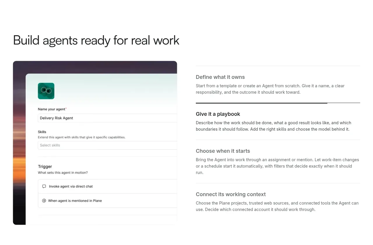
A section heading introduces a two-column explanation: a large configuration UI visual on the left and four concise setup principles on the right.
Prompt preview
## Reference images

Study these alongside the description below: hierarchy, rhythm, spacing, colour. Build for the product you are asked about, using this design language.

- Component: https://kage-design-assets.t3.tigrisfiles.io/components/plane-agents/6cd7606f-e6b6-4968-a1a7-76c61b9969ac-1790143341-3.webp
- Full page it was cut from: https://kage-design-assets.t3.tigrisfiles.io/screenshots/plane-agents/6cd7606f-e6b6-4968-a1a7-76c61b9969ac-1790143303447-full.webp
- Component on Kage: https://kage.design/component/plane-agents-feature-grid

## Before you start
Ask what the user's product, audience, and brand are, then apply the principles below to that product rather than copying the reference.

Create a feature section explaining how users configure the product. Start with a left-aligned heading and then use a two-column layout: a large rounded product UI mockup or screenshot on the left, and a vertically stacked list of four principles on the right. Each principle should have a short bold title, one or two sentences, and a thin divider; use the dividers to create rhythm without heavy cards. Keep the layout within a 1200px max-width, with a 48–80px gap between columns. Use white space, near-black headings #171717, gray body text #666666, and subtle rules #dedede. The visual should feel tangible and detailed, but the explanatory text must remain scannable. Stack the columns on mobile, placing the visual below the heading and before or after the principles based on reading order.

Never: use logos, product names, copy, illustrations, or imagery from the reference.
More components

 Spend visibility and daily-cost breakdown
Subscrr · Feature grid
Spend visibility and daily-cost breakdown
Subscrr · Feature grid
 Reminders and simple setup flow
Subscrr · Feature grid
Reminders and simple setup flow
Subscrr · Feature grid

 Security and permissions cards
NotchPop · Feature grid
Security and permissions cards
NotchPop · Feature grid
 Focused feature cards
NotchPop · Feature grid
Focused feature cards
NotchPop · Feature grid
 Interactive product demonstration
NotchPop · Feature grid
Interactive product demonstration
NotchPop · Feature grid
 Quiet information cards
NotchPop · Feature grid
Quiet information cards
NotchPop · Feature grid