 kage
kage
plane.so
Design analysis
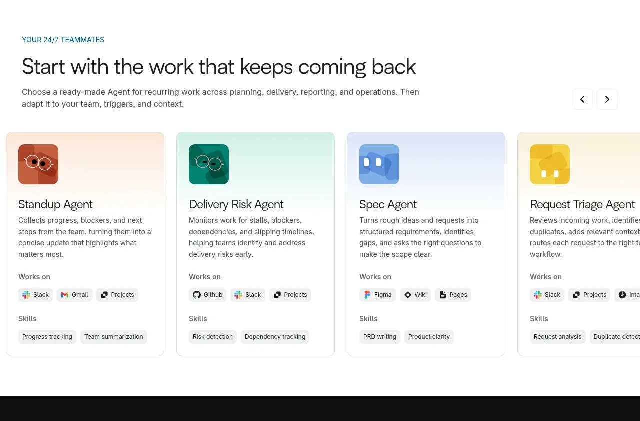
An eyebrow and large heading introduce a horizontally scrolling collection of colorful agent template cards with integrations and skills metadata.
Prompt preview
## Reference images

Study these alongside the description below: hierarchy, rhythm, spacing, colour. Build for the product you are asked about, using this design language.

- Component: https://kage-design-assets.t3.tigrisfiles.io/components/plane-agents/6cd7606f-e6b6-4968-a1a7-76c61b9969ac-1790143341-4.webp
- Full page it was cut from: https://kage-design-assets.t3.tigrisfiles.io/screenshots/plane-agents/6cd7606f-e6b6-4968-a1a7-76c61b9969ac-1790143303447-full.webp
- Component on Kage: https://kage.design/component/plane-agents-feature-grid-2

## Before you start
Ask what the user's product, audience, and brand are, then apply the principles below to that product rather than copying the reference.

Build a template gallery section for ready-made workflows. Use a small uppercase eyebrow, a strong section heading, supporting copy, and optional previous/next controls aligned to the heading row. Below, show four horizontally arranged cards in a responsive carousel or scroll rail. Each card should have a soft tinted top area, a small abstract icon, a clear title, short description, and compact metadata groups such as connected tools and capabilities. Use white cards with 1px #e2e2e2 borders, 10–14px radius, subtle hover elevation, and distinct but harmonious pale backgrounds such as #fff1e8, #e2f6f2, #e8efff, and #fff8d9. Keep body copy around 13–15px and avoid excessive card density. On mobile, show one card plus a visible next-card peek and support touch dragging.

Never: use logos, product names, copy, illustrations, or imagery from the reference.
More components

 Spend visibility and daily-cost breakdown
Subscrr · Feature grid
Spend visibility and daily-cost breakdown
Subscrr · Feature grid
 Reminders and simple setup flow
Subscrr · Feature grid
Reminders and simple setup flow
Subscrr · Feature grid

 Security and permissions cards
NotchPop · Feature grid
Security and permissions cards
NotchPop · Feature grid
 Focused feature cards
NotchPop · Feature grid
Focused feature cards
NotchPop · Feature grid
 Interactive product demonstration
NotchPop · Feature grid
Interactive product demonstration
NotchPop · Feature grid
 Quiet information cards
NotchPop · Feature grid
Quiet information cards
NotchPop · Feature grid