 kage
kage
plane.so
Design analysis
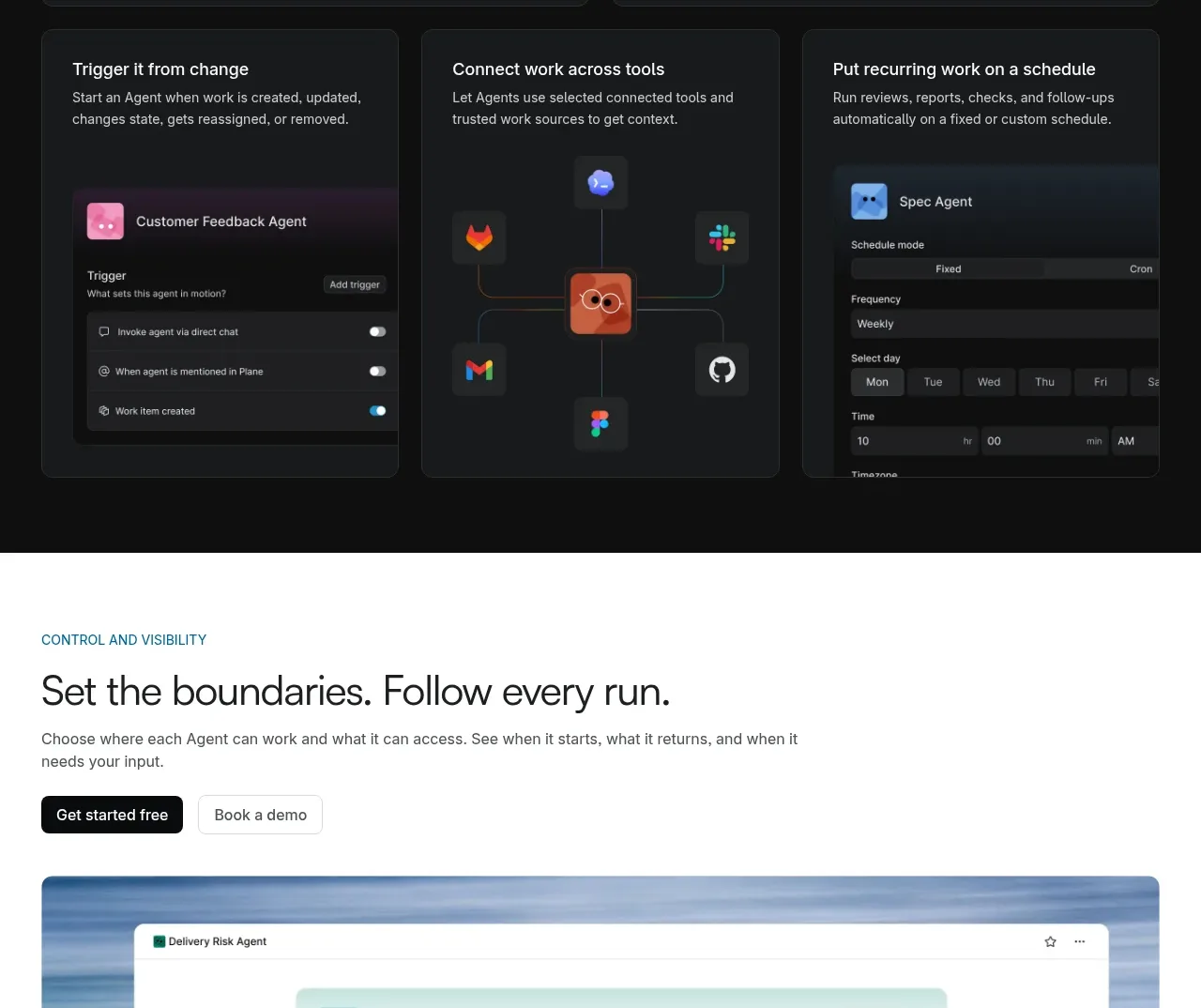
A white section presents a heading and CTAs, a wide permissions-oriented interface visual, and three concise explanatory columns underneath.
Prompt preview
## Reference images

Study these alongside the description below: hierarchy, rhythm, spacing, colour. Build for the product you are asked about, using this design language.

- Component: https://kage-design-assets.t3.tigrisfiles.io/components/plane-agents/6cd7606f-e6b6-4968-a1a7-76c61b9969ac-1790143342-6.webp
- Full page it was cut from: https://kage-design-assets.t3.tigrisfiles.io/screenshots/plane-agents/6cd7606f-e6b6-4968-a1a7-76c61b9969ac-1790143303447-full.webp
- Component on Kage: https://kage.design/component/plane-agents-feature-grid-3

## Before you start
Ask what the user's product, audience, and brand are, then apply the principles below to that product rather than copying the reference.

Build a governance and visibility feature section. Begin with a small category label, a large benefit-oriented heading, supporting copy, and two CTAs aligned left. Follow with a wide rounded interface mockup showing permissions, access scope, usage, or audit information over a soft atmospheric background. Below the visual, use three equal columns with short titles and explanatory text; add a thin top rule above each column to create alignment. Use a white background, dark text #181818, gray copy #656565, pale blue/gray visual surround around #e9f1f7, 12px image radius, and 32–56px column gaps. Keep the interface legible enough to communicate hierarchy without reproducing real data. Stack the three columns on mobile.

Never: use logos, product names, copy, illustrations, or imagery from the reference.
More components

 Spend visibility and daily-cost breakdown
Subscrr · Feature grid
Spend visibility and daily-cost breakdown
Subscrr · Feature grid
 Reminders and simple setup flow
Subscrr · Feature grid
Reminders and simple setup flow
Subscrr · Feature grid

 Security and permissions cards
NotchPop · Feature grid
Security and permissions cards
NotchPop · Feature grid
 Focused feature cards
NotchPop · Feature grid
Focused feature cards
NotchPop · Feature grid
 Interactive product demonstration
NotchPop · Feature grid
Interactive product demonstration
NotchPop · Feature grid
 Quiet information cards
NotchPop · Feature grid
Quiet information cards
NotchPop · Feature grid