kage
kage
plane.so
Design analysis
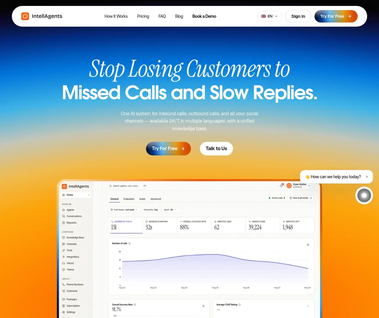
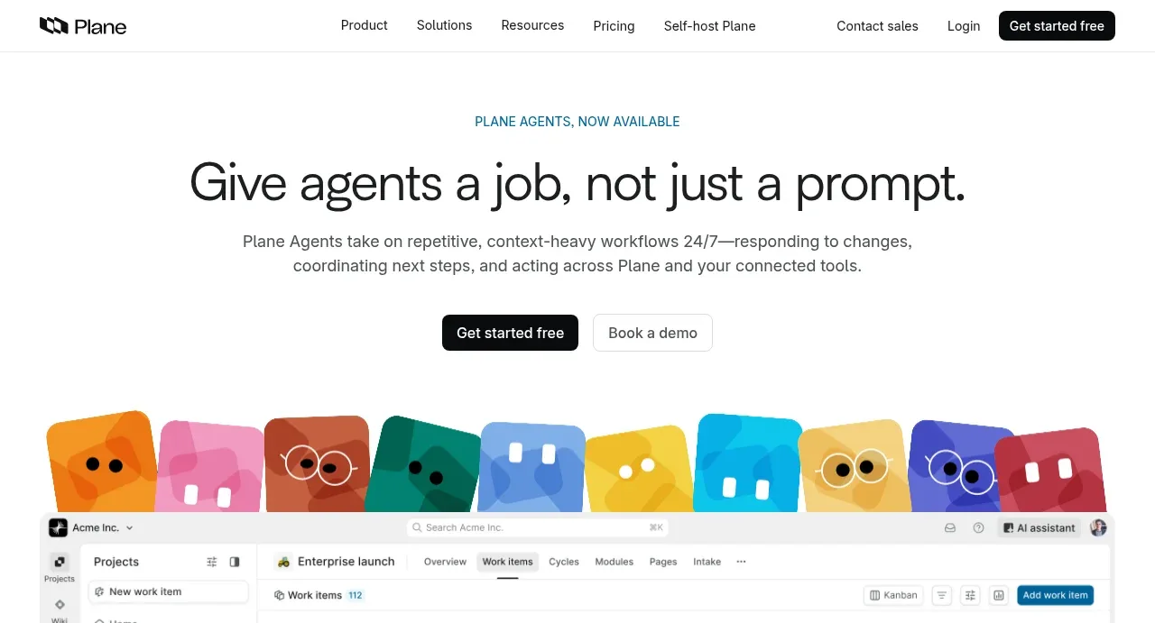
The hero combines a compact eyebrow, oversized promise-led headline, supporting explanation, dual CTAs, and a colorful agent strip above a large product interface preview.
Prompt preview
## Reference images

Study these alongside the description below: hierarchy, rhythm, spacing, colour. Build for the product you are asked about, using this design language.

- Component: https://kage-design-assets.t3.tigrisfiles.io/components/plane-agents/6cd7606f-e6b6-4968-a1a7-76c61b9969ac-1790143340-1.webp
- Full page it was cut from: https://kage-design-assets.t3.tigrisfiles.io/screenshots/plane-agents/6cd7606f-e6b6-4968-a1a7-76c61b9969ac-1790143303447-full.webp
- Component on Kage: https://kage.design/component/plane-agents-hero

## Before you start
Ask what the user's product, audience, and brand are, then apply the principles below to that product rather than copying the reference.

Create a centered SaaS hero directly beneath the navigation. Use an optional uppercase eyebrow in a muted accent, a large responsive headline with a clear job-to-be-done, one concise supporting paragraph, and two contrasting CTAs: a dark filled primary button and a light outlined secondary button. Add generous vertical whitespace and finish the hero with a wide product screenshot or UI preview that visually proves the promise. The preview may sit partially below the initial text area, with a row of abstract, colorful rounded agent tiles as a distinctive visual motif. Use near-black text #171717, white background #ffffff, muted gray copy #5f6368, and restrained teal/blue accent text around #176b78. Keep the headline around 48–64px desktop, 34–42px mobile, with tight line-height; use a max-width of roughly 760px for text and 1200px for the preview. Ensure the UI preview is responsive, rounded 12–16px, and clipped safely on small screens.

Never: use logos, product names, copy, illustrations, or imagery from the reference.