 kage
kage
getpolyglot.io
Design analysis
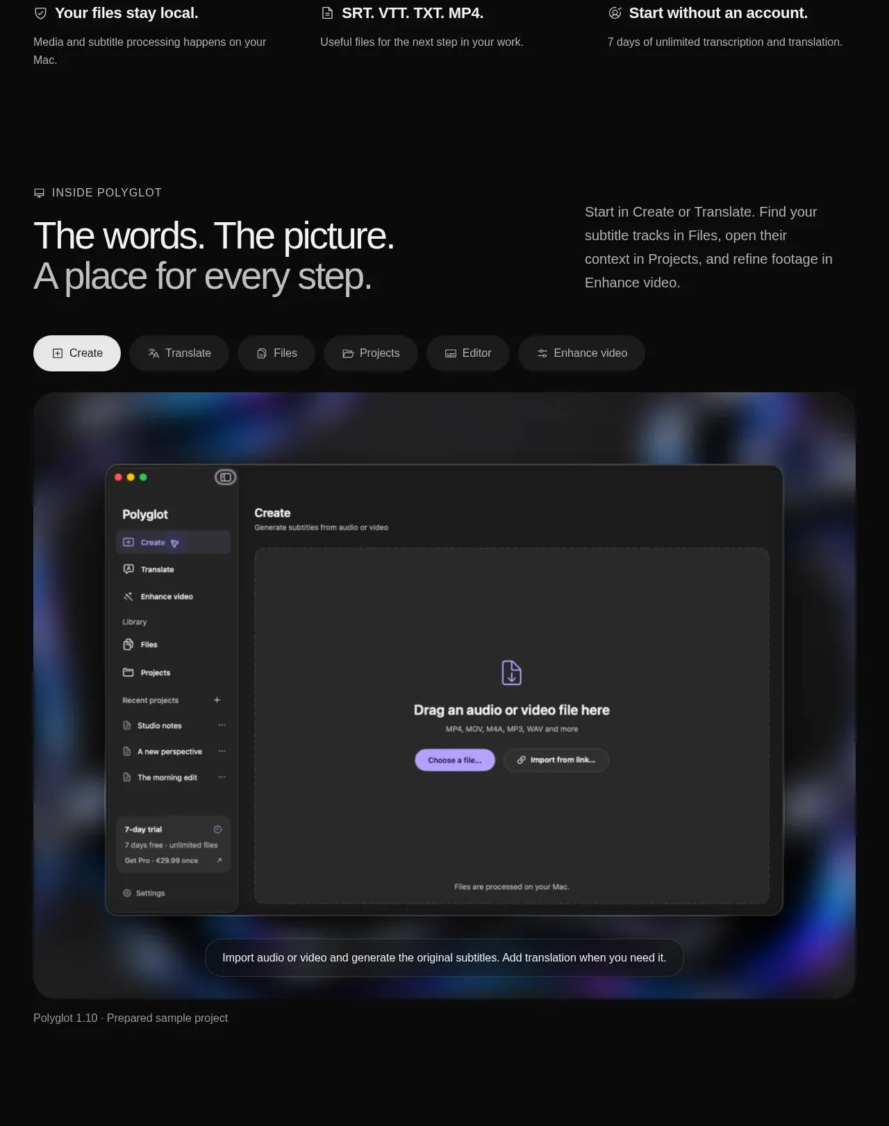
An editorial section introduces the product workflow with an eyebrow, split heading and description, a pill-like mode selector, and a large framed application preview.
Prompt preview
## Reference images

Study these alongside the description below: hierarchy, rhythm, spacing, colour. Build for the product you are asked about, using this design language.

- Component: https://kage-design-assets.t3.tigrisfiles.io/components/polyglot/16feff4e-ce5f-4860-8cf6-49c37e8ed17f-1790402683-3.webp
- Full page it was cut from: https://kage-design-assets.t3.tigrisfiles.io/screenshots/polyglot/16feff4e-ce5f-4860-8cf6-49c37e8ed17f-1790402570740-full.webp
- Component on Kage: https://kage.design/component/polyglot-feature-grid

## Before you start
Ask what the user's product is, who it serves, and what brand personality and visual identity it should use. Apply these principles to that product rather than copying the reference.

Create an editorial product showcase section on a black background. Use a two-column heading row: a small uppercase eyebrow and large two-line headline on the left, with explanatory copy aligned on the right. Below it, add a horizontal row of rounded mode tabs with one light active state and several dark inactive states; tabs should be keyboard accessible and visibly change the preview. Place a large rounded media frame below, with a subtle blurred blue-violet atmospheric backdrop and a centered neutral product UI mockup. Use restrained borders (#242424), 18–24px corner radii, 32px internal padding, and generous section spacing. Keep the preview decorative but clearly subordinate to the explanatory content.

Never use logos, product names, copy, illustrations, or imagery from the reference.
More components

 Three-step process cards
godaylight.com · Feature grid
Three-step process cards
godaylight.com · Feature grid

 Use-case selector with vertical video preview
Spira Maxima · Feature grid
Use-case selector with vertical video preview
Spira Maxima · Feature grid

 Insights and enterprise model access
FastRouter.ai · Feature grid
Insights and enterprise model access
FastRouter.ai · Feature grid
 Solutions by organizational role
FastRouter.ai · Feature grid
Solutions by organizational role
FastRouter.ai · Feature grid
 Routing reliability and model collaboration
FastRouter.ai · Feature grid
Routing reliability and model collaboration
FastRouter.ai · Feature grid
 Goal-oriented product capabilities
FastRouter.ai · Feature grid
Goal-oriented product capabilities
FastRouter.ai · Feature grid