 kage
kage
getpolyglot.io
Design analysis
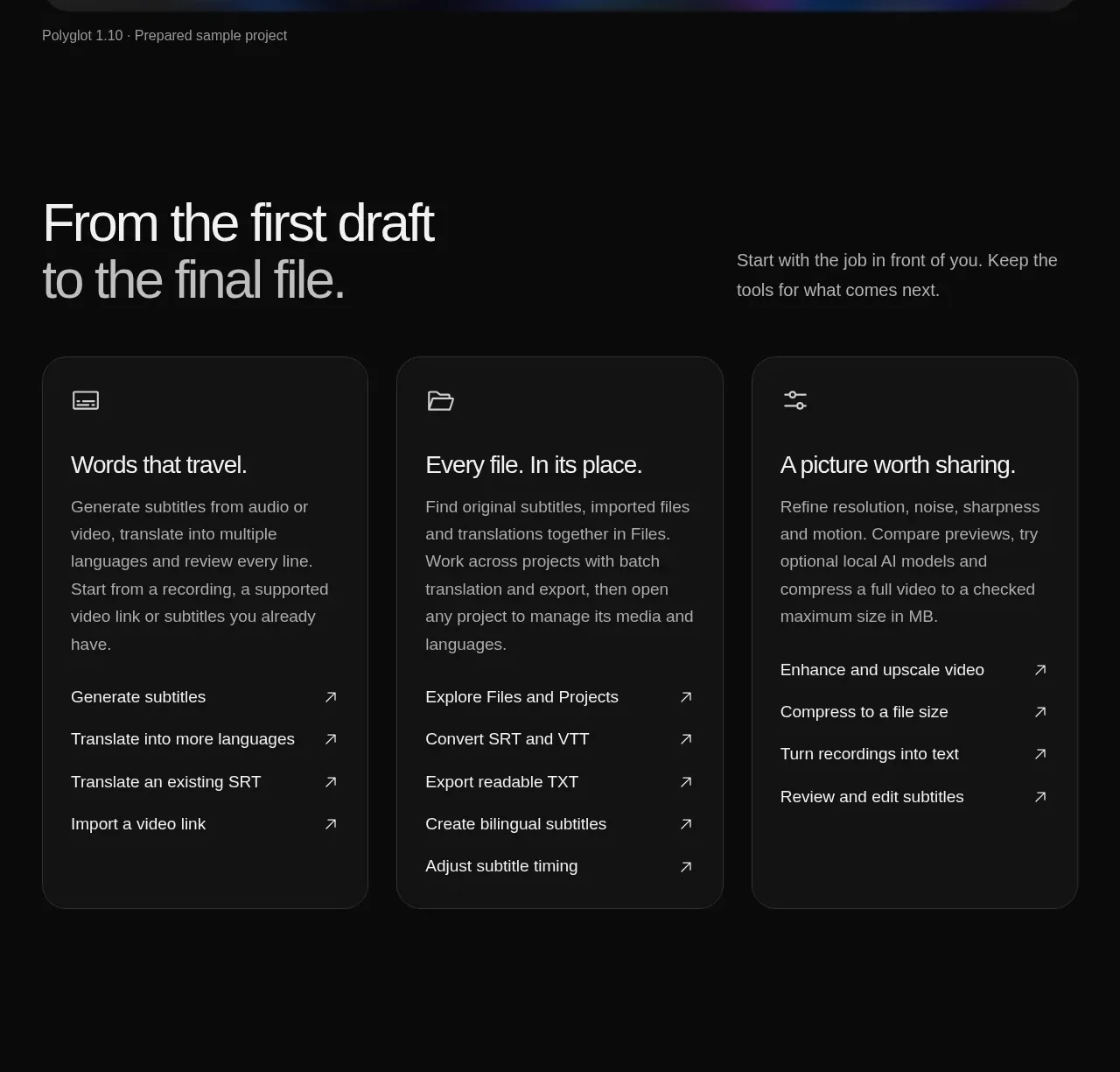
Three equal-height dark cards translate the product into practical workflows, with concise explanations and repeated text-link affordances.
Prompt preview
## Reference images

Study these alongside the description below: hierarchy, rhythm, spacing, colour. Build for the product you are asked about, using this design language.

- Component: https://kage-design-assets.t3.tigrisfiles.io/components/polyglot/16feff4e-ce5f-4860-8cf6-49c37e8ed17f-1790402683-4.webp
- Full page it was cut from: https://kage-design-assets.t3.tigrisfiles.io/screenshots/polyglot/16feff4e-ce5f-4860-8cf6-49c37e8ed17f-1790402570740-full.webp
- Component on Kage: https://kage.design/component/polyglot-feature-grid-2

## Before you start
Ask what the user's product is, who it serves, and what brand personality and visual identity it should use. Apply these principles to that product rather than copying the reference.

Build a three-card feature grid on a near-black page. Introduce it with a split heading row: a large benefit-oriented headline on the left and a short framing paragraph on the right. Use equal-width cards with a slightly lighter surface (#151515), a 1px border (#292929), 18–20px radius, and 28–32px padding. Each card contains a small line icon, a short 20–24px title, muted descriptive text, and several compact text links with right-arrow affordances. Keep card heights aligned, give links consistent vertical rhythm, and add a restrained hover border or surface change. Stack the cards below tablet width.

Never use logos, product names, copy, illustrations, or imagery from the reference.
More components

 Three-step process cards
godaylight.com · Feature grid
Three-step process cards
godaylight.com · Feature grid

 Use-case selector with vertical video preview
Spira Maxima · Feature grid
Use-case selector with vertical video preview
Spira Maxima · Feature grid

 Insights and enterprise model access
FastRouter.ai · Feature grid
Insights and enterprise model access
FastRouter.ai · Feature grid
 Solutions by organizational role
FastRouter.ai · Feature grid
Solutions by organizational role
FastRouter.ai · Feature grid
 Routing reliability and model collaboration
FastRouter.ai · Feature grid
Routing reliability and model collaboration
FastRouter.ai · Feature grid
 Goal-oriented product capabilities
FastRouter.ai · Feature grid
Goal-oriented product capabilities
FastRouter.ai · Feature grid