 kage
kage
polylane.com
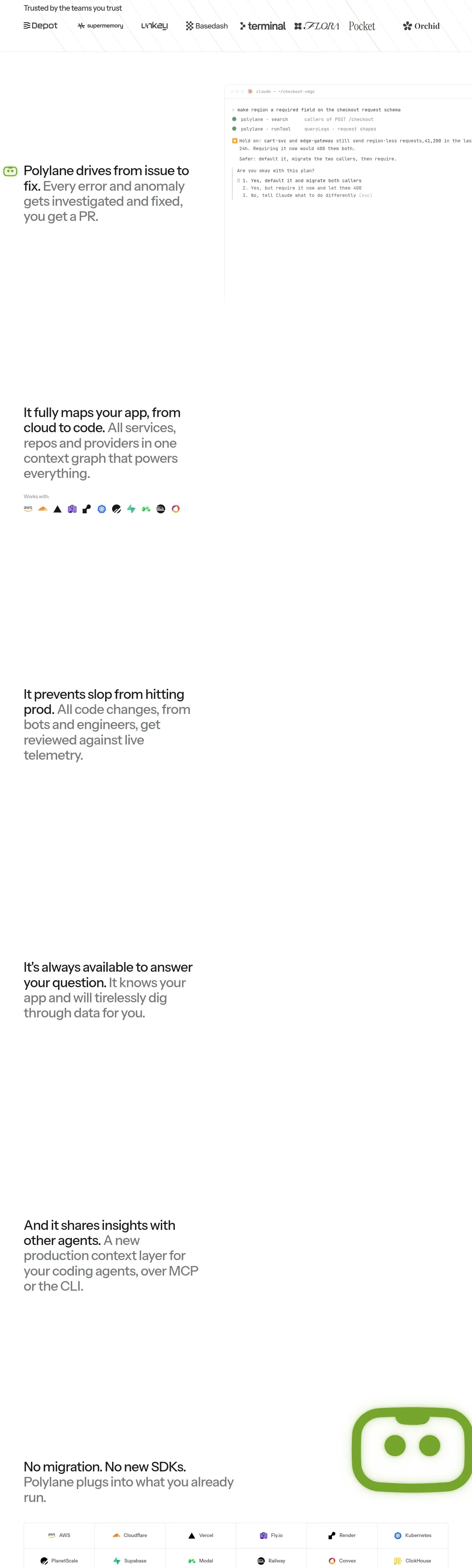
Design analysis
Several generous feature bands explain the product progressively: investigate issues, map technical context, prevent regressions, answer questions, and share context with agents. Alternating visual and text zones create rhythm even where the visuals are sparse.
Prompt preview
## Reference images

Study these alongside the description below: hierarchy, rhythm, spacing, colour. Build for the product you are asked about, using this design language.

- Component: https://kage-design-assets.t3.tigrisfiles.io/components/polylane/638c7112-70a9-484e-b85d-ab255c3ac21a-1790920980-3.webp
- Full page it was cut from: https://kage-design-assets.t3.tigrisfiles.io/screenshots/polylane/638c7112-70a9-484e-b85d-ab255c3ac21a-1790920937285-full.webp
- Component on Kage: https://kage.design/component/polylane-feature-grid

## Before you start
Ask what the user's product's three to five core capabilities are, which proof or UI visuals can be shown, and which user outcome matters most. Apply the structure to those capabilities rather than reproducing the reference.

Build a sequence of spacious feature bands inside a single product-story section. Each band should have a clear benefit headline, supporting copy, and an optional product UI, diagram, or evidence panel. Alternate the visual/text emphasis between rows to create rhythm, while keeping a shared max-width grid, consistent left and right gutters, and generous vertical whitespace. Use short sentences with selective bold emphasis; let each row communicate one outcome before introducing the next. If a visual is unavailable, reserve the space with a quiet framed panel rather than collapsing the layout.

Use white or near-white #FFFFFF/#FAFAF8, text #171717, supporting gray #6B6B6B, and green accents around #73AA2A. Use a 12-column desktop grid, roughly 48–52% text and 48–52% visual columns, 96–160px vertical padding per band, and 1px #EEEEEE rules only where they aid grouping. Use 18–24px body text, 34–52px feature headings, 8–16px panel radius, and restrained shadows. Make visuals responsive, stack columns on mobile, and support subtle reveal motion without requiring animation.

Never: use logos, product names, copy, illustrations or imagery from the reference.
More components

 Three-step process cards
godaylight.com · Feature grid
Three-step process cards
godaylight.com · Feature grid

 Use-case selector with vertical video preview
Spira Maxima · Feature grid
Use-case selector with vertical video preview
Spira Maxima · Feature grid

 Insights and enterprise model access
FastRouter.ai · Feature grid
Insights and enterprise model access
FastRouter.ai · Feature grid
 Solutions by organizational role
FastRouter.ai · Feature grid
Solutions by organizational role
FastRouter.ai · Feature grid
 Routing reliability and model collaboration
FastRouter.ai · Feature grid
Routing reliability and model collaboration
FastRouter.ai · Feature grid
 Goal-oriented product capabilities
FastRouter.ai · Feature grid
Goal-oriented product capabilities
FastRouter.ai · Feature grid