 kage
kage
polylane.com
Design analysis
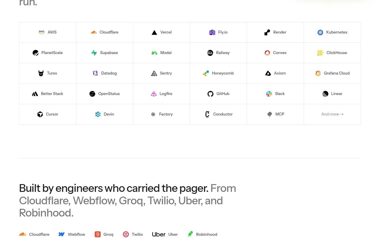
An integrations section turns compatibility into proof with a concise migration message, a small accent visual, and a dense bordered matrix of supported tools.
Prompt preview
## Reference images

Study these alongside the description below: hierarchy, rhythm, spacing, colour. Build for the product you are asked about, using this design language.

- Component: https://kage-design-assets.t3.tigrisfiles.io/components/polylane/638c7112-70a9-484e-b85d-ab255c3ac21a-1790920981-4.webp
- Full page it was cut from: https://kage-design-assets.t3.tigrisfiles.io/screenshots/polylane/638c7112-70a9-484e-b85d-ab255c3ac21a-1790920937285-full.webp
- Component on Kage: https://kage.design/component/polylane-feature-grid-2

## Before you start
Ask which platforms and integrations the user's product genuinely supports, whether they need categories or search, and what migration concern should be addressed. Build an original ecosystem section around that information.

Create an integrations block with a short reassuring headline and supporting sentence at the top, optionally paired with a small abstract product accent. Below it, use a clean multi-column matrix of integration names with tiny neutral icons or text marks. The grid should feel dependable and scannable: equal cells, aligned baselines, subtle separators, and a final “view all” affordance rather than oversized logos.

Use white background, #171717 headings, #666666 body text, green #73AA2A for small accents, #E8E8E8 borders, and 8px corner radius only on the outer container. Use a 6-column desktop matrix that becomes 2 columns or a horizontally scrollable list on mobile. Keep labels around 12–14px and the section heading around 34–44px. Add hover highlighting and accessible labels.

Never: use logos, product names, copy, illustrations or imagery from the reference.
More components

 Three-step process cards
godaylight.com · Feature grid
Three-step process cards
godaylight.com · Feature grid

 Use-case selector with vertical video preview
Spira Maxima · Feature grid
Use-case selector with vertical video preview
Spira Maxima · Feature grid

 Insights and enterprise model access
FastRouter.ai · Feature grid
Insights and enterprise model access
FastRouter.ai · Feature grid
 Solutions by organizational role
FastRouter.ai · Feature grid
Solutions by organizational role
FastRouter.ai · Feature grid
 Routing reliability and model collaboration
FastRouter.ai · Feature grid
Routing reliability and model collaboration
FastRouter.ai · Feature grid
 Goal-oriented product capabilities
FastRouter.ai · Feature grid
Goal-oriented product capabilities
FastRouter.ai · Feature grid