 kage
kage
polylane.com
Design analysis
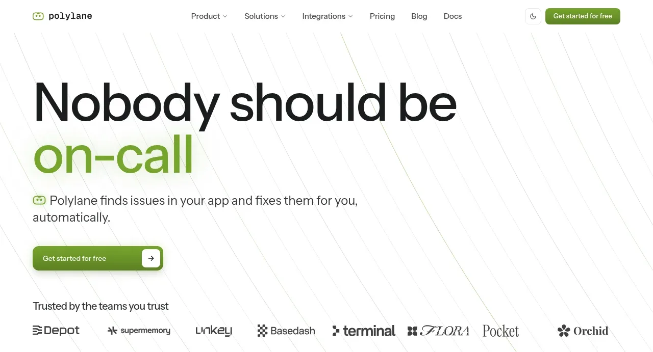
The hero uses an oversized two-line claim with a green emphasis, short explanatory copy, and one low-friction CTA against a very quiet technical background.
Prompt preview
## Reference images

Study these alongside the description below: hierarchy, rhythm, spacing, colour. Build for the product you are asked about, using this design language.

- Component: https://kage-design-assets.t3.tigrisfiles.io/components/polylane/638c7112-70a9-484e-b85d-ab255c3ac21a-1790920979-1.webp
- Full page it was cut from: https://kage-design-assets.t3.tigrisfiles.io/screenshots/polylane/638c7112-70a9-484e-b85d-ab255c3ac21a-1790920937285-full.webp
- Component on Kage: https://kage.design/component/polylane-hero

## Before you start
Ask what the user's product does, its audience, brand voice, and the single action the hero should drive. Then create an original hero using these principles.

Build a spacious left-aligned SaaS hero directly beneath the navigation. Use a large display headline with a short first line in near-black and a concise emphasized phrase in the brand colour on the next line. Place one or two lines of supporting copy below, then a prominent single CTA with a right-arrow affordance. Keep the content in a centered max-width container with the text block around 50–60% width and ample whitespace; an extremely subtle diagonal-line or grid texture may sit behind it at low contrast, but it must not reduce readability.

Use near-black #171717, soft gray #4F4F4F, green accent approximately #73AA2A, and white #FFFFFF. Use a modern sans-serif, headline around 64–76px desktop with tight line-height and responsive clamp sizing, body around 18px, and a CTA with 10–12px radius, green fill, white text, and a slight shadow. Add hover/focus states and preserve a clear reading order on mobile.

Never: use logos, product names, copy, illustrations or imagery from the reference.
More components

 AI workflow hero
Incredible · Hero
AI workflow hero
Incredible · Hero

 Decentralized energy statement
godaylight.com · Hero
Decentralized energy statement
godaylight.com · Hero
 Warm mission statement panel
godaylight.com · Hero
Warm mission statement panel
godaylight.com · Hero
 Photographic power-home hero
godaylight.com · Hero
Photographic power-home hero
godaylight.com · Hero
 Grid problem statement
godaylight.com · Hero
Grid problem statement
godaylight.com · Hero

 Product hero with download action and video
HyperFrames Studio (Desktop) · Hero
Product hero with download action and video
HyperFrames Studio (Desktop) · Hero