 kage
kage
polylane.com
Design analysis
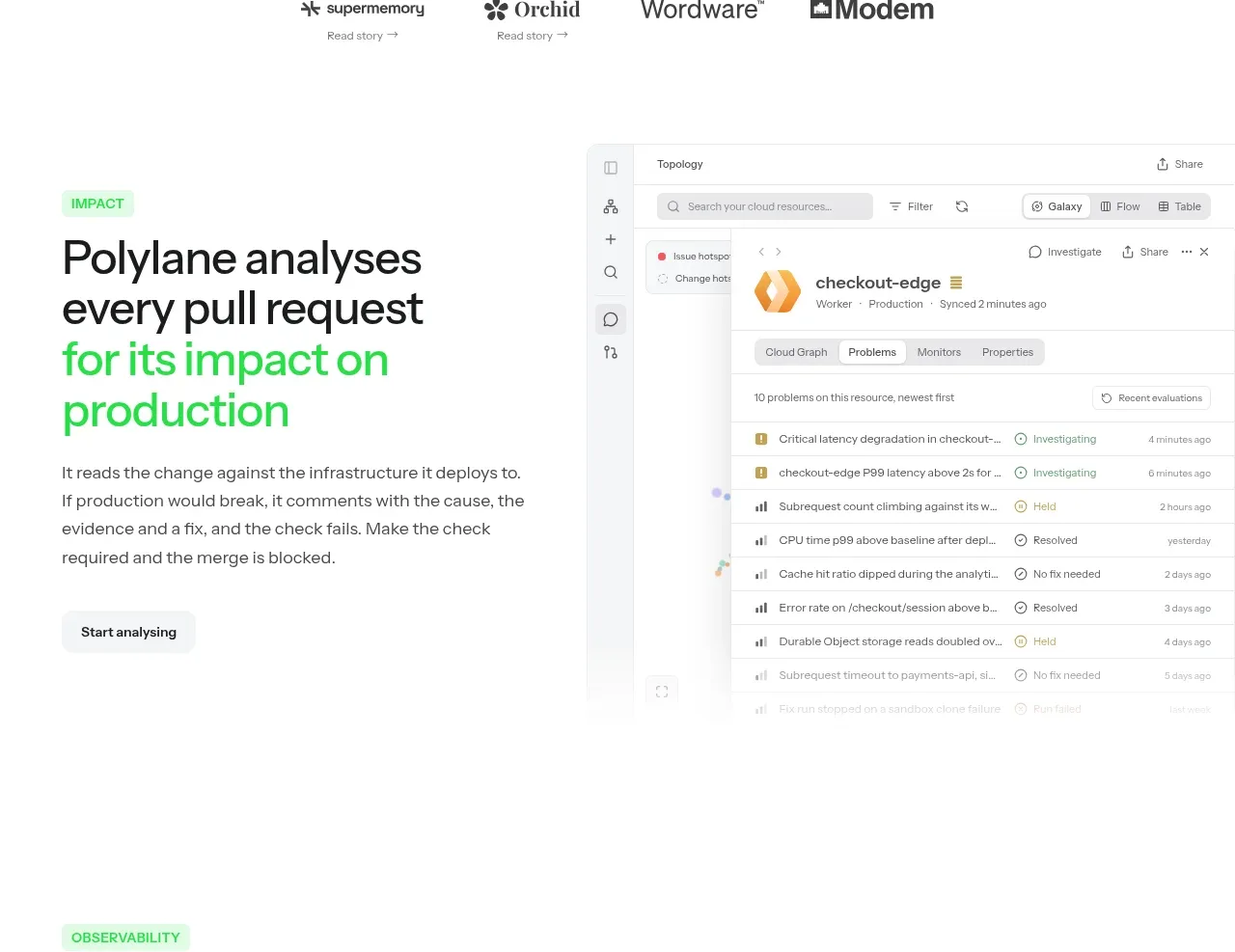
A two-column product story explains the core impact-analysis outcome on the left and pairs it with a large interface visual on the right.
Prompt preview
## Reference images

Study these alongside the description below: hierarchy, rhythm, spacing, colour. Build for the product you are asked about, using this design language.

- Component: https://kage-design-assets.t3.tigrisfiles.io/components/polylane-impact-analysis/878f0a8a-6be5-46ae-8786-d3cb31a469c0-1792130546-4.webp
- Full page it was cut from: https://kage-design-assets.t3.tigrisfiles.io/screenshots/polylane-impact-analysis/878f0a8a-6be5-46ae-8786-d3cb31a469c0-1792130477581-full.webp
- Component on Kage: https://kage.design/component/polylane-impact-analysis-feature-grid

## Before you start
Ask what the user's product does, what workflow it improves, and what brand system to use. Build an original alternating product-story section from those answers.

Create a wide two-column feature band with a text column around 38% and a visual column around 62%. Use a small uppercase pale-green eyebrow, a 42–52px heading with selected benefit phrases in #25cf59, a 16px explanatory paragraph, and a low-emphasis secondary button. Vertically center the copy beside a large soft-edged product screenshot or abstract UI panel, with the visual allowed to extend toward the right edge. Use a max-width around 812px, 80–120px vertical padding, 48–72px column gap, white background, and very light borders/shadows on the visual. Keep the copy readable and ensure the visual has a meaningful mobile fallback below the text.

Never: use logos, product names, copy, illustrations, or imagery from the reference.
More components

 Data-to-action engine
Salience · Feature grid
Data-to-action engine
Salience · Feature grid
 Actionable alert workflow
Salience · Feature grid
Actionable alert workflow
Salience · Feature grid
 Trust proof and core outcomes
Salience · Feature grid
Trust proof and core outcomes
Salience · Feature grid
 Three-step implementation flow
Salience · Feature grid
Three-step implementation flow
Salience · Feature grid
 What analytics misses
Salience · Feature grid
What analytics misses
Salience · Feature grid

 Workflow features and capabilities
CrewTower Mod for Claude Code · Feature grid
Workflow features and capabilities
CrewTower Mod for Claude Code · Feature grid