 kage
kage
polylane.com
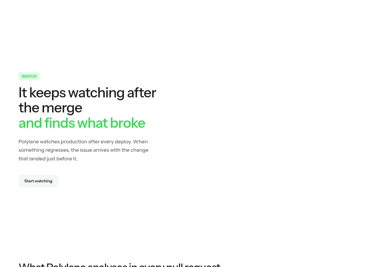
Design analysis
A second benefit section mirrors the editorial rhythm while explaining continuous monitoring after a change is merged.
Prompt preview
## Reference images

Study these alongside the description below: hierarchy, rhythm, spacing, colour. Build for the product you are asked about, using this design language.

- Component: https://kage-design-assets.t3.tigrisfiles.io/components/polylane-impact-analysis/878f0a8a-6be5-46ae-8786-d3cb31a469c0-1792130547-6.webp
- Full page it was cut from: https://kage-design-assets.t3.tigrisfiles.io/screenshots/polylane-impact-analysis/878f0a8a-6be5-46ae-8786-d3cb31a469c0-1792130477581-full.webp
- Component on Kage: https://kage.design/component/polylane-impact-analysis-feature-grid-3

## Before you start
Ask what happens after the user's product is used or deployed, and ask for the user's brand colours. Then apply this editorial feature pattern to that workflow.

Build a spacious single-message feature section with a left-aligned narrow text block. Include a small status eyebrow, a large 42–50px heading with one accent-green line, a concise paragraph, and a soft secondary button. Use a white canvas, large top and bottom whitespace, max-width 812px, and a layout that can accommodate an optional product visual on the opposite side or below on mobile. Keep all text aligned to the same content grid and use an 8px spacing rhythm. Make the monitoring concept feel continuous through subtle status indicators or a small timeline, not decorative clutter.

Never: use logos, product names, copy, illustrations, or imagery from the reference.
More components

 Data-to-action engine
Salience · Feature grid
Data-to-action engine
Salience · Feature grid
 Actionable alert workflow
Salience · Feature grid
Actionable alert workflow
Salience · Feature grid
 Trust proof and core outcomes
Salience · Feature grid
Trust proof and core outcomes
Salience · Feature grid
 Three-step implementation flow
Salience · Feature grid
Three-step implementation flow
Salience · Feature grid
 What analytics misses
Salience · Feature grid
What analytics misses
Salience · Feature grid

 Workflow features and capabilities
CrewTower Mod for Claude Code · Feature grid
Workflow features and capabilities
CrewTower Mod for Claude Code · Feature grid