 kage
kage
polylane.com
Design analysis
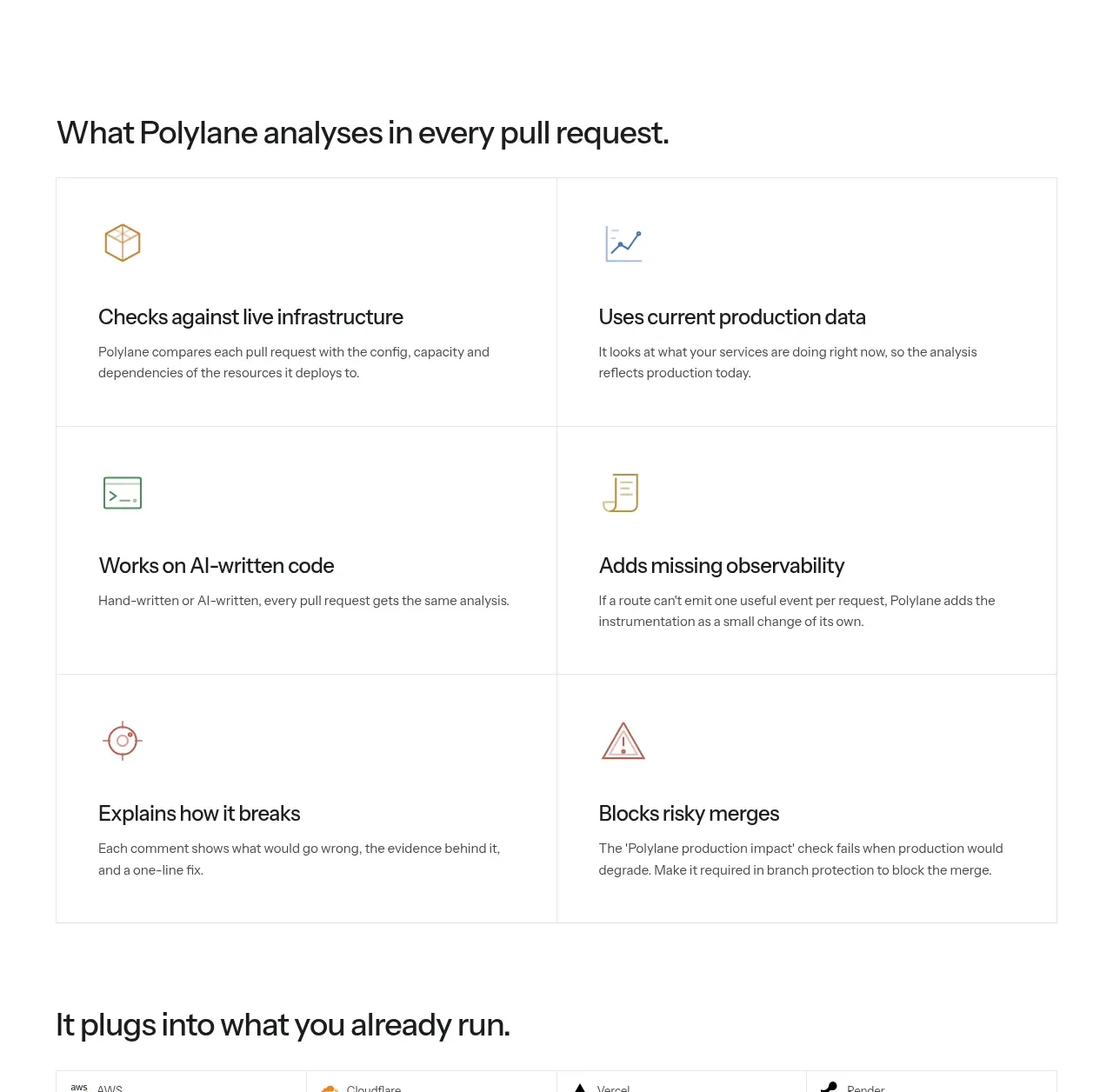
A six-item two-column grid turns the product promise into scannable capabilities, with simple line icons and concise explanations.
Prompt preview
## Reference images

Study these alongside the description below: hierarchy, rhythm, spacing, colour. Build for the product you are asked about, using this design language.

- Component: https://kage-design-assets.t3.tigrisfiles.io/components/polylane-impact-analysis/878f0a8a-6be5-46ae-8786-d3cb31a469c0-1792130547-7.webp
- Full page it was cut from: https://kage-design-assets.t3.tigrisfiles.io/screenshots/polylane-impact-analysis/878f0a8a-6be5-46ae-8786-d3cb31a469c0-1792130477581-full.webp
- Component on Kage: https://kage.design/component/polylane-impact-analysis-feature-grid-4

## Before you start
Ask what capabilities matter most for the user's product and brand, then create a six-item information architecture that is original to it.

Build a section with a left-aligned heading above a bordered two-column grid. Use six equal cards in three rows, each with a small simple line icon, a 19–22px title, and a 13–15px description. Give every cell consistent 34–40px padding, 1px dividers in #e7e8e5, and no heavy shadows. Use a near-black heading around 28–34px, charcoal body text, and a restrained accent palette for icons; reserve bright green (#27d35c) for emphasis. Keep rows equal height, align icon/title baselines, and make cards stack into one column on mobile. Include hover feedback only as a subtle background tint or border change.

Never: use logos, product names, copy, illustrations, or imagery from the reference.
More components

 Data-to-action engine
Salience · Feature grid
Data-to-action engine
Salience · Feature grid
 Actionable alert workflow
Salience · Feature grid
Actionable alert workflow
Salience · Feature grid
 Trust proof and core outcomes
Salience · Feature grid
Trust proof and core outcomes
Salience · Feature grid
 Three-step implementation flow
Salience · Feature grid
Three-step implementation flow
Salience · Feature grid
 What analytics misses
Salience · Feature grid
What analytics misses
Salience · Feature grid

 Workflow features and capabilities
CrewTower Mod for Claude Code · Feature grid
Workflow features and capabilities
CrewTower Mod for Claude Code · Feature grid