 kage
kage
portfolioframe.com
Design analysis
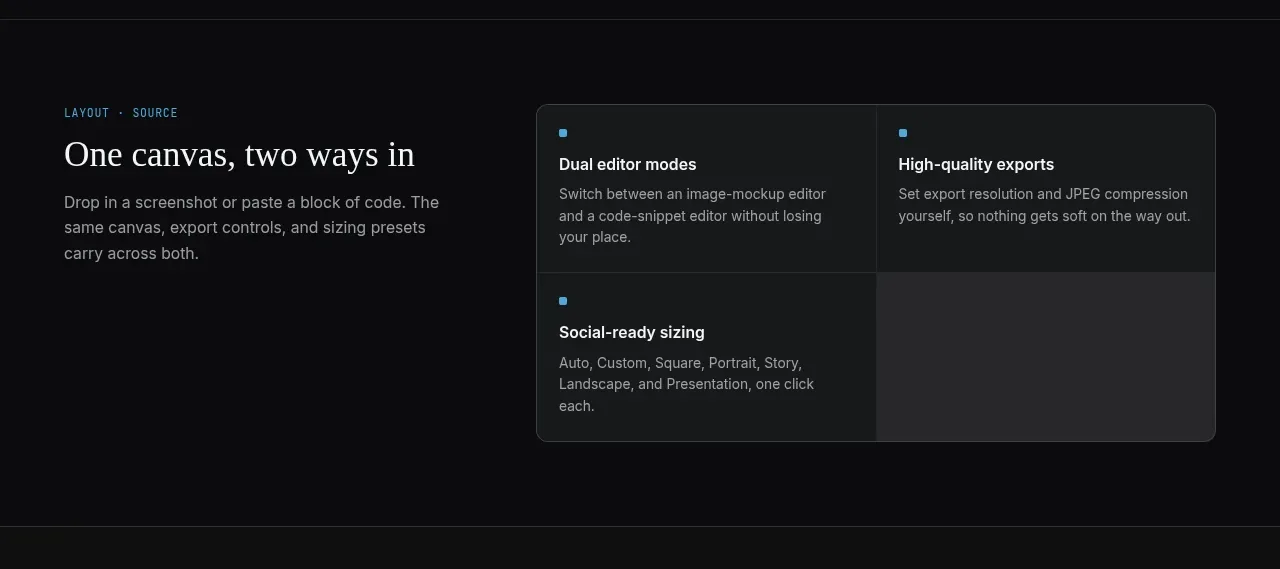
A concise feature band introduces the first product category with a left-aligned explanation and a bordered two-column feature matrix on the right.
Prompt preview
## Reference images

Study these alongside the description below: hierarchy, rhythm, spacing, colour. Build for the product you are asked about, using this design language.

- Component: https://kage-design-assets.t3.tigrisfiles.io/components/portfolio-frame/48220de1-a18c-43ab-aca5-f2ed5e4c7799-1789538572-2.webp
- Full page it was cut from: https://kage-design-assets.t3.tigrisfiles.io/screenshots/portfolio-frame/48220de1-a18c-43ab-aca5-f2ed5e4c7799-1789538513158-full.webp
- Component on Kage: https://kage.design/component/portfolio-frame-feature-grid

## Before you start
Ask what the user's product and brand are, then apply the principles below to that product rather than reproducing the reference.

Build a dark feature section with a left text block occupying roughly 38% and a right two-column grid occupying the rest. Include a small mono eyebrow, an editorial section heading, and two or three lines of supporting copy. The feature grid should be a single rounded container with a 1px #303536 border, dark #171a1b fill, and internal dividers; each cell gets a tiny blue square marker, a bold 14px title, and compact muted description. Maintain 28–36px section padding and align all content to a shared horizontal rail. Use #0b0d0d page background, #8d9397 secondary text, #f0f1f2 headings, and #55b2e4 accent. Stack the columns on narrow screens.

Never:
- use logos, product names, copy, illustrations, or imagery from the reference
- reproduce the same feature names or number of cells
- add decorative graphics that compete with the information hierarchy
More components

 Authentication product capabilities
tiun. · Feature grid
Authentication product capabilities
tiun. · Feature grid
 Customer data and user management
tiun. · Feature grid
Customer data and user management
tiun. · Feature grid
 Problem and unified solution narrative
tiun. · Feature grid
Problem and unified solution narrative
tiun. · Feature grid
 Integration and agent workflow
tiun. · Feature grid
Integration and agent workflow
tiun. · Feature grid
 Billing and checkout capabilities
tiun. · Feature grid
Billing and checkout capabilities
tiun. · Feature grid

 Receiving money channels
Payflip · Feature grid
Receiving money channels
Payflip · Feature grid