 kage
kage
portfolioframe.com
Design analysis
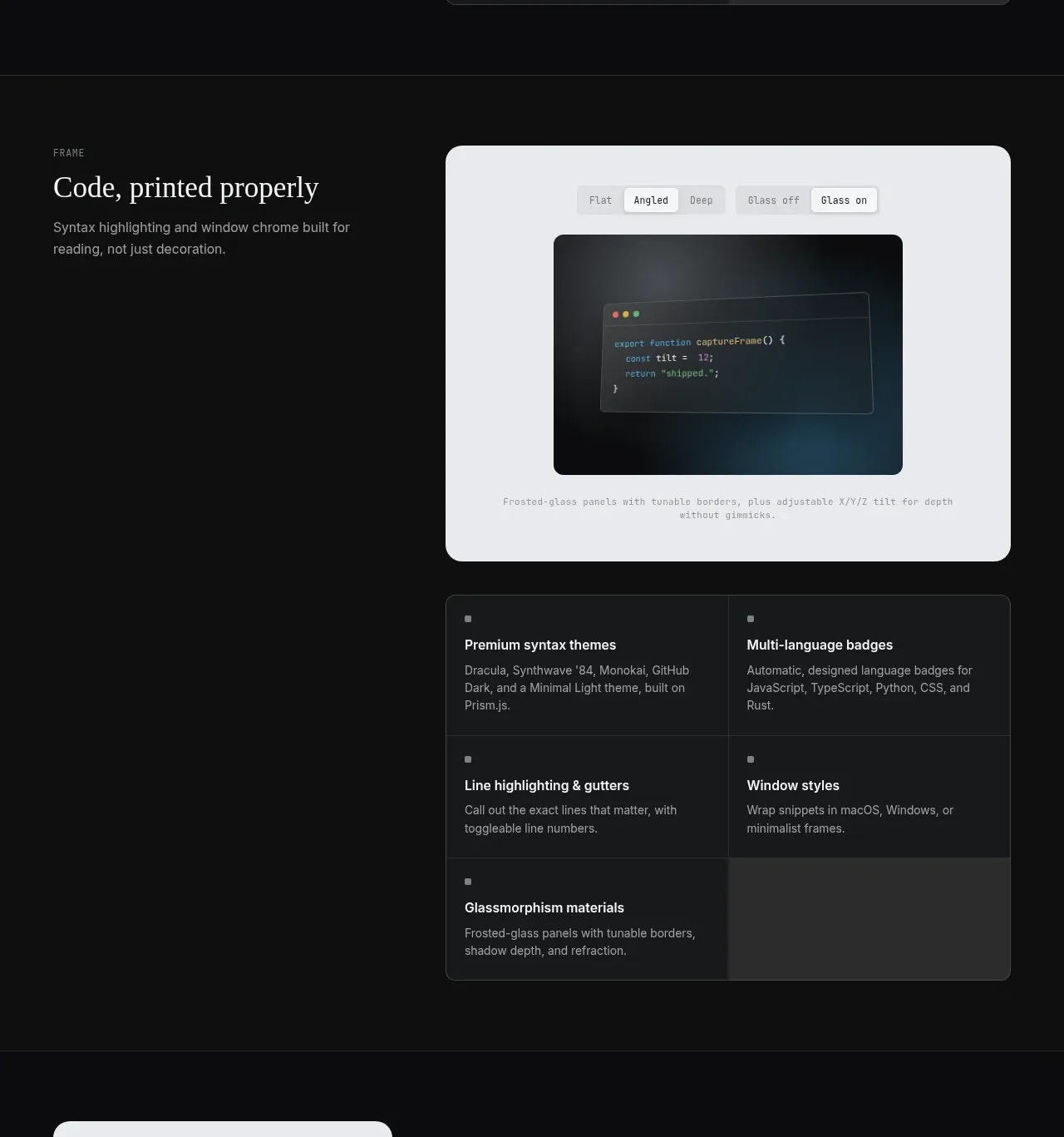
This taller section combines a code-focused heading, a large light preview canvas with controls, and a second feature matrix beneath it to demonstrate depth and configurability.
Prompt preview
## Reference images

Study these alongside the description below: hierarchy, rhythm, spacing, colour. Build for the product you are asked about, using this design language.

- Component: https://kage-design-assets.t3.tigrisfiles.io/components/portfolio-frame/48220de1-a18c-43ab-aca5-f2ed5e4c7799-1789538573-3.webp
- Full page it was cut from: https://kage-design-assets.t3.tigrisfiles.io/screenshots/portfolio-frame/48220de1-a18c-43ab-aca5-f2ed5e4c7799-1789538513158-full.webp
- Component on Kage: https://kage.design/component/portfolio-frame-feature-grid-2

## Before you start
Ask what the user's product and brand are, then apply the principles below to that product rather than reproducing the reference.

Create a two-part product feature section on a dark background. At the top, align a text column on the left with a large rounded demonstration canvas on the right. The canvas should be light gray #e8eaee with a 14px radius, a small segmented control row, a dark embedded preview, and a tiny explanatory caption; it should feel like a real tool state rather than a decorative image. Beneath it, place a full-width two-column feature grid using charcoal #171a1b, subtle #303536 borders, square corners or a 10px radius, and compact typography. Give the section generous vertical whitespace and keep the text/preview edges aligned to the same grid. Controls should have selected states, hover states, and accessible labels; preview changes may be simulated locally. On mobile stack text, preview, and grid.

Never:
- use logos, product names, copy, illustrations, or imagery from the reference
- reuse the reference code, screenshots, or exact control labels
- treat a static decoration as an interactive control without feedback
More components

 Authentication product capabilities
tiun. · Feature grid
Authentication product capabilities
tiun. · Feature grid
 Customer data and user management
tiun. · Feature grid
Customer data and user management
tiun. · Feature grid
 Problem and unified solution narrative
tiun. · Feature grid
Problem and unified solution narrative
tiun. · Feature grid
 Integration and agent workflow
tiun. · Feature grid
Integration and agent workflow
tiun. · Feature grid
 Billing and checkout capabilities
tiun. · Feature grid
Billing and checkout capabilities
tiun. · Feature grid

 Receiving money channels
Payflip · Feature grid
Receiving money channels
Payflip · Feature grid