 kage
kage
portfolioframe.com
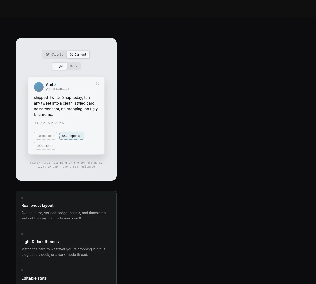
Design analysis
A left-positioned light social-card preview is paired with a vertical stack of explanatory feature cards, creating visual variety while communicating output formats and controls.
Prompt preview
## Reference images

Study these alongside the description below: hierarchy, rhythm, spacing, colour. Build for the product you are asked about, using this design language.

- Component: https://kage-design-assets.t3.tigrisfiles.io/components/portfolio-frame/48220de1-a18c-43ab-aca5-f2ed5e4c7799-1789538573-4.webp
- Full page it was cut from: https://kage-design-assets.t3.tigrisfiles.io/screenshots/portfolio-frame/48220de1-a18c-43ab-aca5-f2ed5e4c7799-1789538513158-full.webp
- Component on Kage: https://kage.design/component/portfolio-frame-feature-grid-3

## Before you start
Ask what the user's product and brand are, then apply the principles below to that product rather than reproducing the reference.

Build a dark showcase section with a compact light mockup canvas on the left and a narrow stacked feature list beneath or beside it. Use the mockup as a responsive, believable content card with a pale #e7e9ed surface, soft shadow, small toolbar chips, and a centered inner card; use generic placeholder content relevant to the user's product. The supporting cards should use #171a1b, 1px #2d3233 borders, 10–12px radius, a small square marker, bold title, and 2–3 lines of muted text. Preserve a large empty area on the opposite side if the composition benefits from asymmetry, but keep the section visually balanced through alignment and whitespace. Add subtle chip selected states and responsive stacking.

Never:
- use logos, product names, copy, illustrations, or imagery from the reference
- recreate the reference social network post or its text
- fill empty space with unrelated decorative art
More components

 Authentication product capabilities
tiun. · Feature grid
Authentication product capabilities
tiun. · Feature grid
 Customer data and user management
tiun. · Feature grid
Customer data and user management
tiun. · Feature grid
 Problem and unified solution narrative
tiun. · Feature grid
Problem and unified solution narrative
tiun. · Feature grid
 Integration and agent workflow
tiun. · Feature grid
Integration and agent workflow
tiun. · Feature grid
 Billing and checkout capabilities
tiun. · Feature grid
Billing and checkout capabilities
tiun. · Feature grid

 Receiving money channels
Payflip · Feature grid
Receiving money channels
Payflip · Feature grid