 kage
kage
portfolioframe.com
Design analysis
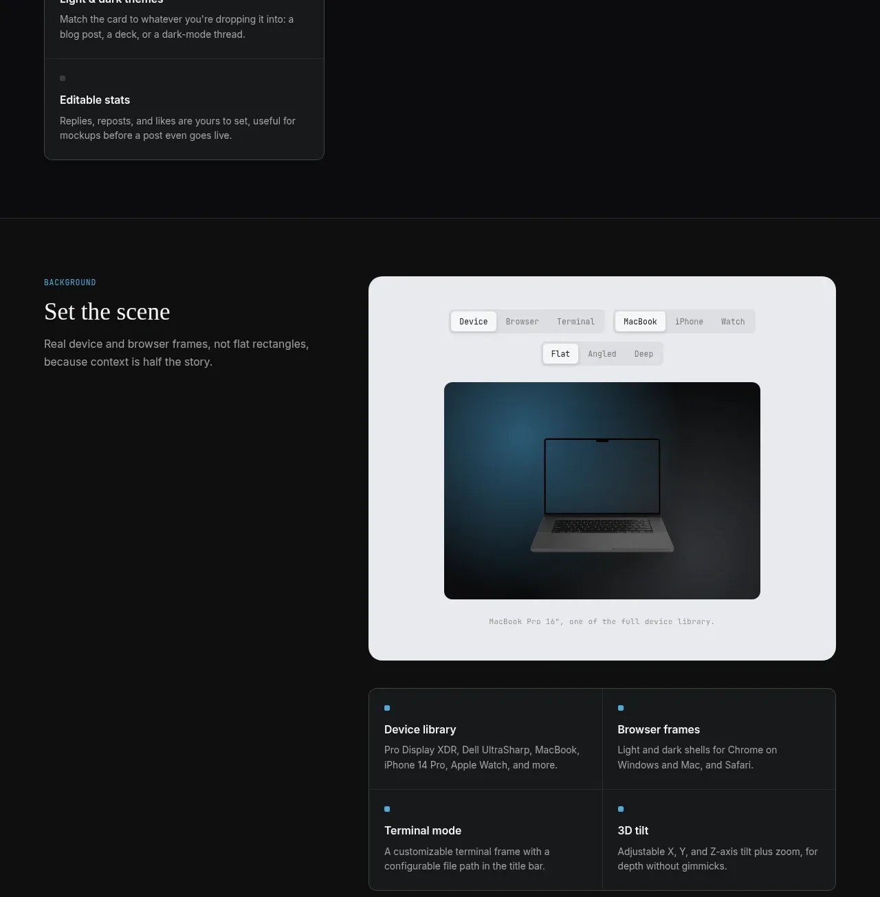
This section explains contextual device and browser framing through a large light preview and a four-cell capability grid below it.
Prompt preview
## Reference images

Study these alongside the description below: hierarchy, rhythm, spacing, colour. Build for the product you are asked about, using this design language.

- Component: https://kage-design-assets.t3.tigrisfiles.io/components/portfolio-frame/48220de1-a18c-43ab-aca5-f2ed5e4c7799-1789538573-5.webp
- Full page it was cut from: https://kage-design-assets.t3.tigrisfiles.io/screenshots/portfolio-frame/48220de1-a18c-43ab-aca5-f2ed5e4c7799-1789538513158-full.webp
- Component on Kage: https://kage.design/component/portfolio-frame-feature-grid-4

## Before you start
Ask what the user's product and brand are, then apply the principles below to that product rather than reproducing the reference.

Create a dark product showcase with a left-side heading block and a large pale preview canvas on the right. Inside the canvas, place compact device-type and perspective segmented controls above a dark media viewport, then add a small caption. The canvas uses #e9ebef, 14px radius, soft shadow, and generous inner padding; controls use white and #d9dde2 surfaces with a clear selected state. Below, add a two-by-two feature grid aligned to the preview width, with charcoal fill, fine borders, and blue square markers. Keep the hierarchy quiet and technical: mono eyebrow, editorial heading, muted body copy, dense but readable feature text. Make the controls keyboard accessible and ensure the layout collapses vertically on mobile.

Never:
- use logos, product names, copy, illustrations, or imagery from the reference
- use the same device names, screenshot, or exact interface
- imply controls work without implementing a basic state change
More components

 Authentication product capabilities
tiun. · Feature grid
Authentication product capabilities
tiun. · Feature grid
 Customer data and user management
tiun. · Feature grid
Customer data and user management
tiun. · Feature grid
 Problem and unified solution narrative
tiun. · Feature grid
Problem and unified solution narrative
tiun. · Feature grid
 Integration and agent workflow
tiun. · Feature grid
Integration and agent workflow
tiun. · Feature grid
 Billing and checkout capabilities
tiun. · Feature grid
Billing and checkout capabilities
tiun. · Feature grid

 Receiving money channels
Payflip · Feature grid
Receiving money channels
Payflip · Feature grid