 kage
kage
portfolioframe.com
Design analysis
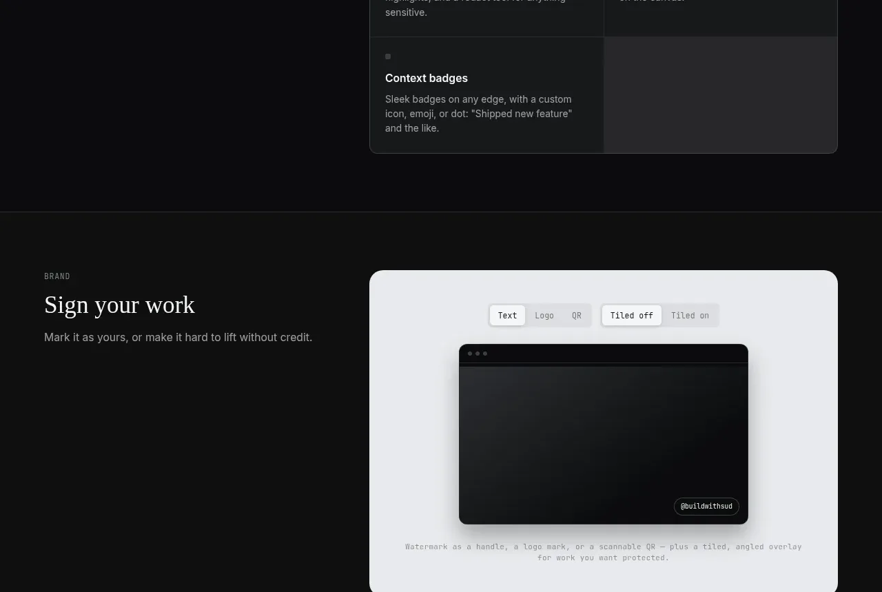
The branding section uses a large protected-preview canvas and a compact two-column list to explain watermark flexibility without requiring a separate call to action.
Prompt preview
## Reference images

Study these alongside the description below: hierarchy, rhythm, spacing, colour. Build for the product you are asked about, using this design language.

- Component: https://kage-design-assets.t3.tigrisfiles.io/components/portfolio-frame/48220de1-a18c-43ab-aca5-f2ed5e4c7799-1789538574-7.webp
- Full page it was cut from: https://kage-design-assets.t3.tigrisfiles.io/screenshots/portfolio-frame/48220de1-a18c-43ab-aca5-f2ed5e4c7799-1789538513158-full.webp
- Component on Kage: https://kage.design/component/portfolio-frame-feature-grid-6

## Before you start
Ask what the user's product and brand are, then apply the principles below to that product rather than reproducing the reference.

Design a dark brand-protection feature band with a left text column and a pale preview canvas on the right. Include a small toolbar for watermark mode and placement, a dark media area, and a subtle generic watermark treatment inside it. Use a #e8eaee canvas with 14px radius, soft shadow, and a clear inset hierarchy; use dark charcoal cards and thin #303536 dividers for the two supporting features below. Keep headings editorial and body text muted, with a small blue-gray mono eyebrow. Toolbar controls should visibly toggle and should be usable with keyboard and touch. On mobile, stack the description, preview, and supporting cards.

Never:
- use logos, product names, copy, illustrations, or imagery from the reference
- reproduce any reference watermark, handle, or exact preview
- make the watermark so strong that it distracts from the content
More components

 Authentication product capabilities
tiun. · Feature grid
Authentication product capabilities
tiun. · Feature grid
 Customer data and user management
tiun. · Feature grid
Customer data and user management
tiun. · Feature grid
 Problem and unified solution narrative
tiun. · Feature grid
Problem and unified solution narrative
tiun. · Feature grid
 Integration and agent workflow
tiun. · Feature grid
Integration and agent workflow
tiun. · Feature grid
 Billing and checkout capabilities
tiun. · Feature grid
Billing and checkout capabilities
tiun. · Feature grid

 Receiving money channels
Payflip · Feature grid
Receiving money channels
Payflip · Feature grid