kage
kage
portfolioframe.com
Design analysis
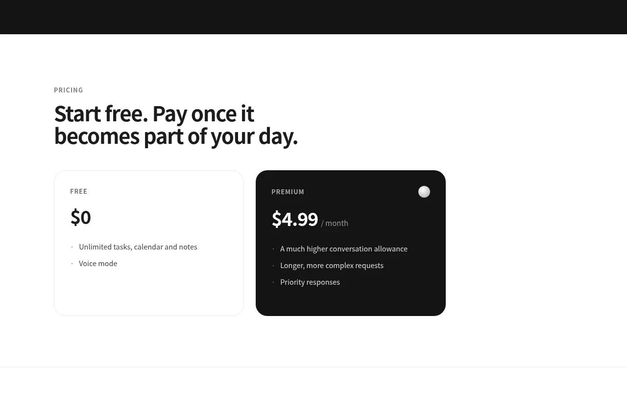
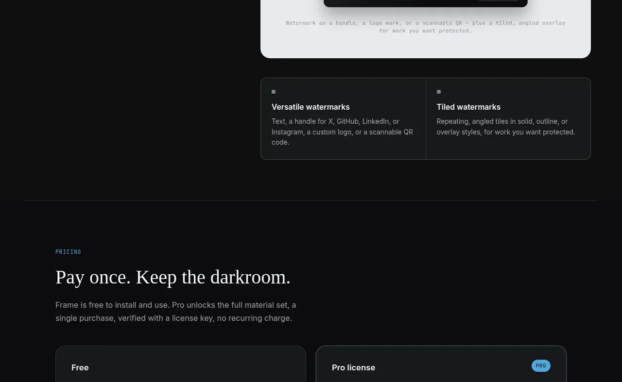
A clear pricing section opens with a value-oriented heading, then compares two large plan cards with feature lists and distinct actions; the paid option is visually emphasized.
Prompt preview
## Reference images

Study these alongside the description below: hierarchy, rhythm, spacing, colour. Build for the product you are asked about, using this design language.

- Component: https://kage-design-assets.t3.tigrisfiles.io/components/portfolio-frame/48220de1-a18c-43ab-aca5-f2ed5e4c7799-1789538574-8.webp
- Full page it was cut from: https://kage-design-assets.t3.tigrisfiles.io/screenshots/portfolio-frame/48220de1-a18c-43ab-aca5-f2ed5e4c7799-1789538513158-full.webp
- Component on Kage: https://kage.design/component/portfolio-frame-pricing-table

## Before you start
Ask what the user's product and brand are, then apply the principles below to that product rather than reproducing the reference.

Build a pricing section on a nearly black background with a centered max-width rail. Start with a small mono eyebrow, an editorial heading, and concise explanation of the pricing model. Below, place two equal-width plan cards in a responsive grid. Each card has a plan name, price, short summary, bulleted benefits, and a bottom-aligned full-width button so the cards remain comparable. Use #181b1c cards, #303536 borders, 12–16px radius, #f1f2f3 headings, #92989b text, and a bright #52afe1 primary button. Give the paid card a subtle accent border or small badge, not an excessive glow. Ensure plan actions and any billing/payment note are clearly legible, with mobile cards stacked.

Never:
- use logos, product names, copy, illustrations, or imagery from the reference
- reuse the reference prices, plan names, or feature lists
- use scarcity or misleading urgency