kage
kage
postsider.com
Design analysis
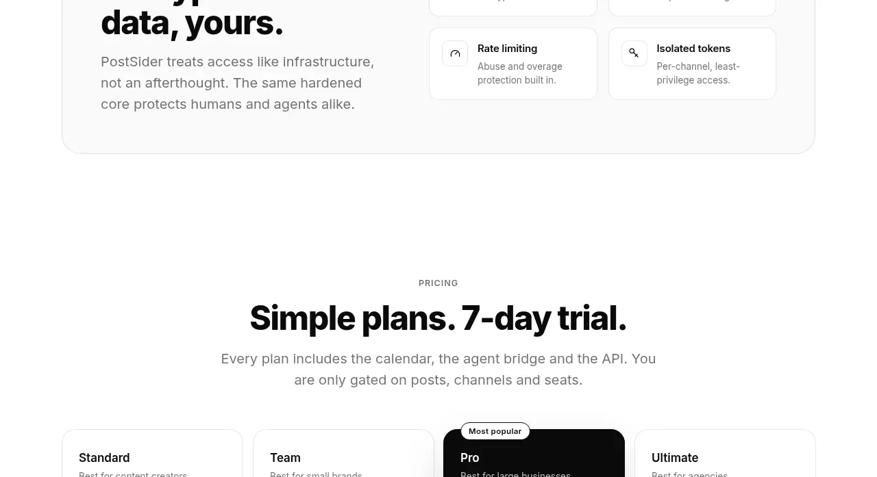
A single large rounded card puts a strong security headline and explanation beside a compact four-item protection matrix.
Prompt preview
## Reference images

Study these alongside the description below: hierarchy, rhythm, spacing, colour. Build for the product you are asked about, using this design language.

- Component: https://kage-design-assets.t3.tigrisfiles.io/components/postsider/9db522ee-ab56-4492-bd61-aeca6aa2f318-1790057109-7.webp
- Full page it was cut from: https://kage-design-assets.t3.tigrisfiles.io/screenshots/postsider/9db522ee-ab56-4492-bd61-aeca6aa2f318-1790056967277-full.webp
- Component on Kage: https://kage.design/component/postsider-card

## Before you start
Ask what security, privacy, compliance, or reliability guarantees the user's product can substantiate. Use those real claims and the user's brand system.

Build a wide security feature card on a quiet white or #fafafa section background. Use a two-column layout: left has a small uppercase label, a 34–40px multi-line headline, and muted explanatory paragraph; right has a 2×2 matrix of compact feature cells. Each cell includes a tiny line icon, a concise title, and one short supporting sentence. Use a 1px #ededed outer border, 16px radius, subtle shadow, and internal dividers or consistent gaps. Keep the tone calm and evidence-oriented, with responsive stacking on narrow screens.

Never: use logos, product names, copy, illustrations, or imagery from the reference.