 kage
kage
postsider.com
Design analysis
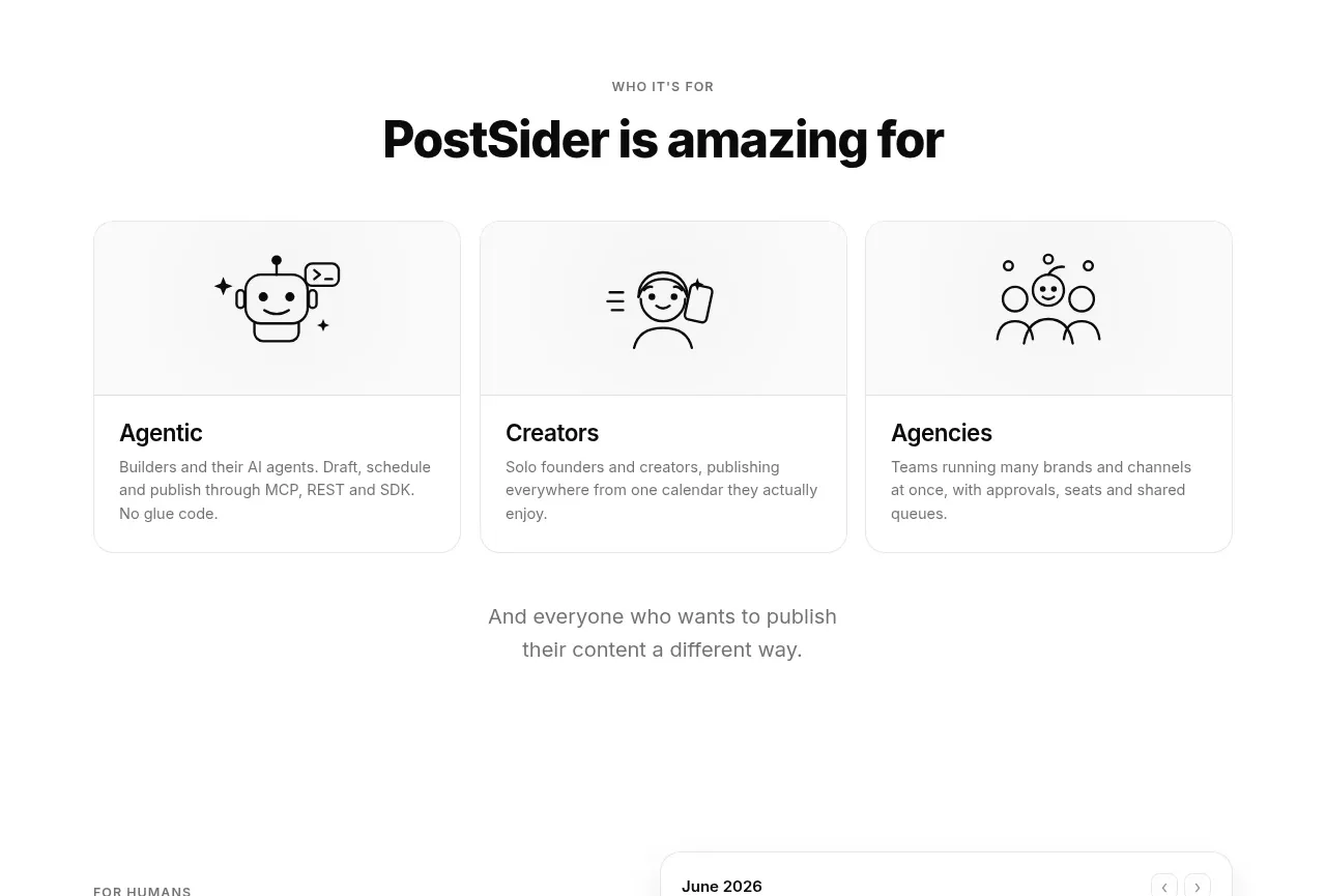
A short eyebrow and centered heading introduce three equal cards for distinct user groups, with simple line illustrations and concise descriptions.
Prompt preview
## Reference images

Study these alongside the description below: hierarchy, rhythm, spacing, colour. Build for the product you are asked about, using this design language.

- Component: https://kage-design-assets.t3.tigrisfiles.io/components/postsider/9db522ee-ab56-4492-bd61-aeca6aa2f318-1790057107-2.webp
- Full page it was cut from: https://kage-design-assets.t3.tigrisfiles.io/screenshots/postsider/9db522ee-ab56-4492-bd61-aeca6aa2f318-1790056967277-full.webp
- Component on Kage: https://kage.design/component/postsider-feature-grid

## Before you start
Ask which audiences the user's product serves and what actions matter to each one. Apply the structure to those audiences with the user's brand system.

Build a centered audience-segmentation section on white. Add a tiny uppercase eyebrow, a bold 30–36px heading, and three equal cards in a responsive grid. Each card should have a shallow visual header with an original abstract line icon, then a divider, audience title, and two-line explanatory copy. Use #fafafa or white cards, a 1px #eeeeee border, 12–16px radius, and restrained shadows only on hover. Keep card heights equal, align titles and descriptions consistently, and add a concluding centered sentence below the grid. Use near-black headings, #666 body text, and generous vertical whitespace.

Never: use logos, product names, copy, illustrations, or imagery from the reference.
More components

 Spend visibility and daily-cost breakdown
Subscrr · Feature grid
Spend visibility and daily-cost breakdown
Subscrr · Feature grid
 Reminders and simple setup flow
Subscrr · Feature grid
Reminders and simple setup flow
Subscrr · Feature grid

 Security and permissions cards
NotchPop · Feature grid
Security and permissions cards
NotchPop · Feature grid
 Focused feature cards
NotchPop · Feature grid
Focused feature cards
NotchPop · Feature grid
 Interactive product demonstration
NotchPop · Feature grid
Interactive product demonstration
NotchPop · Feature grid
 Quiet information cards
NotchPop · Feature grid
Quiet information cards
NotchPop · Feature grid