 kage
kage
postsider.com
Design analysis
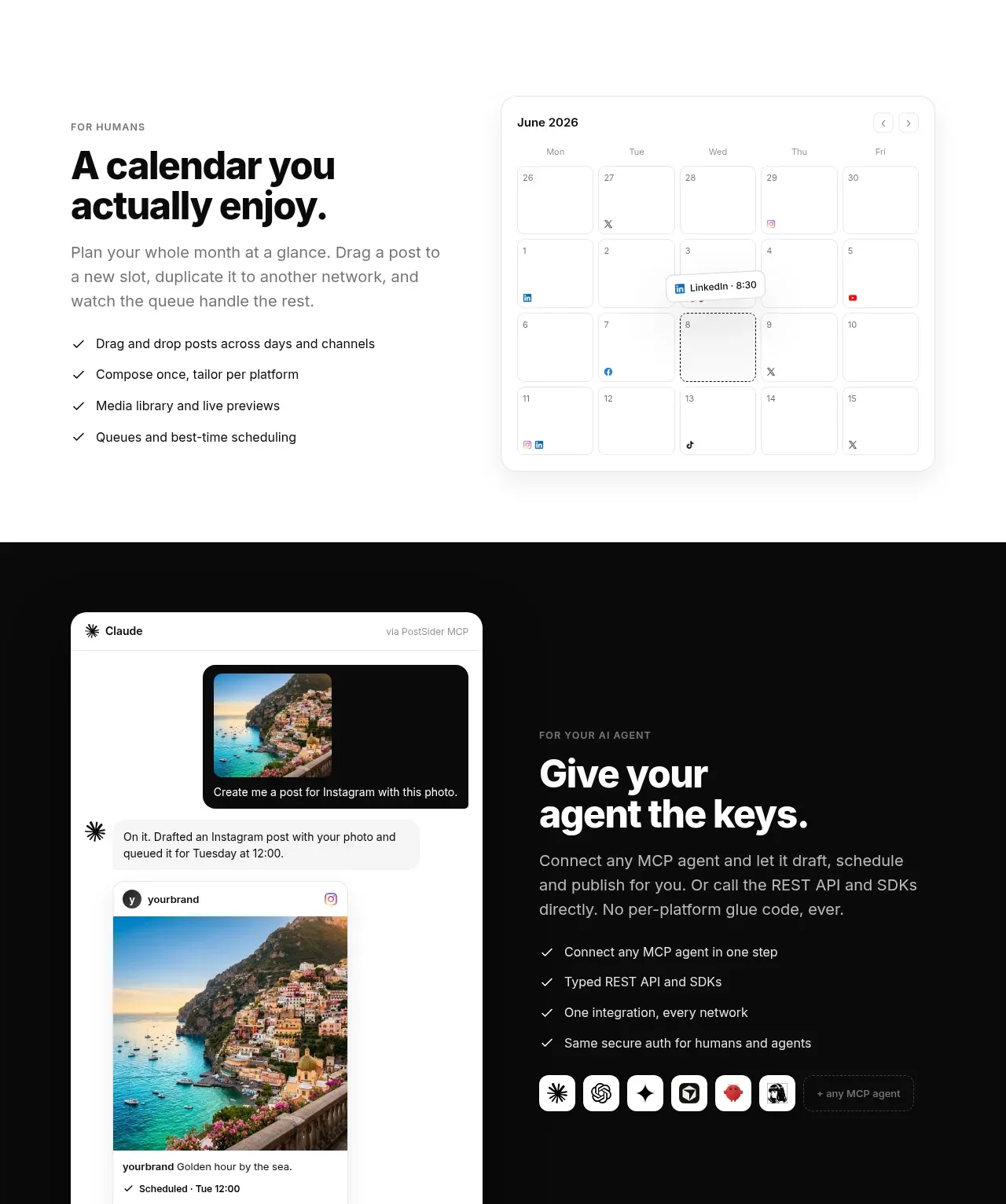
This product-capability band uses a text-and-checklist column beside a calendar visual, then transitions into a dark agent integration panel with a conversational preview.
Prompt preview
## Reference images

Study these alongside the description below: hierarchy, rhythm, spacing, colour. Build for the product you are asked about, using this design language.

- Component: https://kage-design-assets.t3.tigrisfiles.io/components/postsider/9db522ee-ab56-4492-bd61-aeca6aa2f318-1790057107-3.webp
- Full page it was cut from: https://kage-design-assets.t3.tigrisfiles.io/screenshots/postsider/9db522ee-ab56-4492-bd61-aeca6aa2f318-1790056967277-full.webp
- Component on Kage: https://kage.design/component/postsider-feature-grid-2

## Before you start
Ask what the user's core workflow is, what human task it simplifies, and how automation or agents participate. Build an original version for that product.

Create a two-part capability section. First use a 50/50 split: left-aligned eyebrow, strong 34–42px heading, muted explanation, and four compact checkmarked benefits; on the right place a large calendar or workflow UI mockup in a rounded white frame. Then use a full-width near-black #0b0b0b band with a split layout: an original chat/task preview in a light rounded device-like panel on the left and an explanatory heading, paragraph, checklist, and small integration chips on the right. Maintain a high-contrast inversion, generous padding, 18px radius, and subtle grid/noise texture only if it supports legibility. The dark panel should feel like a proof-of-capability moment, not a decorative banner.

Never: use logos, product names, copy, illustrations, or imagery from the reference.
More components

 Spend visibility and daily-cost breakdown
Subscrr · Feature grid
Spend visibility and daily-cost breakdown
Subscrr · Feature grid
 Reminders and simple setup flow
Subscrr · Feature grid
Reminders and simple setup flow
Subscrr · Feature grid

 Security and permissions cards
NotchPop · Feature grid
Security and permissions cards
NotchPop · Feature grid
 Focused feature cards
NotchPop · Feature grid
Focused feature cards
NotchPop · Feature grid
 Interactive product demonstration
NotchPop · Feature grid
Interactive product demonstration
NotchPop · Feature grid
 Quiet information cards
NotchPop · Feature grid
Quiet information cards
NotchPop · Feature grid