 kage
kage
postsider.com
Design analysis
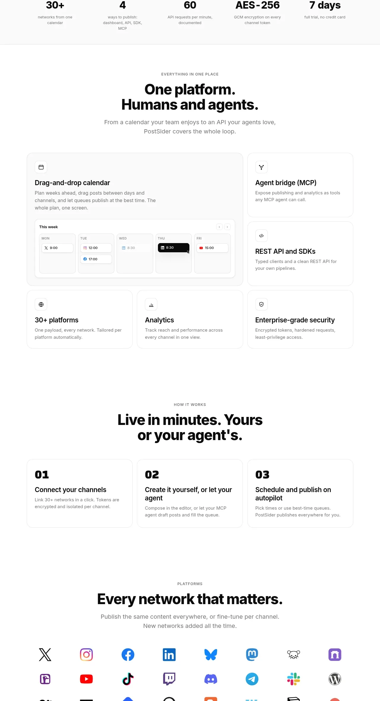
A centered platform overview combines a large featured calendar card, smaller capability cards, a three-step workflow, and a platform-focused follow-on heading.
Prompt preview
## Reference images

Study these alongside the description below: hierarchy, rhythm, spacing, colour. Build for the product you are asked about, using this design language.

- Component: https://kage-design-assets.t3.tigrisfiles.io/components/postsider/9db522ee-ab56-4492-bd61-aeca6aa2f318-1790057108-5.webp
- Full page it was cut from: https://kage-design-assets.t3.tigrisfiles.io/screenshots/postsider/9db522ee-ab56-4492-bd61-aeca6aa2f318-1790056967277-full.webp
- Component on Kage: https://kage.design/component/postsider-feature-grid-3

## Before you start
Ask what the user's product's three to six core capabilities are and what the shortest successful user journey looks like. Translate those answers into this layout pattern.

Build a capabilities section with a centered eyebrow, bold two-line heading, and muted subtitle. Use a responsive asymmetric grid: one large featured card showing an original UI preview, two stacked cards for adjacent capabilities, and a bottom row of three equal cards. Give cards white surfaces, #ededed borders, 14px radius, compact line icons, strong 17–20px titles, and concise gray descriptions. Follow it with a separate “how it works” subsection: centered heading, then three equal numbered cards with oversized 01/02/03 labels, short titles, and supporting copy. Preserve a clear vertical rhythm and make the grid collapse to one column on mobile.

Never: use logos, product names, copy, illustrations, or imagery from the reference.
More components

 Spend visibility and daily-cost breakdown
Subscrr · Feature grid
Spend visibility and daily-cost breakdown
Subscrr · Feature grid
 Reminders and simple setup flow
Subscrr · Feature grid
Reminders and simple setup flow
Subscrr · Feature grid

 Security and permissions cards
NotchPop · Feature grid
Security and permissions cards
NotchPop · Feature grid
 Focused feature cards
NotchPop · Feature grid
Focused feature cards
NotchPop · Feature grid
 Interactive product demonstration
NotchPop · Feature grid
Interactive product demonstration
NotchPop · Feature grid
 Quiet information cards
NotchPop · Feature grid
Quiet information cards
NotchPop · Feature grid