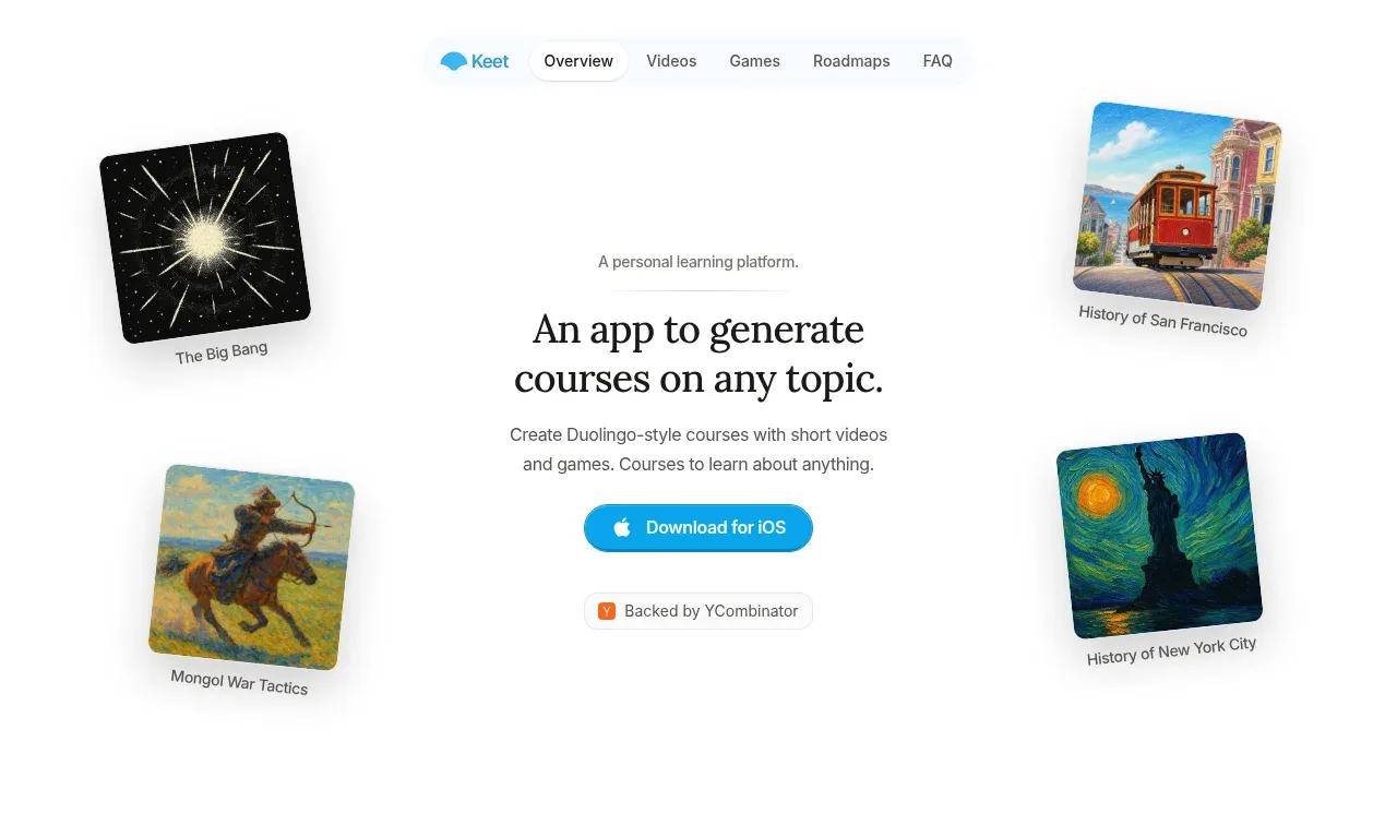
kage
kage
postsider.com
Design analysis
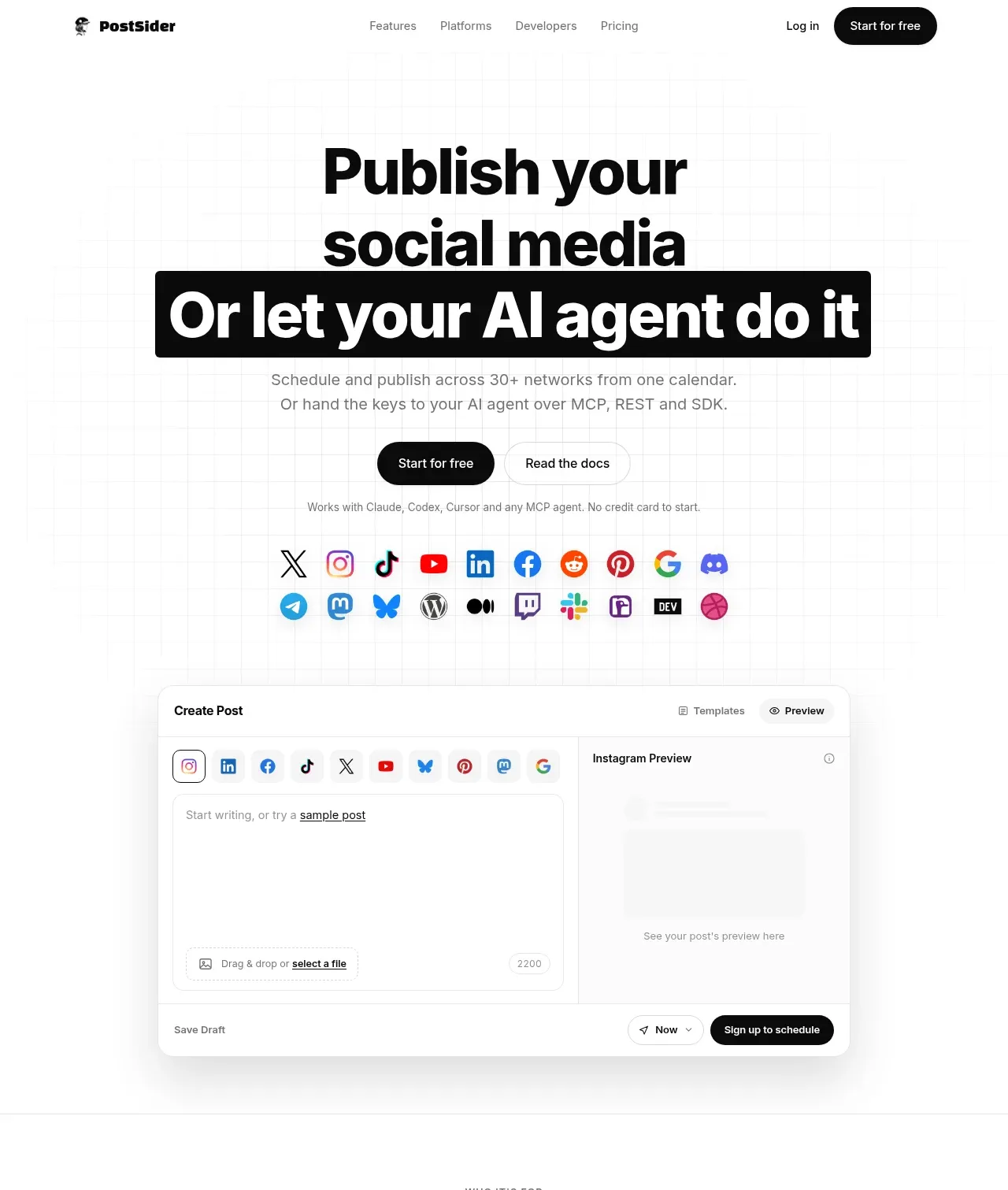
The hero pairs an oversized two-line promise and black highlighted AI statement with concise supporting copy, dual actions, platform icons, and a large product preview.
Prompt preview
## Reference images

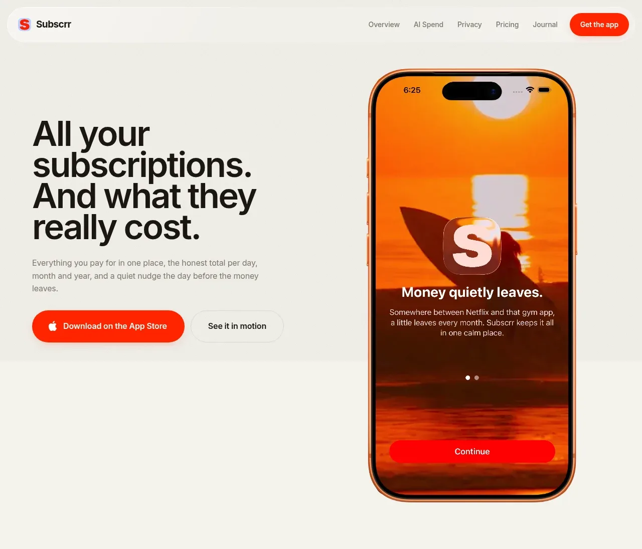
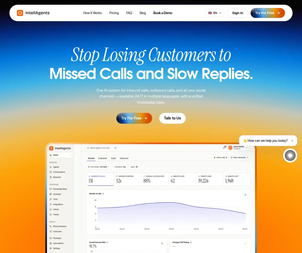
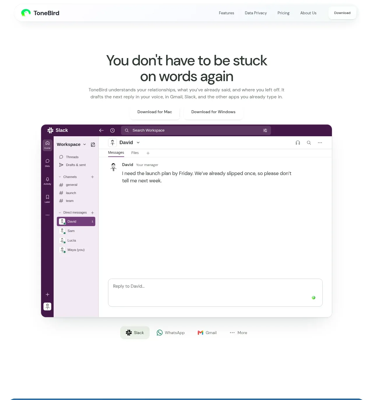
Study these alongside the description below: hierarchy, rhythm, spacing, colour. Build for the product you are asked about, using this design language.

- Component: https://kage-design-assets.t3.tigrisfiles.io/components/postsider/9db522ee-ab56-4492-bd61-aeca6aa2f318-1790057106-1.webp
- Full page it was cut from: https://kage-design-assets.t3.tigrisfiles.io/screenshots/postsider/9db522ee-ab56-4492-bd61-aeca6aa2f318-1790056967277-full.webp
- Component on Kage: https://kage.design/component/postsider-hero

## Before you start
Ask what the user's product does, who the ideal customer is, and what brand personality and visual assets are available. Design an original hero using these principles.

Create a centered SaaS hero directly below the navigation. Use a tall, airy white layout with a faint square grid texture behind the lower half. Set an oversized bold headline in near-black #080808, approximately 44–52px with tight line height, followed by a short supporting paragraph in muted gray #777. Emphasize one decisive phrase with a black rounded rectangle and white type. Place a dark primary pill CTA beside a light secondary text/button CTA, then a small reassurance line. Show a restrained two-row collection of small network/channel glyphs, followed by a large rounded product-interface preview: a light editor pane beside a preview pane, thin #ededed borders, 14–18px radius, and a soft shadow. Keep the entire composition centered and let the preview carry the visual proof. Make buttons keyboard accessible and add modest hover elevation.

Never: use logos, product names, copy, illustrations, or imagery from the reference.