 kage
kage
postsider.com
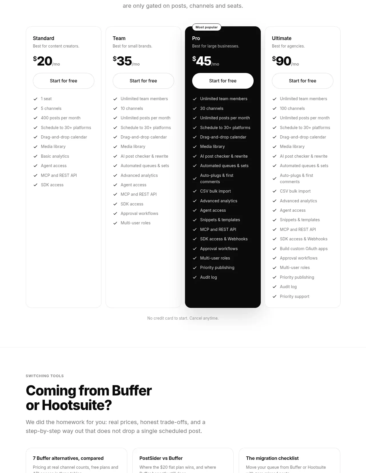
Design analysis
A centered pricing introduction leads into four tall plans, with one dark featured tier, repeated CTAs, and detailed checkmarked feature lists.
Prompt preview
## Reference images

Study these alongside the description below: hierarchy, rhythm, spacing, colour. Build for the product you are asked about, using this design language.

- Component: https://kage-design-assets.t3.tigrisfiles.io/components/postsider/9db522ee-ab56-4492-bd61-aeca6aa2f318-1790057109-8.webp
- Full page it was cut from: https://kage-design-assets.t3.tigrisfiles.io/screenshots/postsider/9db522ee-ab56-4492-bd61-aeca6aa2f318-1790056967277-full.webp
- Component on Kage: https://kage.design/component/postsider-pricing-table

## Before you start
Ask about the user's pricing model, audience segments, billing cadence, trial policy, and which plan should be recommended. Apply the design principles without copying the reference's plan names or prices.

Build a four-column pricing table beneath a centered eyebrow, bold heading, and short subtitle. Give every plan a consistent structure: plan label, audience hint, prominent price, billing suffix, full-width pill CTA, and a vertically spaced checkmarked feature list. Highlight one recommended plan using a near-black #0b0b0b background, white text, and a small floating “recommended” badge; keep the others white with #e8e8e8 borders. Use 14–16px card radii, equal column heights, aligned CTAs, and clear comparison density. Add a small trial/no-card reassurance beneath the table. On mobile, stack cards or provide an accessible horizontal comparison with the recommended tier first.

Never: use logos, product names, copy, illustrations, or imagery from the reference.
More components
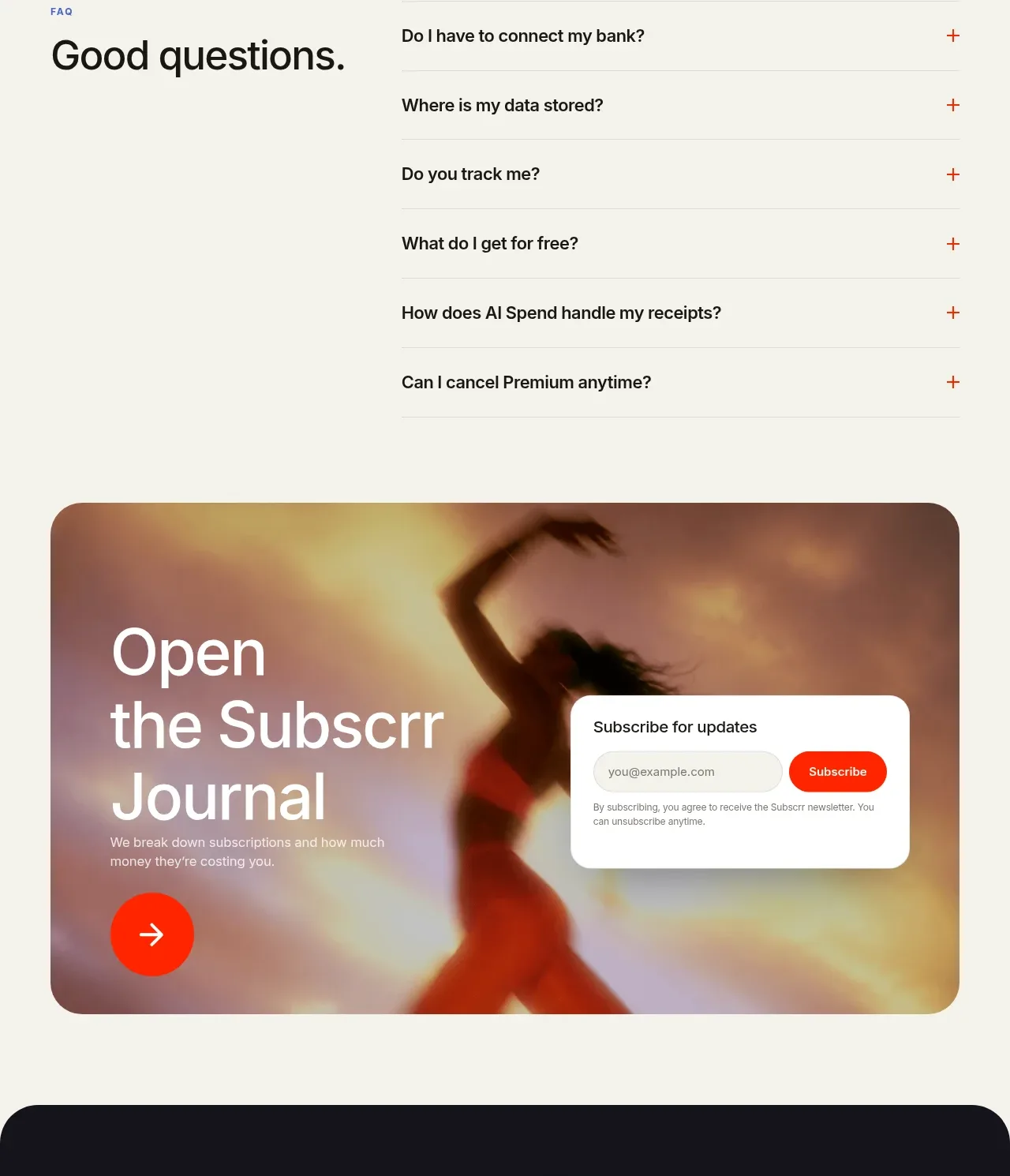
 Free and premium pricing comparison
Subscrr · Pricing table
Free and premium pricing comparison
Subscrr · Pricing table
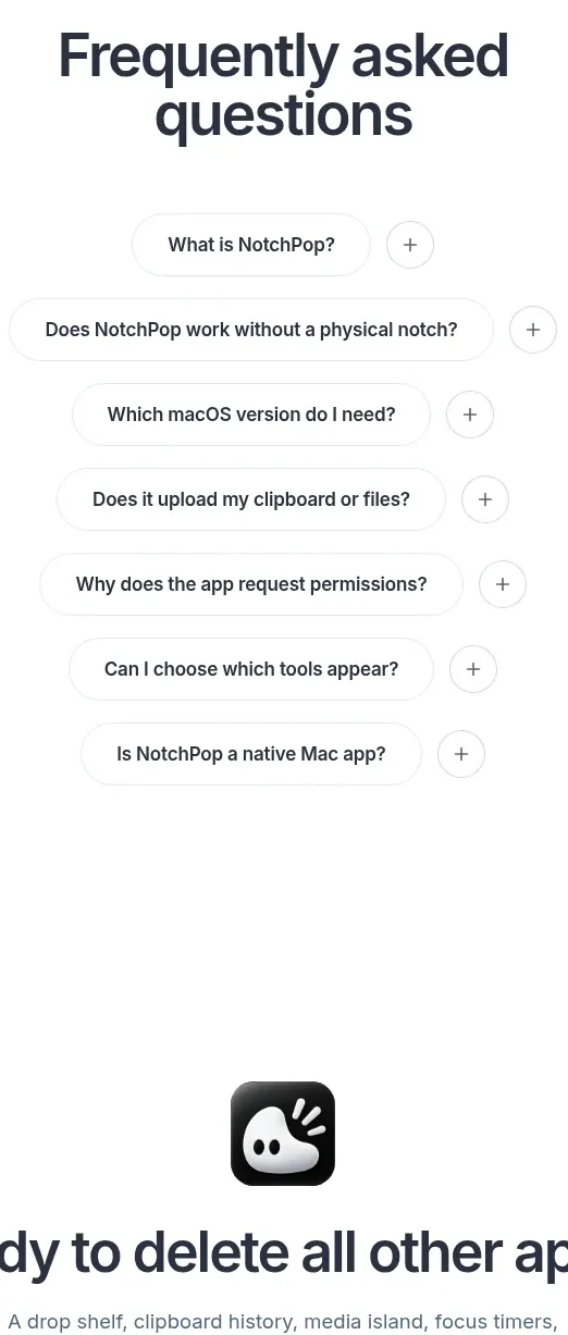
 One-time purchase pricing
NotchPop · Pricing table
One-time purchase pricing
NotchPop · Pricing table
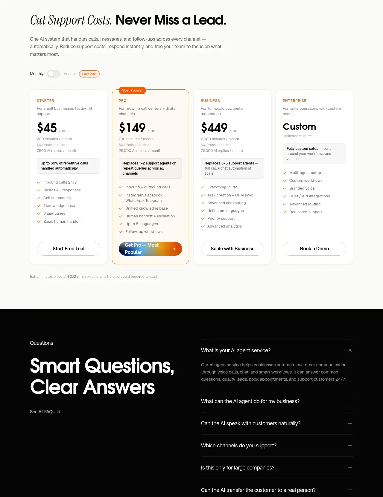
 Support plan pricing
IntellAgents.io · Pricing table
Support plan pricing
IntellAgents.io · Pricing table
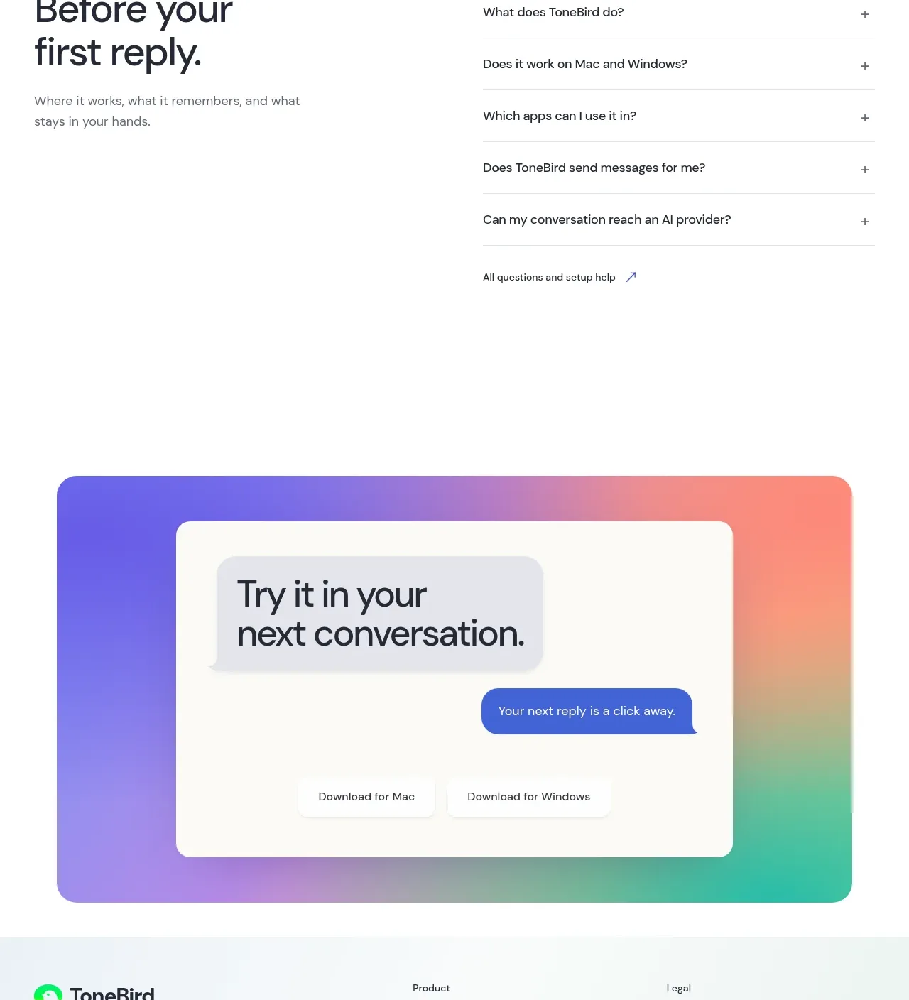
 Four-tier pricing table
ToneBird · Pricing table
Four-tier pricing table
ToneBird · Pricing table
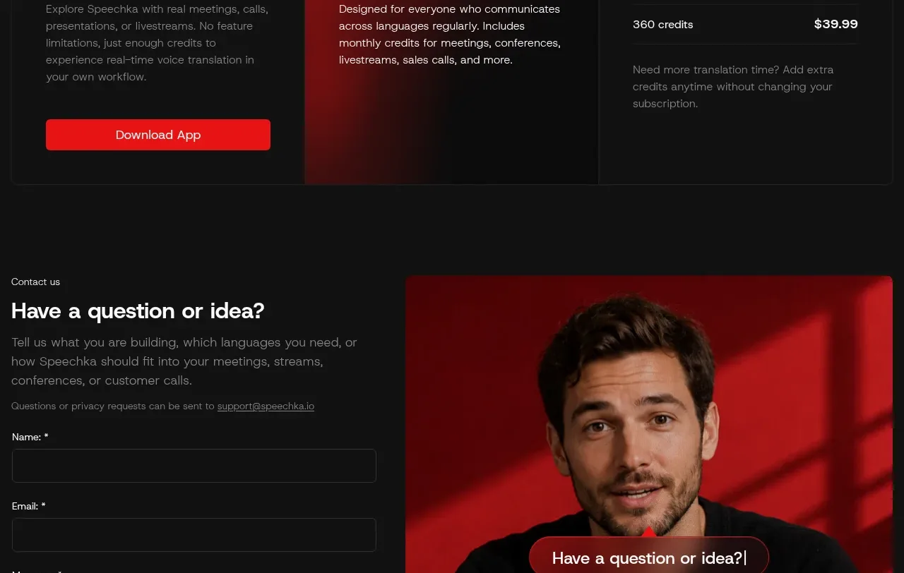
 Trial and subscription plans
Speechka · Pricing table
Trial and subscription plans
Speechka · Pricing table
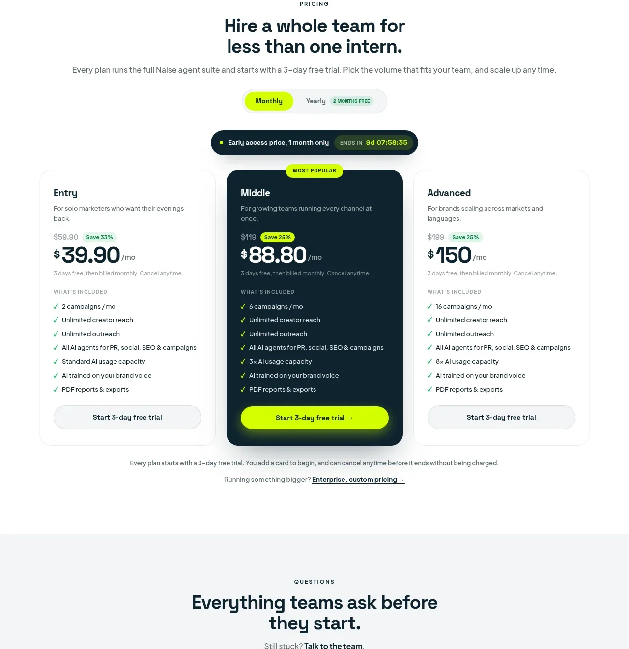
 Three-tier pricing plans
Naise AI · Pricing table
Three-tier pricing plans
Naise AI · Pricing table