 kage
kage
procboss.com
Design analysis
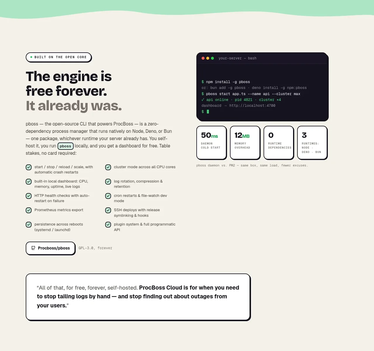
A warm cream section explains the foundational product promise with a bold editorial heading, checklist benefits, a terminal-style visual, metrics, and a bordered pull quote.
Prompt preview
## Reference images

Study these alongside the description below: hierarchy, rhythm, spacing, colour. Build for the product you are asked about, using this design language.

- Component: https://kage-design-assets.t3.tigrisfiles.io/components/procboss/3737396f-2984-4e55-9600-739ab09d7da3-1791525904-2.webp
- Full page it was cut from: https://kage-design-assets.t3.tigrisfiles.io/screenshots/procboss/3737396f-2984-4e55-9600-739ab09d7da3-1791525801598-full.webp
- Component on Kage: https://kage.design/component/procboss-feature-grid

## Before you start
Ask what foundational capability the user's product provides and which evidence makes that promise credible. Use the user's own terminology and brand system.

Build a warm cream benefit section with a two-column upper layout: an assertive heading and explanatory paragraph on the left, and a dark terminal, dashboard, or product proof panel on the right. Below, use a compact two-column checklist of specific benefits with small circular check icons, then a lightweight secondary action and a wide bordered quotation or proof statement. Keep content aligned to a centered max-width grid, with generous vertical whitespace and a clear reading order on mobile. Use black text, muted gray supporting text, mint check accents, 1–2px borders, 12–18px radii, and occasional monospace labels for technical proof. The section should feel editorial and trustworthy rather than like a generic feature list.

Never copy the reference's logos, product names, copy, illustrations or imagery.
More components

 Reliable, recoverable actions
Mailwell · Feature grid
Reliable, recoverable actions
Mailwell · Feature grid
 Unified account setup
Mailwell · Feature grid
Unified account setup
Mailwell · Feature grid
 Fast local workflow and calm reading
Mailwell · Feature grid
Fast local workflow and calm reading
Mailwell · Feature grid
 Privacy and optional intelligence
Mailwell · Feature grid
Privacy and optional intelligence
Mailwell · Feature grid
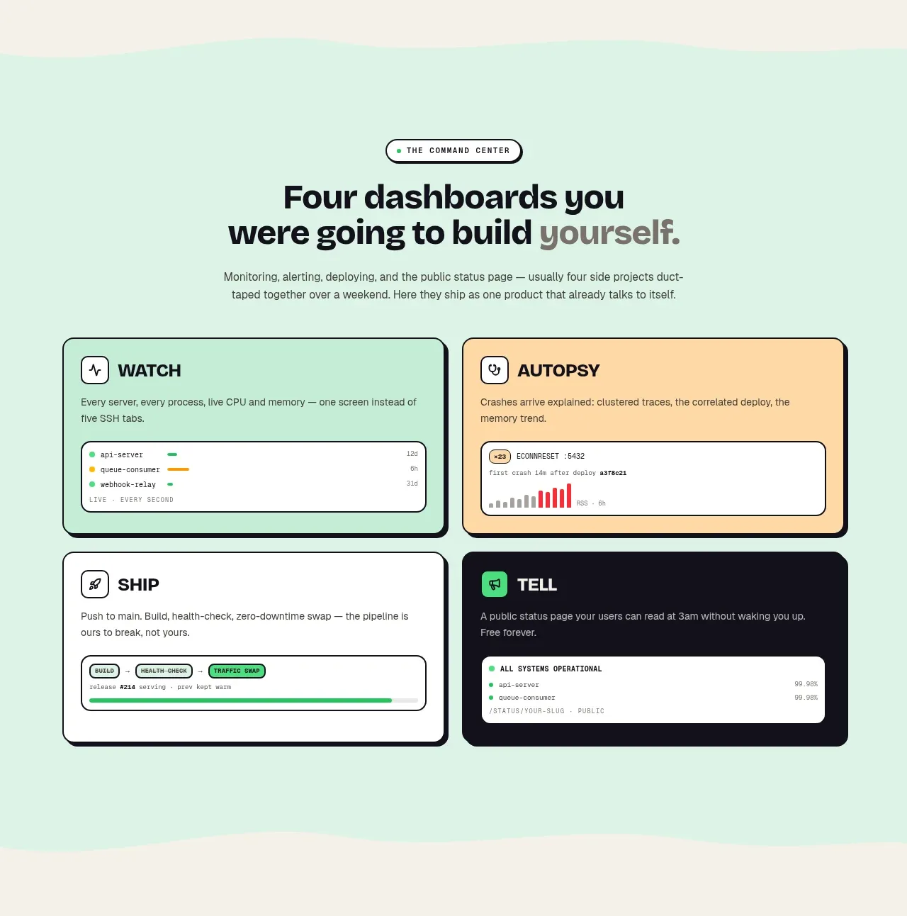
 Four product surfaces
ProcBoss · Feature grid
Four product surfaces
ProcBoss · Feature grid
 Operational blind spots
ProcBoss · Feature grid
Operational blind spots
ProcBoss · Feature grid