 kage
kage
procboss.com

Design analysis
This section frames a problem with a centered headline and three contrasting cards that describe concrete operational failure modes in a conversational, technical voice.
Prompt preview
## Reference images

Study these alongside the description below: hierarchy, rhythm, spacing, colour. Build for the product you are asked about, using this design language.

- Component: https://kage-design-assets.t3.tigrisfiles.io/components/procboss/3737396f-2984-4e55-9600-739ab09d7da3-1791525905-3.webp
- Full page it was cut from: https://kage-design-assets.t3.tigrisfiles.io/screenshots/procboss/3737396f-2984-4e55-9600-739ab09d7da3-1791525801598-full.webp
- Component on Kage: https://kage.design/component/procboss-feature-grid-2

## Before you start
Ask what hidden problems users experience after adopting the user's product and what three memorable scenarios best explain them. Adapt the tone to the brand.

Create a cream section with a small eyebrow label, a centered two-line heading, short supporting copy, and a row of three equal cards. Each card should have a small icon tile, a short scenario title, compact body copy, and a tiny monospace or command-like footer. Make the third card dark to create rhythm, while the others use warm white surfaces. Use thick dark outlines, 14–18px corners, modest offset shadows, and consistent card padding. On mobile stack the cards; preserve the distinct dark variant and ensure card text remains readable. Use a strong display hierarchy with approximate 30–42px heading size and 12–14px body text.

Never copy the reference's logos, product names, copy, illustrations or imagery.
More components

 Reliable, recoverable actions
Mailwell · Feature grid
Reliable, recoverable actions
Mailwell · Feature grid
 Unified account setup
Mailwell · Feature grid
Unified account setup
Mailwell · Feature grid
 Fast local workflow and calm reading
Mailwell · Feature grid
Fast local workflow and calm reading
Mailwell · Feature grid
 Privacy and optional intelligence
Mailwell · Feature grid
Privacy and optional intelligence
Mailwell · Feature grid
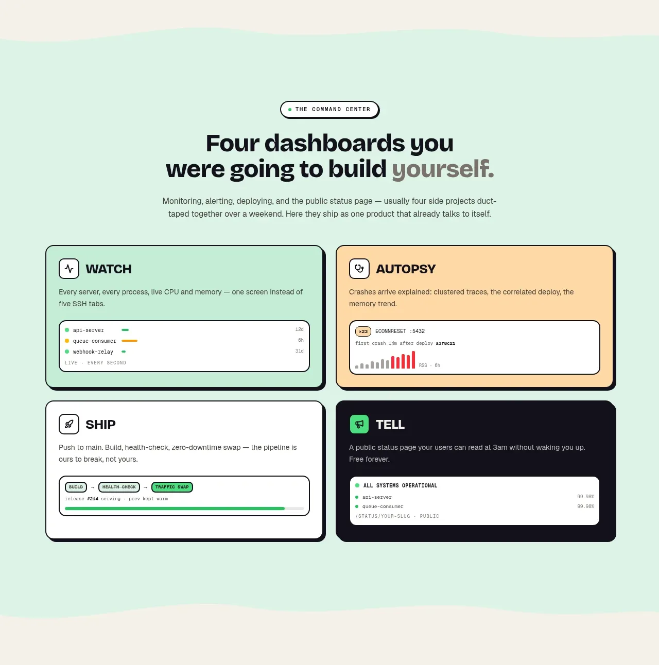
 Four product surfaces
ProcBoss · Feature grid
Four product surfaces
ProcBoss · Feature grid
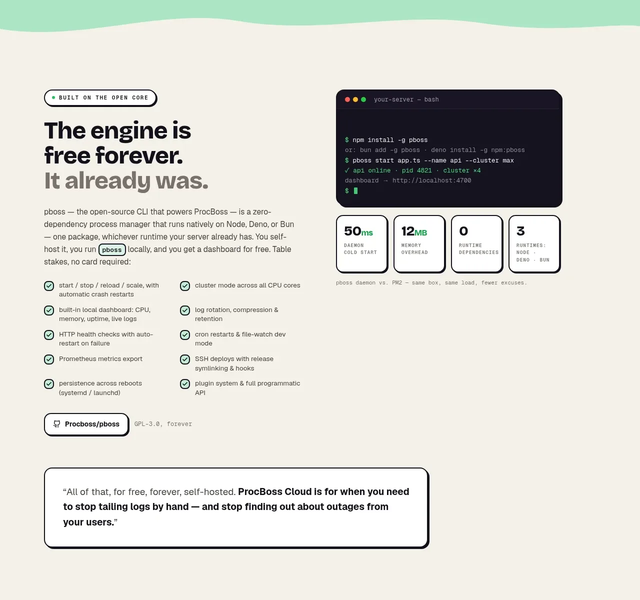 Free forever foundation
ProcBoss · Feature grid
Free forever foundation
ProcBoss · Feature grid