 kage
kage
procboss.com
Design analysis
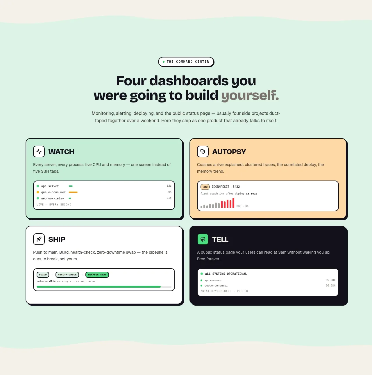
A mint band introduces four product surfaces in a 2×2 grid, each with a different pastel or dark card treatment and an embedded miniature interface illustration.
Prompt preview
## Reference images

Study these alongside the description below: hierarchy, rhythm, spacing, colour. Build for the product you are asked about, using this design language.

- Component: https://kage-design-assets.t3.tigrisfiles.io/components/procboss/3737396f-2984-4e55-9600-739ab09d7da3-1791525905-4.webp
- Full page it was cut from: https://kage-design-assets.t3.tigrisfiles.io/screenshots/procboss/3737396f-2984-4e55-9600-739ab09d7da3-1791525801598-full.webp
- Component on Kage: https://kage.design/component/procboss-feature-grid-3

## Before you start
Ask what four major jobs or modules the user's product supports, and what visual evidence could make each one immediately understandable. Use the user's brand colours.

Build a mint-background feature section with a centered eyebrow, bold heading, concise description, and a 2×2 grid of large feature cards. Each card needs a short all-caps or bold title, one-sentence explanation, and a miniature UI sample such as a chart, event list, status strip, or alert panel. Vary card surfaces between white, pale yellow, and near-black, but keep the same dark border, strong radius, and compact internal spacing. Use subtle irregular or hand-drawn energy only through small accents, not distracting decoration. Ensure the grid collapses to one column on narrow screens and that the UI samples are semantic, not screenshots.

Never copy the reference's logos, product names, copy, illustrations or imagery.
More components

 Reliable, recoverable actions
Mailwell · Feature grid
Reliable, recoverable actions
Mailwell · Feature grid
 Unified account setup
Mailwell · Feature grid
Unified account setup
Mailwell · Feature grid
 Fast local workflow and calm reading
Mailwell · Feature grid
Fast local workflow and calm reading
Mailwell · Feature grid
 Privacy and optional intelligence
Mailwell · Feature grid
Privacy and optional intelligence
Mailwell · Feature grid

 Operational blind spots
ProcBoss · Feature grid
Operational blind spots
ProcBoss · Feature grid
 Free forever foundation
ProcBoss · Feature grid
Free forever foundation
ProcBoss · Feature grid