 kage
kage
procboss.com

Design analysis
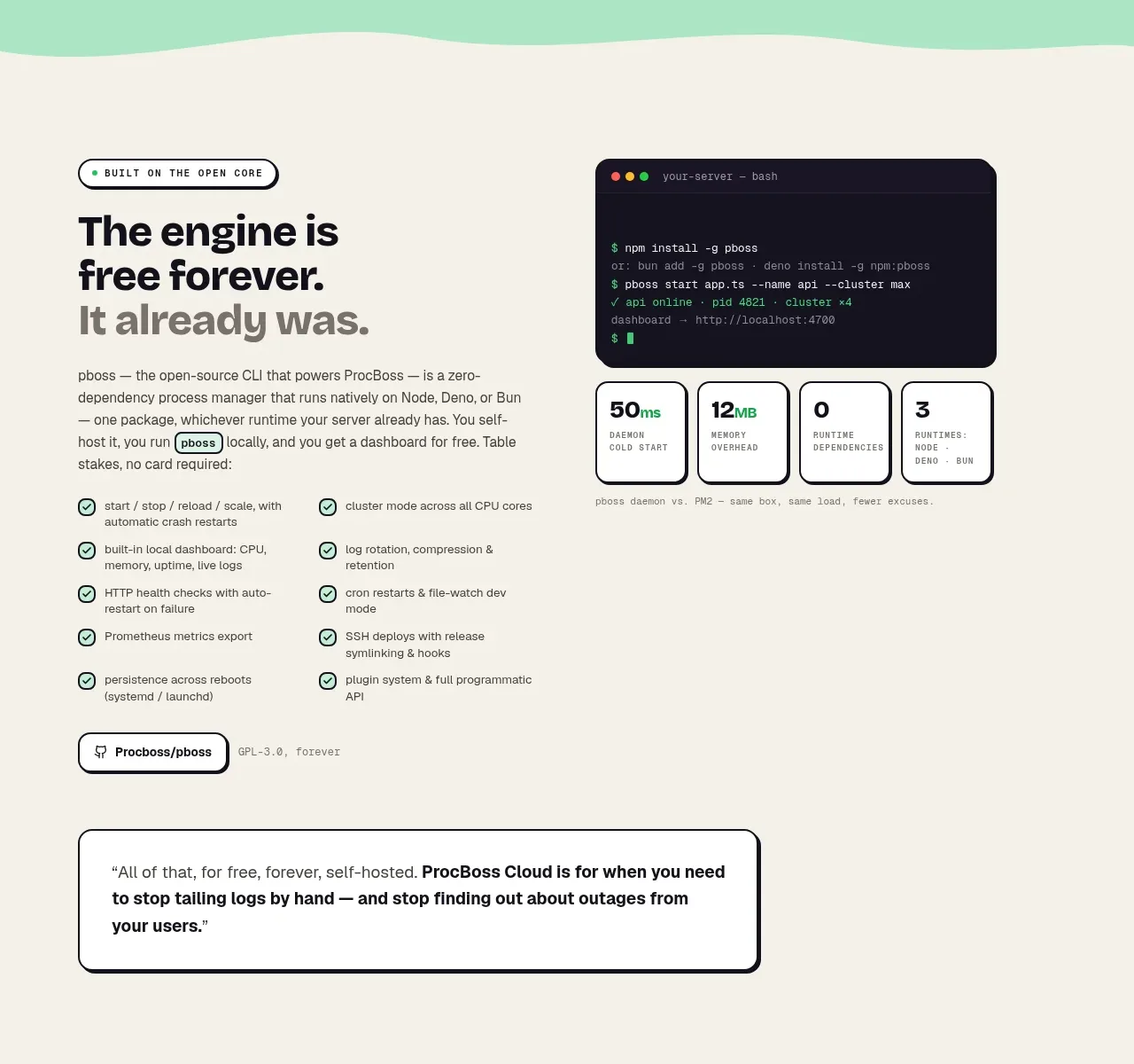
A long cream workflow section explains the value of a cloud layer through five alternating text-and-interface rows, each with a numbered label, checklist, and visual proof.
Prompt preview
## Reference images

Study these alongside the description below: hierarchy, rhythm, spacing, colour. Build for the product you are asked about, using this design language.

- Component: https://kage-design-assets.t3.tigrisfiles.io/components/procboss/3737396f-2984-4e55-9600-739ab09d7da3-1791525906-5.webp
- Full page it was cut from: https://kage-design-assets.t3.tigrisfiles.io/screenshots/procboss/3737396f-2984-4e55-9600-739ab09d7da3-1791525801598-full.webp
- Component on Kage: https://kage.design/component/procboss-feature-grid-4

## Before you start
Ask what layer or workflow the user's product adds, what sequence of jobs users perform, and what evidence belongs beside each job. Ask for their preferred UI visual language.

Create a long warm-cream workflow section. Start with a centered eyebrow, large promise-led heading, and short explanatory paragraph. Follow with five alternating feature rows in a centered two-column grid: each row has a numbered pill label, strong heading, explanatory paragraph, three concise checkmarked benefits, optional “alternative to” chips, and a dark product visual on the opposite side. Alternate image-left and image-right to create motion down the page. Use generous row spacing, thin separators, rounded dark UI panels with coloured edge accents, and small monospace metadata. Keep the reading order logical on mobile by placing text before its visual. Use #F7F3E8, #171720, mint/green highlights, coral and violet accents, 1px rules, and 14–20px radii.

Never copy the reference's logos, product names, copy, illustrations or imagery.
More components

 Reliable, recoverable actions
Mailwell · Feature grid
Reliable, recoverable actions
Mailwell · Feature grid
 Unified account setup
Mailwell · Feature grid
Unified account setup
Mailwell · Feature grid
 Fast local workflow and calm reading
Mailwell · Feature grid
Fast local workflow and calm reading
Mailwell · Feature grid
 Privacy and optional intelligence
Mailwell · Feature grid
Privacy and optional intelligence
Mailwell · Feature grid

 Operational blind spots
ProcBoss · Feature grid
Operational blind spots
ProcBoss · Feature grid
 Free forever foundation
ProcBoss · Feature grid
Free forever foundation
ProcBoss · Feature grid